Tutorial #1: Full Moon
At the moment, I’m using CS3, but once the class I’m currently enrolled in is over with (since it uses CS3), I’m upgrading to CS4. There will be tricks/features in some tutorials not used in previous versions of Photoshop. You can d/l a 30-day trial version of CS4 straight from Adobe’s website!
Since this is my first tutorial and I know a lot of you are starting with the basics, I just want to do something simple today. Nothing fancy, promise! I’m going to assume you’ve never used the program and tell you where everything is. I won’t do this every time, but as I introduce stuff!
**When using Photoshop, make sure you save often so you don’t lose all of your hard work! Constantly using File->Save or CTRL+S will keep you from heartache later, I PROMISE!!**
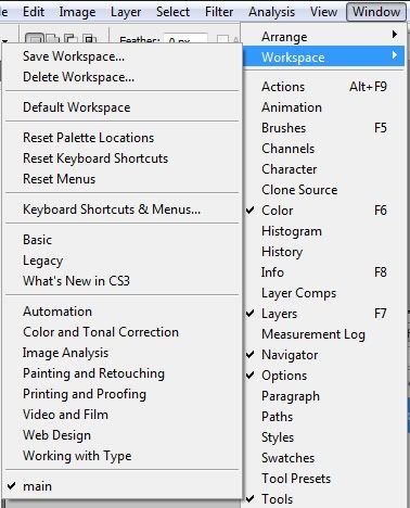
First, we want to make sure we all have the same palette windows open on our screens. By default, you should have Tools, Options, Navigator, Histogram, Info, Layers, Channels, Colors, Swatches, Styles, Layers, Channels, and Paths on your screen, but if you don’t, go to your toolbar and pull down WINDOW, and check off each feature. We won’t be using all of these palettes, so don’t stress out. The top two most important screens to have open are TOOLS and LAYERS. Make sure they’re always open, no matter what! You will ALWAYS use layers in Photoshop. A layer is basically putting one thing on top of something else, like if you wear a sheer black shirt over a fuchsia tank top. You’re wearing two shirts, and create a new color shade in the process. It’s sort of like that. And Tools is on your left and it has every tool you will ever use in Photoshop. I personally like to click that double-arrow at the top of the toolbar and get a double-screen so that my tools don’t take up as much vertical space. Personally, I also feel that Options is pretty useful to have at my fingertips. We can add and delete palettes as we need them. For this tutorial, we don’t need a lot. If you want to save the palettes you’ve opened so you don’t have to check them off every time you open Photoshop, go to:
Window->Workspace->Save Workspace,
and then the next time you open the program, you can go to:
Window->Workspace->and scroll to the bottom. If you named your current workspace “main,” for example, you should see it with a checkmark at the bottom of the bar!
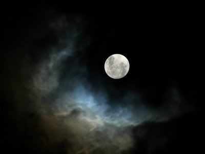
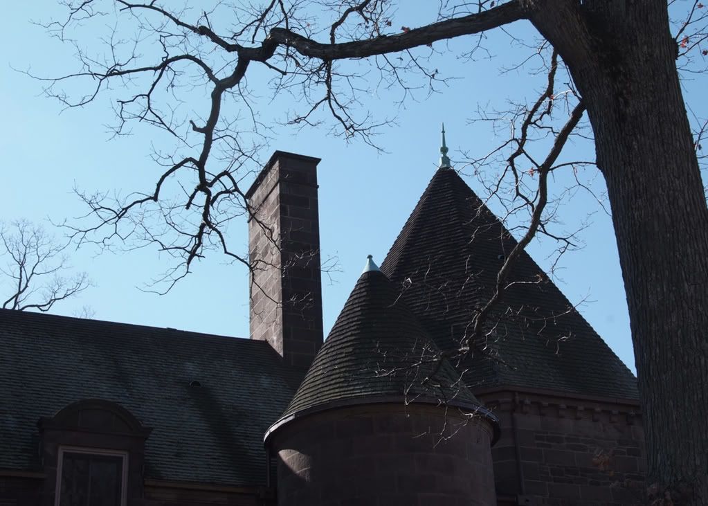
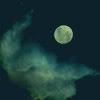
Okay, first, let’s take a picture of a full moon. I really like the one I found here: http://www.papermag.com/blogs/full_moon.jpg
(Here is a mirror link to download the image from if the PaperMag site goes down.)
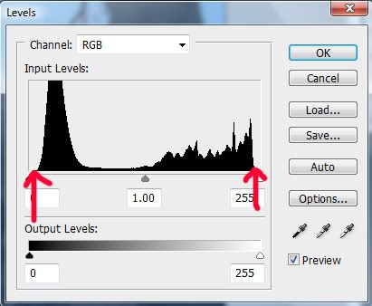
One thing we always want to do is check the balance of our levels when starting out and adjust them. Levels are...complicated to explain. http://www.earthboundlight.com/phototips/photoshop-levels-1-2-3.html does a pretty good job, though. Basically, we want to achieve the right balance. I also really like the ALT-button trick they mention when gauging how an image should look.
There are two ways to adjust your levels. One is to go to:
Image->Adjustments->Levels
You can do this and it will work just fine. Any changes you make to what you’re working on, however, will be permanent.
There is a second method you can use that isn’t permanent. It’s a little more advanced, but it’s probably better to know early on. Look at your Layers Palette. Do you see the little half-moon button at the bottom? It looks like this:
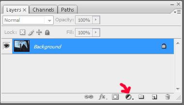
Click that button, then click on the word LEVELS. It brings you to the same screen as if you had used the first method I mentioned. The only difference is, you get a second layer on your layers palette that looks like this:
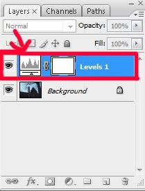
This is a type of mask, but don’t worry about that word right now. Just think of it as a second layer. You can change the levels of your image (or any other category under that half-moon button) however you want, and you won’t permanently adjust your picture. See the little eyeball on the left-hand side of your level layer? If you click it, the eyeball disappears and that layer becomes invisible. It doesn’t change any of your other layers. With the first method where you went to Image->Adjustments->Levels, you didn’t get a second layer and the changes are permanent. You can’t change them later. So I, personally, like to make changes this way, and felt it worth teaching you despite it being slightly more advanced.
Okay, to show you what I mean about levels because it’s hard to comprehend, look at the picture located here.
Save it to your computer, open it in Photoshop, and open up LEVELS using whichever of the above methods suits you best.
Are you there? OKAY! See this picture that comes up?
I want you to notice how the two black lines come in slightly from the sides and aren’t off completely to the side. This photograph is leveled pretty well!
Okay, close that picture. I want you to open up the image of our full moon again (if you closed it). Go into your levels. See the difference?
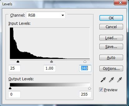
Adjust your image as you see fit. I’m going to use 25/1.00/240. I like how that looks. Again, this is me. Don’t be afraid to make your graphic unique!
Next, I want to crop my picture. Sometimes I do this right away before I start working on my image, other times, I do it at the end. If you work on a big surface and shrink it later, be forewarned that your end-result may not look exactly the same as it did on a larger scale.
For LJ-Avatars, images can be 100 pixels wide by 100 pixels tall. That’s pretty small!
Look at your toolbar (on your left, remember?) We’re going to start with our Rectangular Marquee Tool. That’s the button that looks like a rectangle (with dashed lines instead of one solid line), like this:
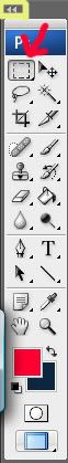
Don’t worry if your buttons are all on one line and in my picture, they’re on two. You see where I drew that yellow box? If you click that double-arrow, your toolbar will look just like mine. It’s okay to leave it as the default, too! It’s all personal preference. Also don’t worry when you don’t see that weird blue/gray line down the left-hand side of my toolbar. I have a Wacom Intuos3 drawing tablet, and that’s actually a hideaway bar for the handwriting feature, so it’s not a part of my Photoshop toolbar at all! It just...doesn’t go away! Sorry!! (You can also use the letter M on your keyboard as a shortcut!)
Okay, have you clicked on your Rectangular Marquee Tool? Drag your mouse over your picture, and the little dancing white ants that make up a rectangle will appear. Make a box framing the image you want, then go to:
Image->Crop
That’s it! You can crop it as many times as you want, so don’t worry if you missed something! If you want to go backwards, you can either go to:
Edit->Undo
or use the keyboard shortcut CTRL (or ⌘ if you’re on a Mac)+Z.
When you have the image you want, go to:
Image->Image Size
(or use shortcut ALT+CTRL/⌘+I)
This is where we’ll go to change our image size. STOP!! Before you change your numbers, look at the bottom of your screen. See where it says Constrain Proportions with a checkbox? Make sure there is a check in that box!! If there isn’t, check it off. If you don’t do this, then when you change the size of your width, the height of your image won’t change (and vice versa). Granted, sometimes you want this, but usually, you want to keep your picture in proportion so it doesn’t look strange. Okay, now that your box is checked, look at the size of your width and your height. Unless you cropped perfectly, one number is larger than the other. What I do is find the size that’s smaller and overwrite it with the number 100. I just did that, and my height is 100 and my width is 106 pixels at the moment. I can either hit CANCEL and crop my width a little bit more before repeating the process or click OK and move the left or right arrow buttons on my keyboard over six times. (Because at the moment, I’m six pixels over) This will move my dancing ants, and then I can go in and crop out those six extra pixels. The method you choose is up to you.
Okay, are you at 100x100 pixels now?
Let’s move on!
Go back to your layers palette. Two buttons over from that half-moon on the bottom, you’ll see what looks like a curled up post-it note.
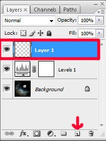
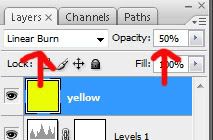
Click that! You’ll get a third layer on your palette. There’s a picture of a gray-and-white-checkered square. It says LAYER 1. If you double-click the words LAYER 1, you can rename the layer to anything you want. You don’t have to, but for images where you have a lot of layers, it helps when it comes to keeping everything organized. I’m going to call my layer “yellow” because I’m going to paint this layer yellow.
Go back to your toolbar. Do you see the tool that looks like a paint bucket? Click it! If you don’t, hover over your icons with a mouse. The words will show up each time you do this. You’ll also see the keyboard shortcut for each tool in parantheses (G is the one for Paint Bucket, for example).
(http://www.newtutorials.com/photoshop-toolbar-tutorial.htm will show you what every tool on your toolbar is. I don’t want to add a screencap of every button and make this too image-intensive. Leave a comment if you want a pic, though, and I’ll send you one! But for the toolbar, I think I’m going to just start mentioning what it is and have you hover for it. Use that site as a reference! ^^;;)
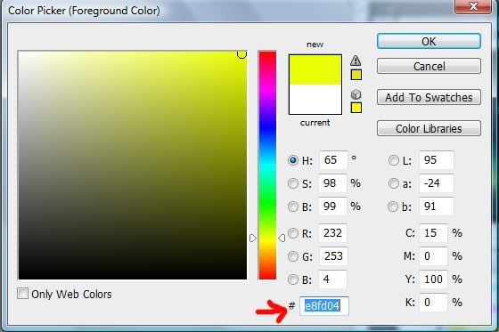
Toward the bottom of your toolbar, you should have a white box and a black box that overlap one another. When you hover over them, they say, Set Foreground Color and Set Background Color. We want to set our foreground color. This is the color that we’re actively using right now. Click on the white square. The Color Picker should show up! I picked a nice, strong yellow. If you want to use the exact shade I have, go to the bottom of the picker where you see the pound (#) sign and input the code e8fd04.
Now, go back to your layers palette. We're going to play with some blend modes now. See at the top where it says NORMAL? We’re going to change that. Go ahead and play with the different effects. http://www.uwec.edu/help/PhotoshopCS2/blendmodes.htm briefly mentions the different modes and shows the difference for each. I’m setting my mode to Linear Burn. The color’s very harsh, though, so to the right, where you see the button that says Opacity, go ahead and type in 50% instead of the 100% default. Ah, much better!!
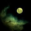
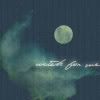
Now, my image looks like this:
Okay, now make another new layer! (The post-it button, remember?)
Click on the yellow square on your toolbar that you just made and go back into your Color Picker. This time, I chose white (#ffffff). Go back to your toolbar. Click on the image of a paintbrush. (It says Brush Tool. The keyboard shortcut is B.) I want to pick a brush that has a soft edge. At the top of your screen, you should see a row of options. One should say BRUSH with a little circle/number (I don’t know what the default brush that the program starts with is, sorry!). Click this circle. You’ll get something that looks likes this:
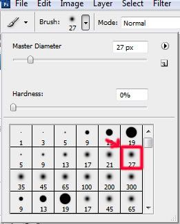
In red, you can see the brush I chose. Notice how the edges are sort of blurry? That means that the brush has a soft edge and isn’t hard like the solid circles you see above it. You can make the brush smaller or larger by changing your Master Diameter (you can also hit [ on your keyboard to make your brush a smaller size and ] to make the brusher a larger size w/o going back into this panel). You can also adjust the hardness of your brush here.
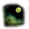
With the soft brush that you’ve chosen, draw a square around your image. Mine looks like this:
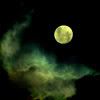
Okay, we’re going to add another blending option now! Go back to that bar that says NORMAL in your layers. This time, change it to SOFT LIGHT. With some pictures, flooding a picture with white and softening it will do wonders. I use this trick a lot. It doesn’t do a ton to this image, but it lightens it up a bit and brings out some of the yellow reflection in the clouds.
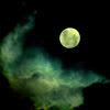
Okay, now, make ANOTHER new layer! Click on your white square. Pick a nice, dreamy blue. I picked # 799ead. Using your Paint Bucket Tool, fill the entire layer with color. Now, go back to your Normal Mode and change it to Soft Light. It gets rid of some of the gritty color and adds a nice hue, imo.
Next, we’re going to-you guessed it!!-make another new layer! We’re going to make our foreground color a darker blue this time. I chose # 20566c. Using your Paint Bucket Tool, fill the entire layer with color. This time when you go over to your layers palette, we’re not going to play with our modes. Lower the Opacity to 39% to reduce some of the image’s blackness. Now I have this:
Looking better, but it still feels unfinished. To keep this tutorial simple, I’m going to add a simple pattern. Go back to your half-moon icon. Click it, then choose the Pattern option.
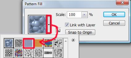
Pattern Fill should have come up for you. See the first red square in my diagram there with the little arrow? Click it, and you’ll get some preset patterns. (Follow my arrow and you’ll see the box that pops up with presets.) I chose the third box in, which I’ve outlined in red (You can also add more presets by clicking on the arrow to the right of THAT box and then clicking Artist Surfaces/Color Paper/etc.)
Did you choose the pattern you liked? Okay! Now, go back to your Opacity and lower it to 25% (or to whatever level suits you. Also feel free to skip this step if you don’t like the effect at all, or delete it/hide it on your palette!)
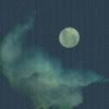
Okay, here’s where I am:
Finally, we’re going to add some text to finish things up. Go back to your toolbar and click the button that looks like the letter T. (Ironically, the letter T is also your keyboard shortcut.) This is your text tool. Click the tool into the image wherever you want your text to be.
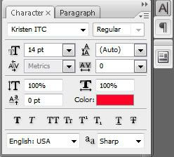
Now, remember that Options Palette I wanted you to have earlier? We’re going to use it! If your setup is just like mine at the moment, it’s the button with the letter A and a vertical line that’s near the top right of your screen near your Navigator palette. Here’s an image:
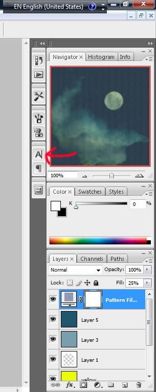
(Er, ignore that thing that says EN English (United States). That’s just a floating keyboard I have for when I want to change my keyboard to be able to write in Japanese and kanji and all that good stuff. It’s not a part of Photoshop.)
Click that A button.
Now, you can pick your font choice, the size of your font, the color, the width, etc! Everything you could ever need is at your fingertips. There’s a great website called www.dafont.com I get so many fonts there!! I chose the font jey. (http://www.dafont.com/search.php?psize=m&q=jey)
[http://www.dafont.com/faq.php will show you how to install fonts onto your computer if you don’t already know how.]
I picked a white in #ffffff. I decided to use the words “watch for me” as my text from the quote,
“Watch for me by moonlight; I'll come to thee by moonlight, though hell should bar the way.” ~Alfred Noyes
Okay, almost done! I didn’t like the way the words stood against the page, so I decided to change them.
Go back to your layers palette. Right-click on your text layer (it will be named “watch for me” or whatever else you have chosen to write onto your icon). A menu of choices comes up. Click Blending Options.
Blending modes are wonderful. I use them *all* the time. You can use them for image layers, text layers...anything, really!
First, I decided to add an Outer Glow to bring some moonlight into my text. So check the checkbox and make sure there’s a blue bar over the words “outer glow” to show that you’re in that option frame. On the right, you have a bunch of options. I didn’t change anything in my Elements or Quality settings. They’re regular. I only changed my Structure settings, and even then, not all of them. I have the Blend Mode set at Screen, the Opacity at 75%, the Noise at 0%, and my color (the square one) is #7c7c59.
Next, I added an Inner Glow. Again, I only changed my Structure settings, and even then, not all of them. I have the Blend Mode set at Screen, the Opacity at 75%, the Noise at 0%, and my color (the square one) is #3d3d16 because I didn’t want too much.
Finally, I added a Drop Shadow. My blend mode is Multiply, my color is #000000B, and my Opacity is 60%.
Finally, say OK to exit out of blend mode and utilize the settings you’ve created.
Here we are:
For my final step, I decided to add a small line beneath my text. I went back to my white #ffffff and took my paintbrush (the same one as before) all the way down to a Master Diameter of 1. I didn’t want a big brush. Then, holding down on my SHIFT BUTTON (SHIFT will give you a straight line), I drew a line beneath the words “watch for me.”
Next, I went to my layers palette, took my layer with my white line, held down on the layer with my mouse, and dragged the layer down so that I moved it beneath my text layer. You can drag layers back and forth so that they’re over/under each other this way whenever you wish to do so.
Once my white line was beneath my text, I took the fill down to 36%.
The very last thing you must do is save!!! However, if you just save the way you’ve been doing all along, your file will save as a .psd file, which can’t be used as an avatar. You can do:
File->Save As->filename+jpg/gif/etc.,
but what I’ve gotten into the habit of doing is:
File->Save for Web & Devices->(making sure my settings are on JPG and MAXIMUM at 100% Quality with Optimized checked, then I hit SAVE and name my file, then finally click SAVE again. VOILA!!!
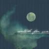
And that’s it! We’re done! Here’s my avatar:
What does yours look like? Please post it in the comments and show me. I really want to see! Also, did this help you? Was it too easy? I don’t know what level everyone is at. What would you like to see/do in the future?
Let me know what I can change/make better. I’ve never made a tutorial before!