Round 7 Challenge 4 Results
I'm a little torn about the results this week, we went from 8 to 4 participants because people didn't enter. I think it would only be fair to start from the final four here, but I don't know if that's just a major tease and a prolonging of an already difficult task. These are the results as of today, down to the final four, but if every one's who's still in, can comment on whether we should be at the final four or three, I'd appreciate it.
Eliminated with -4 votes:
by raths_kitten
I'm sorry to see you go, but we'll see if we don't do the final four this round instead :)
People's Choice with +3 votes:
by good_memories
tallies:
1: +3 = +3
2: -4 = -4
3: +1 / -1 = 0
4: +1 = +1
Needs Improvement:
02 Josh is oversharpened and multicolored, it kind of looks like he got beaten up.
#02 - The icon is too dark and too blue
002: The cropping is nice but the coloring is very blue at the top. It would look much better without the texture/brush.
002 - The textures used does not really enhance the icon, rather it distracts from the subject giving bluish tints on his skin.
03 - in comparison to the other icons, it's just lacking something. Maybe play a bit more with the coloring to make it stand out.
Faboo:
01, simple but effective
01 - Your icon emphasizes his abs. Nice!
001 - The simple crop actually gives this icon a really refreshing feel.
#03 - Good colouring
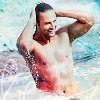
Eliminated with -4 votes:
by raths_kitten
I'm sorry to see you go, but we'll see if we don't do the final four this round instead :)
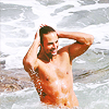
People's Choice with +3 votes:
by good_memories
tallies:
1: +3 = +3
2: -4 = -4
3: +1 / -1 = 0
4: +1 = +1
Needs Improvement:
02 Josh is oversharpened and multicolored, it kind of looks like he got beaten up.
#02 - The icon is too dark and too blue
002: The cropping is nice but the coloring is very blue at the top. It would look much better without the texture/brush.
002 - The textures used does not really enhance the icon, rather it distracts from the subject giving bluish tints on his skin.
03 - in comparison to the other icons, it's just lacking something. Maybe play a bit more with the coloring to make it stand out.
Faboo:
01, simple but effective
01 - Your icon emphasizes his abs. Nice!
001 - The simple crop actually gives this icon a really refreshing feel.
#03 - Good colouring