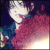
[tutorial] count cain - faded roses
Okay, my first icon tutorial here. This is using a similar method that I've used for my main icon, so I'll show you how I did it, with another picture.
We are going to go from this to this:
.
Using PS 7.0, easy level of difficulty, and should be transferrable to most programs.
01. Crop the icon to 100x100 pixels.

02. Sharpen the base image, not so much as to ruin the picture. Once is enough.

03. Duplicate the base, gaussian blur the layer, at 4.0px radius. Set the layer to soft light, with 100% opacity.

04. Add a new layer, fill with #6FBE57, set at color burn, 66% opacity.

05. New layer, #080540, exclusion, 100% opacity.

06. New layer, #A09E72, darken, 44% opacity.

07. New layer, #FFA9A9, soft light, 100% opacity.

08. Duplicate the second layer (the one you applied the gaussian blur to in step 3). Drag to the top of the palette, overlay, 50%.

09. Go to Layer > New Adjustment Layer > Hue/Saturation. Set the Saturation to -100. Overlay, 70% opacity.

10. Apply this light blue gradient from crumblingwalls:

set to saturation, at 50% opacity.

11. Then apply this texture from soulspring:

set to overlay, at 50% opacity.

12. OPTIONAL. Apply this light texture:

Flip it horizontally, then vertically. Set to screen, 100% opacity.

13. OPTIONAL. Apply a tiny text brush from colorfilter.

14. Draw a simple black border (or one of any colour of your choice) around the icon.

And voila!
You're free to take the original icon, but please do the proper thing and credit me if you do. And I'd love to see your icons you made with this method.
Hope you liked my first tutorial! :D
We are going to go from this to this:

.
Using PS 7.0, easy level of difficulty, and should be transferrable to most programs.
01. Crop the icon to 100x100 pixels.

02. Sharpen the base image, not so much as to ruin the picture. Once is enough.

03. Duplicate the base, gaussian blur the layer, at 4.0px radius. Set the layer to soft light, with 100% opacity.

04. Add a new layer, fill with #6FBE57, set at color burn, 66% opacity.

05. New layer, #080540, exclusion, 100% opacity.

06. New layer, #A09E72, darken, 44% opacity.

07. New layer, #FFA9A9, soft light, 100% opacity.

08. Duplicate the second layer (the one you applied the gaussian blur to in step 3). Drag to the top of the palette, overlay, 50%.

09. Go to Layer > New Adjustment Layer > Hue/Saturation. Set the Saturation to -100. Overlay, 70% opacity.

10. Apply this light blue gradient from crumblingwalls:

set to saturation, at 50% opacity.

11. Then apply this texture from soulspring:

set to overlay, at 50% opacity.

12. OPTIONAL. Apply this light texture:

Flip it horizontally, then vertically. Set to screen, 100% opacity.

13. OPTIONAL. Apply a tiny text brush from colorfilter.

14. Draw a simple black border (or one of any colour of your choice) around the icon.

And voila!
You're free to take the original icon, but please do the proper thing and credit me if you do. And I'd love to see your icons you made with this method.
Hope you liked my first tutorial! :D