what?
yesterday i took the role of behind-the-scenes and production photographer for a short film here in vegas.
i tried my hardest to not get involved in what would be best for the film.
i wasn't the cinematographer or director. they had their 'vision' so i let it be.
all the crew were experienced in their equipment but it seems that they didn't have the creativity to go with it.
the story didn't have much quality. for a 15min short, it took about 12 hours to get all the footage they wanted.
there was supposed to be a 'twist' but i didn't see any.
the basic story: 3 guys live in a house, one comes home and he's all sketched out. a tweaker. lots of yelling. arguments. there's hidden money somewhere in the house. 2 bad guys come in, hunt them down. eventually kill two of them. one escapes. bad guys still looking for money. the end.
huh? what?
the title of the short is called "WHAT?"
exactly.

in other things, i'm on edge about some recent logo/identity changes like pepsi & pizza hut.
i'm sure you've all see pepsi already. i like it but it's been done before. 'let's go retro'
but for lunch yesterday we had pizza hut. i saw the boxes and i was like wha?

'The Hut'. one fault. it reads tIUT. big fault i suppose.
but the logo is already branded into the general public's eye.
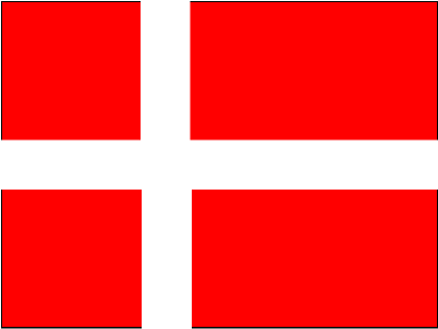
the cross of the H is extended and it's looking like Denmark's Flag
it's reading like a cross instead of an h.
they tried to keep that upward angle like their older logotype but in blocks.
it's hip and cool and all that jazz but it's not visually pleasing.
i like the look of it. bold. strong. but it hurts my eyes!
i tried my hardest to not get involved in what would be best for the film.
i wasn't the cinematographer or director. they had their 'vision' so i let it be.
all the crew were experienced in their equipment but it seems that they didn't have the creativity to go with it.
the story didn't have much quality. for a 15min short, it took about 12 hours to get all the footage they wanted.
there was supposed to be a 'twist' but i didn't see any.
the basic story: 3 guys live in a house, one comes home and he's all sketched out. a tweaker. lots of yelling. arguments. there's hidden money somewhere in the house. 2 bad guys come in, hunt them down. eventually kill two of them. one escapes. bad guys still looking for money. the end.
huh? what?
the title of the short is called "WHAT?"
exactly.
in other things, i'm on edge about some recent logo/identity changes like pepsi & pizza hut.
i'm sure you've all see pepsi already. i like it but it's been done before. 'let's go retro'
but for lunch yesterday we had pizza hut. i saw the boxes and i was like wha?
'The Hut'. one fault. it reads tIUT. big fault i suppose.
but the logo is already branded into the general public's eye.
the cross of the H is extended and it's looking like Denmark's Flag
it's reading like a cross instead of an h.
they tried to keep that upward angle like their older logotype but in blocks.
it's hip and cool and all that jazz but it's not visually pleasing.
i like the look of it. bold. strong. but it hurts my eyes!