Sailor Moon Manga Pre-Order...
I just noticed that Amazon.com (U.S.) has updated the new Sailor Moon manga pre-order pages with the new cover art (If you didn't already know ;) the first four Sailor Moon volumes & both Sailor V volumes are available for pre-order).
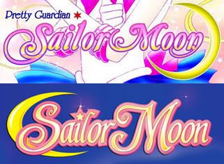
Anyway, I am loving the logo used on the manga! I prefer it much more over the other Italian version, which was used on the anime materials and such. I think the typography for the manga version is cleaner and the flourishes coming from the "S" and "M" seem more interesting and elegant. Also, the crescent moon isn't stretched out oddly.
(I prefer the top version)

On an unrelated topic...I'm getting an exciting new addition to my collection (in the mail this week) and I can't wait to share :D!
Anyway, I am loving the logo used on the manga! I prefer it much more over the other Italian version, which was used on the anime materials and such. I think the typography for the manga version is cleaner and the flourishes coming from the "S" and "M" seem more interesting and elegant. Also, the crescent moon isn't stretched out oddly.
(I prefer the top version)

On an unrelated topic...I'm getting an exciting new addition to my collection (in the mail this week) and I can't wait to share :D!