Icon Coloring Tutorial
Ok this is my first ever tutorial, so I hope it is understandable. If you have any questions or comments, please ask! Also, I would love to see what your icons look like if you use this tutorial. :)
- This tutorial is translatable.
- Uses color fills, channel mixer, and color balance.
- There are 9 steps.
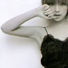
Going from this
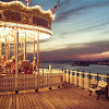
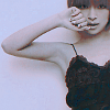
to this
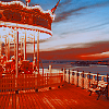
Other examples:
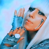
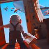
This icon tutorial seems to work better with images that have light backgrounds. It seems to also work with cartoon/anime images, but can make he colors look fuzzy because of the reddish tones. It is probably best to tweak with the opacities when working with the cartoon images to get rid of the blur.
1. I started off with my 100x100 base. The shot is a little blurry, so I sharpened it with the Sharpen Tool at 35%, but you can sharpen it as much or as little as you want.
2. I wanted to lighten the image, so I created a new layer, and filled it with the color #dcaf87, and I set it to Soft Light 100%

>>>>>>>
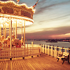
3. Next, I created a new layer, by selecting Layer >> New from Visible.
4. I duplicated that layer, and set it to Burn at 52.3%

>>>>>>
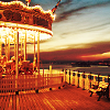
* If your icon is too dark when using Burn, lower the opacity. I used this layer to brighten the image with deeper colors and create stronger outlines of the merrt-go-round and fence, since it was dull.
5. Create a new layer and fill it with #bbb7b7. Set this layer to Value 52.3%

>>>>>>
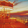
*As you can tell, Value makes thisicon brighter with hues of red, and gives it a cool kind of effect, or at least I think so. You can adjust the opacity as you see fit.
6. Next, create a new layer, like we did before, with Layer >> New from Visible.
7. Ok, we are going to duplicate our base and bring it to the top, so it will be on top of the new visible layer. And this base layer will be set to Darken Only 60%

>>>>>>
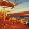
*If you want the icon to be redder lower the opacity. This layer was meant to tame down the red
from the Value layer.
8. Create a new visible layer. On this layer, we will make a Color Balance layer using:
Shadows: 0,0,30
Midtones: -15, -7, 14
Highlights: 0,0,-10

>>>>
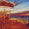
*This color balance layer adds more blues to the icon, since I thought it was a little to bright.
9. Finally, for the last step! Create a new visible layer, and this will become a Channel Mixer layer with the following:
RED: 135, -30, 0
GREEN: -15, 115, 0
BLUE: -58, 130, 40

>>>>>>>>

*This Channel Mixer layer adds brightness and reddish hues.
Other Examples
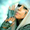
to

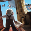
to

to
to
