Nav bar, spiffy date confusion.
Hello there, I'm relatively new to FS and am still getting use to all the wonderful coding that goes along with it. Recently, I was updating my spiffy date that I have in my theme layer so that it was out of the way of the subject, thus making the subject not bunch up. I added a position: relative; to the coding and raised it higher on my entries so that is also functions as a separator.
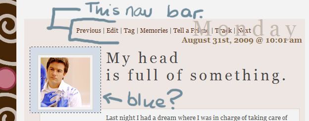
All works well on the main page, and I really like the look, however, when I try to get to the permalink or comment, the nav bar gets in the way of the date and for some reason the comment box goes blue, when originally it is not that shape nor is it that colour.

My Question is:
Can I move the navigation bar below the entry, or even above, therefore freeing up the date and hopefully fixing the blue around the icon?
All works well on the main page, and I really like the look, however, when I try to get to the permalink or comment, the nav bar gets in the way of the date and for some reason the comment box goes blue, when originally it is not that shape nor is it that colour.

My Question is:
Can I move the navigation bar below the entry, or even above, therefore freeing up the date and hopefully fixing the blue around the icon?