Poe woes... - SOLVED!
Hi all! I was defeated by a layout attempt about 5 months ago, but the reactivation of my Paid Account spurred me on to make a new layout! So, using the Poe theme, I went about using the tips and tricks I found on this wonderful community to build a simple, yet unique layout. Anyway, here are some of the issues I'm having and I would really, really appreciate any help you clever folks can offer. Please forgive me if any of this is newbie mistakes... I am new to this and I've thoroughly searched this community! Oh, my layout was made with 1280×1024, if that makes a difference..
Here's my Layer code.. http://www.livejournal.com/customize/advanced/layersource.bml?id=7277563 . And here is my CSS...
#header { height: 350px; }
#header-inner { height: 350px; }
#header-name { display: none; }
#header-description { display: none; }
#header-content-inner {margin: 310px -190px;}
.nav { display:}
#page-inner {
background-color: #000000;
}
.layout-tw #content-inner {
background-position: top left;
background-image: url(http://i27.photobucket.com/albums/c174/bleakharvest/2_leftbgcopy2.gif);
;)
background-color:#000000;
}
.layout-tw #beta .widget-header{
background-image:
url(http://i27.photobucket.com/albums/c174/bleakharvest/2_leftwidget2.gif);
;)
background-repeat:no-repeat;
color: #CCCCCC;
}
.layout-tw #gamma .widget-header {
background-image:
url(http://i27.photobucket.com/albums/c174/bleakharvest/2_leftwidget2.gif);
background-repeat:no-repeat;
color: #CCCCCC;
}
body {
font-family:Palatino, Palatino Linotype, Georgia, "Times New Roman", Times, serif;
font-size: 12px;
color:#FFFFFF;
background: url(http://i27.photobucket.com/albums/c174/bleakharvest/2_bK2.gif)
center top repeat-y #000000;
}
.layout-tw #header-inner {
background-image: url(http://i27.photobucket.com/albums/c174/bleakharvest/newbanner.jpg);
;)
}
.comments-header {
color : #968B74;
}
.comment-even {
border-color : #abb67e;
background-color : #968B74;
}
.asset-body blockquote {
border-left-color : #ffffff;
}
.layout-tw #content-inner,
.layout-wt #content-inner,
.layout-wtt #content-inner,
.layout-twt #content-inner {
background-position: top left;
background-repeat: repeat-y;
background-color:#22201D;
color:#BCB6B1;
}
div#header-name a
{
color:#5C5D5C;
font-variant:small-caps;
font-style:italic;
}
div.hr
{
border-top: thin dashed black;
width: 33%;
margin-bottom: .5em;
}
h2.asset-name {
margin-bottom: 0px;
}
div.asset-meta {
margin-bottom: 0px;
}
div.asset-header {
margin-bottom: 0px;
}
div.user-icon
{
border: 1px solid #000000;
padding: 3px;
}
div.user-pic
{
border: 1px solid #000000;
padding: 3px;
margin-bottom: 3px;
}
____________________________________________________________
Okay, now onto the issues themselves..
1. The colour of the font is pretty much spoiling the entire layout. If you press Ctrl+A you'll see a bunch of text that you couldn't see or could barely make out. Particually in my sidebars... I'd love to make it a slightly lighter font.
2. Again, a font problem. I managed to move the navigation bar into the spot that I desires, but the font colour is white... against a white background.
3. The image in the sidebars ( click ) is being cut off.. is there a way to fix this?
4. In light of that, can I reposition the text on that sidebar image so that it doesn't cover the image?
5. Is there a way to make the background colours on my friends page transparent? It's super fugly....
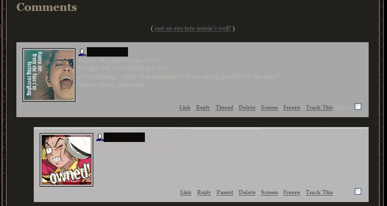
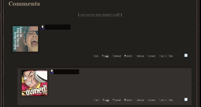
6. This might be my biggest problem: my comments. Here is how it looks now, compared to how I'm trying to make it. As you can probably tell, the text is almost invisible! I tried the code on inabear's request, but it wouldn't work! Please, help me =___=;;
I think that might be it.. if there is anything that's wrong with my code, please point it out! Much thanks in advance!