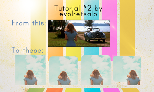
Icon tutorial #2
Program: Photoshop CS4 Extended
Difficulty: Easy - Medium
Steps: 10/15
Translatable: Most likely.
The selective color layer is not really important, I am sure it can be replaced with fill layers and such.
Psd: Yes
Its been awhile since the last tutorial, eh? :)
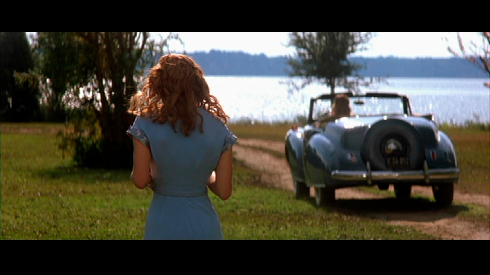
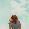
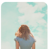
For this tutorial we are going to be working with this screencap from The Notebook: here
Buckle your seat belts, this is going to be a long ride! Ready? Lets go!
*Sorry about the low quality screenshots, I forgot to save them as .png.
Part I (adding a background)
1) Use this as your background by ohfreckle

2) Crop Rachel McAdams out from the cap. I crop at 100X70, not necessary to resize it.
But I like to see the rough composition of my icon.

3) Drag her onto the background and ctrl+F shrink her. This is to create more negative space.
4) Select the layer with Rachel McAdams. Erase all the background around her with an eraser, use different sizes for different parts. Zoom in real close for the best results.
I used a 1px eraser for the spaces between her hair. There are many methods to go about removing backgrounds and I find that this is the most direct method.
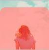
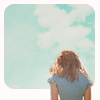
5) Duplicate her and set it to screen. To brighten up the image. Sharpen once or twice depending on your image. For this, I sharpened once and smart sharpen once.

6) Add a curves layer with these settings:
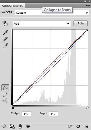
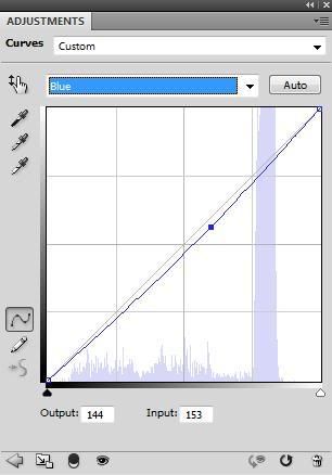
This removes the excess blue and gives her a little more red in the hair and skin.
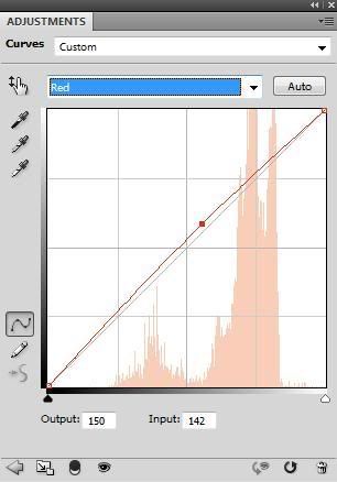
7) Add a selective Color layer.
Reds
Magenta: -2
Yellow:-7
Blues
cyan:+100
Magenta:+100
I wanted to make her shirt more blue and make a teeny change to her skin color.
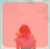
8) Add a Brightness/Contrast layer. Add 10 contrast, its to make her pop a little more.

9) Add a new layer and flood it with #fee3da to soften the icon.
10) Add a new layer (make sure your foreground is white), draw a few strokes of white, wherever you want the light to be.
Then use Gaussian Blur, adjust the radius as you see fit. Set that layer to screen, opacity at 60%. This makes your icon more interesting because of the nice light effect. :)

And you are done for this part! Remember, every image is different so tweek the settings.
Part II (rounded corners)
This part is for rounded corners/the last 3 results.
To avoid rough edges, you should try this method.
11) ctrl+shift+e to flatten the layers, hit q to create a quick mask.
Your selected layer will turn grey when you quick mask it.
12) Select the rounded rectangle tool, set your radius to how circular you want your edges to be.

For the 2nd Result
13) Drag your mouse over your icon, you should see something like this.
14) Hit q again to remove the quick mask and you should see this:
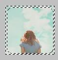
15) Hit delete and voila you have your rounded corners! Ctrl D to deselect (remove the marching ants)

For the 3rd Result
13a) Drag your mouse over your icon, make sure it looks something like this:

>
14a) Hit q again to remove the quick mask and you should see this:
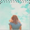
(the screenshot somehow made her redder o.0)
15a) Hit delete and voila you have 2 rounded corners! Ctrl D to deselect (remove the marching ants)
For the 4th Result
Follow steps 13-15 but do it ONLY on the background and move Rachel McAdams to the right.
If you try this tutorial, show me what you get!
Leave a comment if you grab the psd: HERE
Feel free to comment if you have any problems or questions.
Watch or Join if you like what you see!