#067 - HP & Deathly Hallows p.2
Gosh. I am strange. One day I feel like I could do awesome new things in PS, few hours later I'm bored and I feel like "What is that sh*t I made?". With every icon I am experimenting: new colorings, annding new kind of textures, other techniques. But the worst thing is I can't do any icons for myself, I need to have some inspiration, like themes for challenges, or something like that... And It's killing me :/
This batch of icons from Harry Potter & Deathly Hallows p.2 is in between everything I've learned and what I expected to be. Tell me if you like this style, in few days I'll probably reapply at 20inspirations and any critism is welcome, good and bad words.
So, HP movie made for hp20in20 :):)
10 THEMES
animal
black & white
bold
hidden
fake background
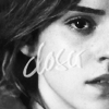
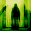
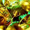
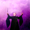
leaving
negative space
pink
profile
upside down
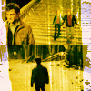
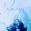

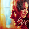
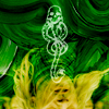
5 CATEGORY - BEGINNING TO END
section one
section two
section three
section four
section five

5 ARTIST'S CHOICE
Artist’s Choice #1
Artist’s Choice #2
Artist’s Choice #3
Artist’s Choice #4
Artist’s Choice #5

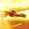
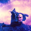
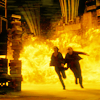
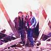
Some alternative icons:
[1-4]
♥ comments are <3<3 ♥
♥ credit is a MUST!! ♥
♥ do not hotlink ♥
♥ do not post my works on other sites without my permission ♥
♥ textless icons are not bases!! ♥