023; ask the maker 2015 tutorial.
This is only the first of this year's Ask the Maker tutorials. The lovely adriftingsea asked me to write this tutorial, so I hope it'll be clear and understandable enough.

from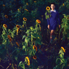
to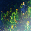
requested by adriftingsea
STEP ONE.
original image
I made this icon for a 20in20 challenge and the theme for this icon was "corner". I didn't want a close crop for this theme so I decided to stick with a picture that allowed me to move Katy into the corner without her taking up too much space on the icon. At the same time, I didn't want any fake background or negative space, so I decided to go with this image.

After placing the image on a 100x100px canvas and moving it around until I liked Katy's corner position, I duplicated the base and set it to screen at 39% which should look something like this:

STEP TWO.
Then I added a black-and-white gradient fill layer with a -51,34° angle set to soft light at 100% and duplicated the layer to give the icon some light and shadow.
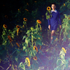
STEP THREE.
I didn't really like the dark blues in the icon, so I added a color fill layer with a light green (#96c58e) and set it to soft light at 100%. Yet, I still wanted her dress to stay blue, so I played around with a selective color layer until my icon looked something like this:
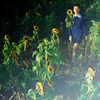
For the selective color layer I used the following settings:
Cyans
Cyan: +100%
Magenta: +26%
Yellow: +43%
Black: +13%
Blues
Cyan: +100%
Magenta: +4%
Yellow: +34%
Black: 0%
Depending on the colours on your image, you might want to play around with the settings or use some other adjustment layers.
STEP FOUR.
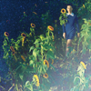
For the next step, I basically just added this texture by daynawashere and set it to lighten at 100%. Then I duplicated the texture and set it to screen and changed the opacity to 34% opacity.
STEP FIVE.
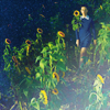
Afterwards, I wanted to change the lighting slightly and added a levels layer with these settings. I also wanted to bring out the greens of the grass more, so I added another selective color layer with the following settings:
Yellows
Cyan: +21%
Magenta: -16%
Yellow: +100%
Black: 0%
Greens
Cyan: +19%
Magenta: -9%
Yellow: +25%
Black: +26%
STEP SIX.
I added another texture to make the top left corner darker. I used this texture by innocent_lexys and set it to soft light at 50%. I'm also pretty sure I rotated it about 90° clock-wise and then erased the light part of the texture to only leave the dark bit.
To make this set a lot easier, you can also just create a new layer, set it to soft light at whatever opacity you need and then paint the parts you want to darken with a black soft brush.
Then I added another levels layer with these settings and then copied all the layers and placed the merged one on top, sharpened it and set the opacity to 14%.
AND WE'RE DONE.

I hope you found this tutorial helpful and understandable. If you have any questions or whatsoever, please let me know.
If you want to request a tutorial or a guide or just ask some questions, you can still do so at my thread. I'd be more than happy to answer them for you.

ask the naker 2015 - my thread

from

to

requested by adriftingsea
STEP ONE.
original image
I made this icon for a 20in20 challenge and the theme for this icon was "corner". I didn't want a close crop for this theme so I decided to stick with a picture that allowed me to move Katy into the corner without her taking up too much space on the icon. At the same time, I didn't want any fake background or negative space, so I decided to go with this image.

After placing the image on a 100x100px canvas and moving it around until I liked Katy's corner position, I duplicated the base and set it to screen at 39% which should look something like this:

STEP TWO.
Then I added a black-and-white gradient fill layer with a -51,34° angle set to soft light at 100% and duplicated the layer to give the icon some light and shadow.

STEP THREE.
I didn't really like the dark blues in the icon, so I added a color fill layer with a light green (#96c58e) and set it to soft light at 100%. Yet, I still wanted her dress to stay blue, so I played around with a selective color layer until my icon looked something like this:

For the selective color layer I used the following settings:
Cyans
Cyan: +100%
Magenta: +26%
Yellow: +43%
Black: +13%
Blues
Cyan: +100%
Magenta: +4%
Yellow: +34%
Black: 0%
Depending on the colours on your image, you might want to play around with the settings or use some other adjustment layers.
STEP FOUR.
For the next step, I basically just added this texture by daynawashere and set it to lighten at 100%. Then I duplicated the texture and set it to screen and changed the opacity to 34% opacity.

STEP FIVE.
Afterwards, I wanted to change the lighting slightly and added a levels layer with these settings. I also wanted to bring out the greens of the grass more, so I added another selective color layer with the following settings:
Yellows
Cyan: +21%
Magenta: -16%
Yellow: +100%
Black: 0%
Greens
Cyan: +19%
Magenta: -9%
Yellow: +25%
Black: +26%

STEP SIX.
I added another texture to make the top left corner darker. I used this texture by innocent_lexys and set it to soft light at 50%. I'm also pretty sure I rotated it about 90° clock-wise and then erased the light part of the texture to only leave the dark bit.
To make this set a lot easier, you can also just create a new layer, set it to soft light at whatever opacity you need and then paint the parts you want to darken with a black soft brush.
Then I added another levels layer with these settings and then copied all the layers and placed the merged one on top, sharpened it and set the opacity to 14%.
AND WE'RE DONE.

I hope you found this tutorial helpful and understandable. If you have any questions or whatsoever, please let me know.
If you want to request a tutorial or a guide or just ask some questions, you can still do so at my thread. I'd be more than happy to answer them for you.

ask the naker 2015 - my thread