2009 A Year in Wallpapers
It's getting that time of year to reflect on the past year. Here are some of the walls that I made this year where I feel like I made leaps forward in my Wallpaper making skills. This year I learned to solidify and standarize my signature look. Prior to this year sometimes my photos didn't quite work, I figured out what adjustments needed to be made in order to consistently achieve my "illustrated" style.
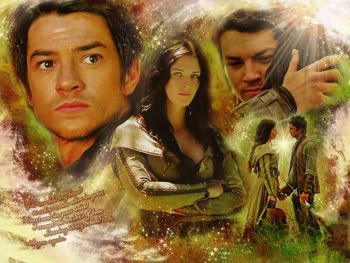
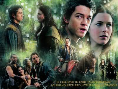
This past year with my newly discovered love of LEGEND OF THE SEEKER I had to try my hands at making my artwork less modern and more fantasy looking. The result was that I experimented more w/ my brushes, playing w/ gradients, and experimented utilizing light as a means of adding drama to my walls. The following 3 wallpapers were my favorites for showing my advancement in skills over the course of the year.
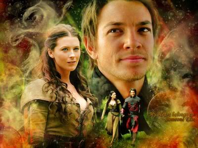
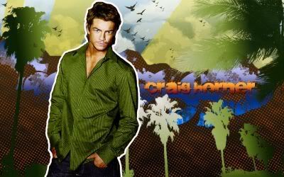
This piece utilized a mixture of vector brushwork and gradients. It's probably the best done modern piece that I've done to date.
The following 2 walls have hidden elements in them that made them fun to create. The first wall - look closely around the text in the lower left hand corner, what do you see? The Richard/Cara piece has the message that Richard uncovered in the top right hand corner. The Richard/Cara piece also has one of the more complex compositions that I've done on a piece w/ how I layered the photos. I really like it because I used limited brushwork around the photos themselves so that you can really see the blending.
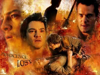
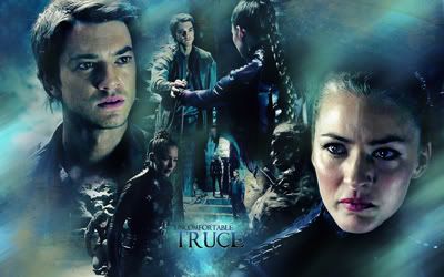
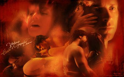
I made a bunch of posters this past year but this one is my favorite.The images that I chose were powerful and the composition is easy on the eyes - the entire piece has a natural flow to it. It's also 100% in the warm color spectrum w/o my having applied a unifying color over the entire piece.
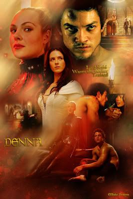
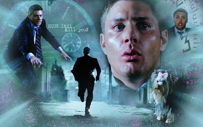
With this wall I started really experimenting on framing my pieces in a way to draw people's eyes into the actual photos. After making a ton of LEGEND walls where I focused so heavily on brushwork, I've spent the last 1/2 easing up on the brushes and focusing more on revealing my blending skills. Overall I love the composition for both of the SPN pieces below and how the brushes unify the images together rather than over power the pieces.
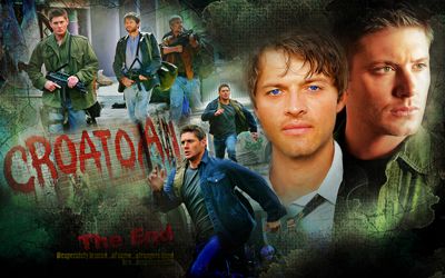
*Sigh*I love this wallpaper. Added light elements to enhance the light that was already there thanks to the 2 stained glass windows. Careful attention was put to my blending and framing the piece to allow the eyes to only focus on the most important part of the wall.
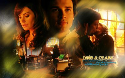
These 3 pieces again showcase blending over brushwork - particularly in the second Ollie/Clark piece - I think that I only used 3 layers of brushes for that wall total. I've spent a lot of time w/ my recent Smallville art concentrating on creative blending - seeing what limits I can push my art for composition of images that include merging images closer together (example - Clark/Lois's heads top left hand corner of the above wall.)
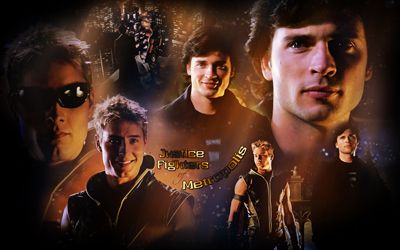
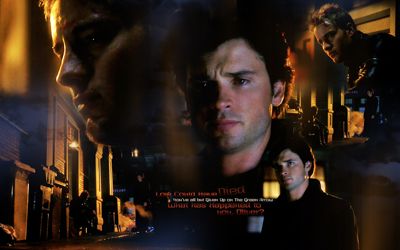
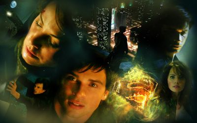
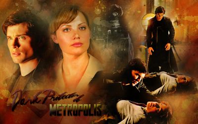
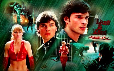
Those in which all all elements come together - these 3 pieces are the culmination of my year's progress in art making. METALLO Wall #1 goes down as my favorite Clois wall. The blending is near perfect and the brushwork is gorgeous on it - it came out as I always strive for - perfect illustrated backing to the images that harmonize the entire piece. PANDORA Hot Clois wall 2 - was the most difficult wall that I've done to date for blending. I spent literally hours working getting those photos all lined up properly so that they'd provide a unified look. I also applied more unique filters to it which makes it stand out from my previous walls. COMBAT wall - this one employs much of the light brushwork that I used in many of my LEGEND pieces, yet the brushes aren't applied quite as heavy so that you can appreciate the blending.
Finally this piece is my reminder that I do know how to manip images. Lois's body came from a model that I found online - head is from a BRIDE promo photo. Her face was darker than the body I employed using the lighting feature in PS to unify the 2 pieces. Her face is the right size, I matched it w/ the model's original size - it just looks slightly small because she's looking down.
Clark, believe it or not is also a manip. I didn't have a full body image of Tom from the Met U Superhero event that I liked, so the top image ended just above his knees. I had to find another image where his legs were facing in the right direction. The photo was LQ and on it's own would've looked horrible for artwork, but since I just wanted his legs they were fine to use. I added them to his top portion, blended, color unified and voila Clark is full sized. If you pay attention enough, his feet do seem to be slightly off in their direction - and that is why. Oh well - you use what you have :)

This past year with my newly discovered love of LEGEND OF THE SEEKER I had to try my hands at making my artwork less modern and more fantasy looking. The result was that I experimented more w/ my brushes, playing w/ gradients, and experimented utilizing light as a means of adding drama to my walls. The following 3 wallpapers were my favorites for showing my advancement in skills over the course of the year.


This piece utilized a mixture of vector brushwork and gradients. It's probably the best done modern piece that I've done to date.

The following 2 walls have hidden elements in them that made them fun to create. The first wall - look closely around the text in the lower left hand corner, what do you see? The Richard/Cara piece has the message that Richard uncovered in the top right hand corner. The Richard/Cara piece also has one of the more complex compositions that I've done on a piece w/ how I layered the photos. I really like it because I used limited brushwork around the photos themselves so that you can really see the blending.


I made a bunch of posters this past year but this one is my favorite.The images that I chose were powerful and the composition is easy on the eyes - the entire piece has a natural flow to it. It's also 100% in the warm color spectrum w/o my having applied a unifying color over the entire piece.

With this wall I started really experimenting on framing my pieces in a way to draw people's eyes into the actual photos. After making a ton of LEGEND walls where I focused so heavily on brushwork, I've spent the last 1/2 easing up on the brushes and focusing more on revealing my blending skills. Overall I love the composition for both of the SPN pieces below and how the brushes unify the images together rather than over power the pieces.


*Sigh*I love this wallpaper. Added light elements to enhance the light that was already there thanks to the 2 stained glass windows. Careful attention was put to my blending and framing the piece to allow the eyes to only focus on the most important part of the wall.

These 3 pieces again showcase blending over brushwork - particularly in the second Ollie/Clark piece - I think that I only used 3 layers of brushes for that wall total. I've spent a lot of time w/ my recent Smallville art concentrating on creative blending - seeing what limits I can push my art for composition of images that include merging images closer together (example - Clark/Lois's heads top left hand corner of the above wall.)


Those in which all all elements come together - these 3 pieces are the culmination of my year's progress in art making. METALLO Wall #1 goes down as my favorite Clois wall. The blending is near perfect and the brushwork is gorgeous on it - it came out as I always strive for - perfect illustrated backing to the images that harmonize the entire piece. PANDORA Hot Clois wall 2 - was the most difficult wall that I've done to date for blending. I spent literally hours working getting those photos all lined up properly so that they'd provide a unified look. I also applied more unique filters to it which makes it stand out from my previous walls. COMBAT wall - this one employs much of the light brushwork that I used in many of my LEGEND pieces, yet the brushes aren't applied quite as heavy so that you can appreciate the blending.


Finally this piece is my reminder that I do know how to manip images. Lois's body came from a model that I found online - head is from a BRIDE promo photo. Her face was darker than the body I employed using the lighting feature in PS to unify the 2 pieces. Her face is the right size, I matched it w/ the model's original size - it just looks slightly small because she's looking down.
Clark, believe it or not is also a manip. I didn't have a full body image of Tom from the Met U Superhero event that I liked, so the top image ended just above his knees. I had to find another image where his legs were facing in the right direction. The photo was LQ and on it's own would've looked horrible for artwork, but since I just wanted his legs they were fine to use. I added them to his top portion, blended, color unified and voila Clark is full sized. If you pay attention enough, his feet do seem to be slightly off in their direction - and that is why. Oh well - you use what you have :)
