Cycle 03 - Challenge 03 - Results
Eliminated:
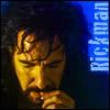
- sra33 [10 votes]
Please stick around for the special challenge and for voting! ♥
---
People's choice:
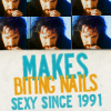
- already_used [6 votes]
---
Mod's Choice
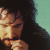
- semi_subtle [Great crop, colouring and the tiny text placement is perfect!]
1
2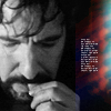
3
4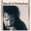
5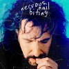
6
7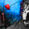
8
9
10
11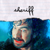
12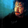
Votes:
[N = Negative votes & P = Positive votes]
01] - sra33 - N = 10/P = 0
[x] "the yellow is too overpowering, it doesn't look like a natural skin colour & the text looks stuffed into the corner."
[x] "The color is way to bright (even though I like bright colors). And the face color doesn't compliment the image."
[x] "the colors are overbearing and the font choice feels obtrusive and doesn't fit with the icon."
[x] "The color is far too saturated... and... he's yellow! It's an interesting treatment of the subject, but the cropping and text need to be daring as well, to support the coloring... and they are not up to snuff. The cropping is boring, and the text is oddly placed. If you can't get your text to work horizontally, then your cropping is not working. :/"
[x] "the coloring is too yellow."
[x] "the icon looks too yellow and dark, but it does have a good crop"
[x] "The icon is too rough and dark. It's too sharp and his face looks an unhealthy shade of yellow. The text could be placed better."
[x] "Alan's skin is too yellow and the text at this size looks pixely."
[x] "The icon is too dark and the face is way too orange/yellow. The crop is good though."
[x] "the coloring is not complimentary for the subject"
02] - spikesbint - N = 1/P = 1
[x] "The crop is nice but the light texture and tiny text don't fit the icon well and there could be a little more contrast to Alan's face."
[x] "This is a great interpretation of the pic and I love how you pulled in bw/color/tinytext/texures great work!"
03] - semi_subtle - N = 0/P = 2
[x] "The cropping is nice. Even though the facial color is a bit yellow it's not too distracting because it goes well with the green background. The tiny text off to the right also looks nice."
[x] "The whole icon is composed well, Alan looks very real, and the subtle brush is a very nice touch."
04] - orlando_girl - N = 1/P = 0
[x] "his face is elongated, the ratio is off."
05] - crazybanana - N = 0/P = 2
[x] "love the text and its placement... excellent execution overall."
[x] "The cropping is very well and text + font fit the icon perfectly."
06] - already_used - N = 0/P = 6
[x] "very original, very funny and great use of font/text"
[x] "I LOVE LOVE LOVE the repeated image... and the text is just perfect. Great way to work the colors."
[x] "amusing text and creative composition"
[x] "Fantastic use of multiple images. Great font, text placement, and text choice! I love the colours and the overall composition is great."
[x] "Really creative. I love the text, font, layout and colouring. And it amuses me :D."
[x] Positive [No comment.]
07] - theblackeyeddog - N = 6/P = 0
[x] "the black in the picture looks heavily washed out and makes it look too crisp."
[x] "it's not very clear what you were going for with this icon, there's just so much going on. the brightness of the textures clash with the black and white image."
[x] "sometimes this effect can work well, colored with greyscale, but it just makes the icon look uneven, nice composition otherwise"
[x] "Too much use of textures, what distracts from the actual picture. And Alan's face looks a little over-sharpened."
[x] "Cropping makes alan's head float eerily, image over-sharpened."
[x] "there seems to be too much going on in the icon"
08] - so_severus - N = 0/P = 0
09] - angryteabag - N = 6/P = 0
[x] "Too dark and out of focus although the cropping is good."
[x] "The icon is far too dark, with next to no contrast. Upping the contrast and sharpening just his face a bit would help him to stand out a lot more than he does. The treatment of the icon makes it look unfinished."
[x] "is just too dark and looks like little has been done to it, but the crop is good"
[x] "This icon is too dark and blurry. The sheriff blends in with the background, rather than popping out."
[x] "Image too dark, hard to see."
[x] "not enough contrast"
10] - whiteroseofdark - N = 1/P = 0
[x] "Hardest choice - The colouring on this icon is lovely as are the other effects used, but either colouring or contrast has made Alan's face pixely in places on his cheek - it's a little too bright/much. Also, though the textures are nice, I feel they suit this particular picture less well than effects used in other icons."
11] - lovesnape - N = 6/P = 0
[x] "too much red, it looks like the sherrif is wearing lipstick and the font looks too crisp"
[x] "Did you use a swirl texture on his face? It seems to distort the image and doesn't look very attractive."
[x] "the saturation is farrrr too high here; it looks like his lip is bleeding and his face appears splotchy. The reasoning behind the notebook paper texture is unclear too, and it doesn't really fit with the icon."
[x] "The red of his lips is too glaring and takes alway from the general aesthetics of the otherwise really nice icon."
[x] "Use of texture and font is okay but the use of selective color layers is over-used. Alan's lips are too red for a man."
[x] "The bright red lips are very distracting, the overall color scheme is off."
12] - spiffydaze - N = 2/P = 0
[x] "The coloring is nice, but maybe a little bit too much selective coloring. The cropping is bland, and all the negative space makes the icon look unfinished."
[x] "The selective colouring doesn't work so well with this picture, because his lips seem unaturally red and his face is too yellow. The overall colouring is too harsh and doesn't work well in the icon."
Participants Status
The following people are still in the contest. If you're name is not in this list, it means you have been eliminated/disqualified.
already_used
angryteabag
cdg
crazybanana726
girlboheme
jessickah
lovesnape
lydkami
orlandogirl
phistolemon_
semi_subtle
so_severus
spiffydaze
spikesbint
theblackeyeddog
whiteroseofdark
xenylamine
Thank you to all who participated in the challenge and voting.
A new challenge will be put up soon.

- sra33 [10 votes]
Please stick around for the special challenge and for voting! ♥
---
People's choice:

- already_used [6 votes]
---
Mod's Choice

- semi_subtle [Great crop, colouring and the tiny text placement is perfect!]
1

2

3

4

5

6

7

8

9

10

11

12

Votes:
[N = Negative votes & P = Positive votes]
01] - sra33 - N = 10/P = 0
[x] "the yellow is too overpowering, it doesn't look like a natural skin colour & the text looks stuffed into the corner."
[x] "The color is way to bright (even though I like bright colors). And the face color doesn't compliment the image."
[x] "the colors are overbearing and the font choice feels obtrusive and doesn't fit with the icon."
[x] "The color is far too saturated... and... he's yellow! It's an interesting treatment of the subject, but the cropping and text need to be daring as well, to support the coloring... and they are not up to snuff. The cropping is boring, and the text is oddly placed. If you can't get your text to work horizontally, then your cropping is not working. :/"
[x] "the coloring is too yellow."
[x] "the icon looks too yellow and dark, but it does have a good crop"
[x] "The icon is too rough and dark. It's too sharp and his face looks an unhealthy shade of yellow. The text could be placed better."
[x] "Alan's skin is too yellow and the text at this size looks pixely."
[x] "The icon is too dark and the face is way too orange/yellow. The crop is good though."
[x] "the coloring is not complimentary for the subject"
02] - spikesbint - N = 1/P = 1
[x] "The crop is nice but the light texture and tiny text don't fit the icon well and there could be a little more contrast to Alan's face."
[x] "This is a great interpretation of the pic and I love how you pulled in bw/color/tinytext/texures great work!"
03] - semi_subtle - N = 0/P = 2
[x] "The cropping is nice. Even though the facial color is a bit yellow it's not too distracting because it goes well with the green background. The tiny text off to the right also looks nice."
[x] "The whole icon is composed well, Alan looks very real, and the subtle brush is a very nice touch."
04] - orlando_girl - N = 1/P = 0
[x] "his face is elongated, the ratio is off."
05] - crazybanana - N = 0/P = 2
[x] "love the text and its placement... excellent execution overall."
[x] "The cropping is very well and text + font fit the icon perfectly."
06] - already_used - N = 0/P = 6
[x] "very original, very funny and great use of font/text"
[x] "I LOVE LOVE LOVE the repeated image... and the text is just perfect. Great way to work the colors."
[x] "amusing text and creative composition"
[x] "Fantastic use of multiple images. Great font, text placement, and text choice! I love the colours and the overall composition is great."
[x] "Really creative. I love the text, font, layout and colouring. And it amuses me :D."
[x] Positive [No comment.]
07] - theblackeyeddog - N = 6/P = 0
[x] "the black in the picture looks heavily washed out and makes it look too crisp."
[x] "it's not very clear what you were going for with this icon, there's just so much going on. the brightness of the textures clash with the black and white image."
[x] "sometimes this effect can work well, colored with greyscale, but it just makes the icon look uneven, nice composition otherwise"
[x] "Too much use of textures, what distracts from the actual picture. And Alan's face looks a little over-sharpened."
[x] "Cropping makes alan's head float eerily, image over-sharpened."
[x] "there seems to be too much going on in the icon"
08] - so_severus - N = 0/P = 0
09] - angryteabag - N = 6/P = 0
[x] "Too dark and out of focus although the cropping is good."
[x] "The icon is far too dark, with next to no contrast. Upping the contrast and sharpening just his face a bit would help him to stand out a lot more than he does. The treatment of the icon makes it look unfinished."
[x] "is just too dark and looks like little has been done to it, but the crop is good"
[x] "This icon is too dark and blurry. The sheriff blends in with the background, rather than popping out."
[x] "Image too dark, hard to see."
[x] "not enough contrast"
10] - whiteroseofdark - N = 1/P = 0
[x] "Hardest choice - The colouring on this icon is lovely as are the other effects used, but either colouring or contrast has made Alan's face pixely in places on his cheek - it's a little too bright/much. Also, though the textures are nice, I feel they suit this particular picture less well than effects used in other icons."
11] - lovesnape - N = 6/P = 0
[x] "too much red, it looks like the sherrif is wearing lipstick and the font looks too crisp"
[x] "Did you use a swirl texture on his face? It seems to distort the image and doesn't look very attractive."
[x] "the saturation is farrrr too high here; it looks like his lip is bleeding and his face appears splotchy. The reasoning behind the notebook paper texture is unclear too, and it doesn't really fit with the icon."
[x] "The red of his lips is too glaring and takes alway from the general aesthetics of the otherwise really nice icon."
[x] "Use of texture and font is okay but the use of selective color layers is over-used. Alan's lips are too red for a man."
[x] "The bright red lips are very distracting, the overall color scheme is off."
12] - spiffydaze - N = 2/P = 0
[x] "The coloring is nice, but maybe a little bit too much selective coloring. The cropping is bland, and all the negative space makes the icon look unfinished."
[x] "The selective colouring doesn't work so well with this picture, because his lips seem unaturally red and his face is too yellow. The overall colouring is too harsh and doesn't work well in the icon."
Participants Status
The following people are still in the contest. If you're name is not in this list, it means you have been eliminated/disqualified.
already_used
angryteabag
cdg
crazybanana726
girlboheme
jessickah
lovesnape
lydkami
orlandogirl
phistolemon_
semi_subtle
so_severus
spiffydaze
spikesbint
theblackeyeddog
whiteroseofdark
xenylamine
Thank you to all who participated in the challenge and voting.
A new challenge will be put up soon.