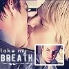
Tutorial #1 - Color Balance and Picture-in-Picture (take my breath away)
andtheafterglow and algophobia asked for tutorials. ♥ As I've never done this before, I'm totally starting with the easier one. :P
For PSP7, but should be translatable to PS easily enough.
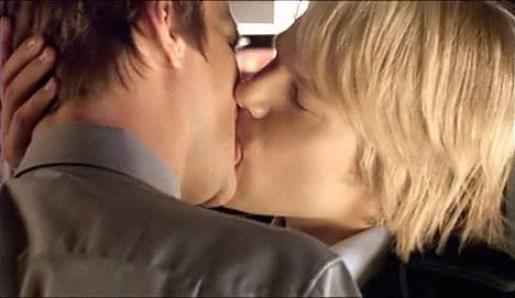
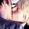
I started with this picture. Good quality caps make all the difference. If a cap is too dark, that can be fixed. But if you can barely make out what you're looking at through all the white noise, resist like Gale's finger and find another one to work with. There are ways you can improve it, but in my experience, it's not worth the effort.
I crop it, then resize to 100 x 100. Image > Resize > Pixel Size 100 x 100. I knew ahead of time I was going to add the picture-in-picture of Brian so I cropped in a way that left extra room at the bottom right corner.

Resizing an image always makes it blurry, so now to Sharpen. Effects > Sharpen > Sharpen. Behold my sharpen whoreness as I do this twice. Justin's hair. ♥
Contrast time. Colors > Adjust > Brightness/Contrast. This step will depend a lot on what cap you're using and the effect you want, but for this one, we're setting Brightness/0 and Contrast/+10. It may not seem to make a huge difference, but it does in the long run.

Getting closer, but it's way too dark for what I want.
Duplicate your layer twice. Layers > Duplicate. Set the first to Screen, the next to Soft Light, both at 100% opacity.

Copy Merged and Paste As New Image.
Now to give Brian and Justin their flawless skin. AKA, the step Brian sits around doing to all the photos of himself when Justin thinks he's slaving away at the computer on a campaign.
Select the Retouch Brush (the little pointy finger on the toolbar) and the Options will come up in a box. Choose Soften with Shape/Round, Size/4, Opacity/100. Carefully drag the brush over their cheeks and neck. Select a smaller size to get closer in some areas. Avoid getting too close to the hairline/eyes or they will end up looking like a scary Dali painting. Also leave larger defining lines alone, such as Justin's nose and Brian's adorkable double chin.
Sidenote: You can do this step earlier, before the duplicating steps so you don't have to Copy/Paste a new selection, but I usually wait until I have the icon lightened so I can see what I'm doing. Otherwise it's like trying to do detail work in a dark room with sunglasses on.
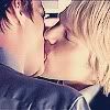
Now we have this. Pretty, pretty boys. But they're too gold for me.
So off to Color > Adjust > Color Balance we go. Set the levels to -69/-27/81. Make sure Midtones and Preserve Luminosity are checked. (You can also use a layer or two of purple set at Overlay to get this effect, but Color Balance is much easier for this icon.)
There are the purples I'm wanting! Brian's shirt. ♥
Only I'm not liking how cold it feels, despite the seering kiss. To warm it up, I add the ole trusty blue exclusion layer. New Layer and fill with #0D1935. Set the layer to Exclusion with 100% opacity.
Okay, the base is done! Now for stunned!Brian.
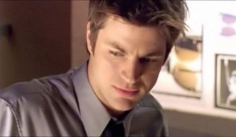
Started with this picture. See how stunned he is? The power of Justin's lips strikes again.
I crop him how I like, this time with a more letterbox shape instead of a perfect square. It took me a couple dry runs to see what size I wanted and finally got warm fuzzies with Resize him Image > Resize > Percentage of Original > 15%. Sharpen only once. Twice, in this case, makes the edges too visible and Brian an ugly boy.
Same steps for lightening the overall color as we did with the main base. Contrast at +10, Duplicate your layer twice. Set one to Screen, the other to Soft Light, both at 100% opacity. Copy Merged and Paste As New Image. Retouch Brush set at 1 to smooth out Brian's cheek and forehead just a little. I didn't worry too much about this, as he's so tiny and I wanted there to be some amount of texture. I wanted him to match the base, so again go to Color Balance with levels at -69/-27/81. Finally, Exclusion layer as above.

to
Copy Merged
Now for his white border.
New Image. My default is usually at 100 x 100, so that's what I use for ease, though it could be any size/shape, as long as it's at least a few pixels larger than stunned!Brian. Background color > White.
Right clicking, select Paste As New Selection. Center it then click your mouse; the picture will now be highlighted. Go to Selections > Modify > Expand. Choose 2 pixels. The highlighted area moves outward and gives you the border.

Time to Copy/Paste him to the suck face base as a New Layer and with the Mover, position him into the bottom right corner.
Now for text. Text can be a bitch. I had it easy on this one, as stunned!Brian's face said it all.
New Layer: take my - Azrael 8pt/150 kerning
New Layer: breath - 4990810 9pt/100 kerning
New Layer: away - Carpenter 16pt/0 kerning
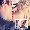
And it's done!
Let me know if there are any questions or if I can be clearer anywhere. :D
For PSP7, but should be translatable to PS easily enough.
I started with this picture. Good quality caps make all the difference. If a cap is too dark, that can be fixed. But if you can barely make out what you're looking at through all the white noise, resist like Gale's finger and find another one to work with. There are ways you can improve it, but in my experience, it's not worth the effort.
I crop it, then resize to 100 x 100. Image > Resize > Pixel Size 100 x 100. I knew ahead of time I was going to add the picture-in-picture of Brian so I cropped in a way that left extra room at the bottom right corner.
Resizing an image always makes it blurry, so now to Sharpen. Effects > Sharpen > Sharpen. Behold my sharpen whoreness as I do this twice. Justin's hair. ♥
Contrast time. Colors > Adjust > Brightness/Contrast. This step will depend a lot on what cap you're using and the effect you want, but for this one, we're setting Brightness/0 and Contrast/+10. It may not seem to make a huge difference, but it does in the long run.
Getting closer, but it's way too dark for what I want.
Duplicate your layer twice. Layers > Duplicate. Set the first to Screen, the next to Soft Light, both at 100% opacity.
Copy Merged and Paste As New Image.
Now to give Brian and Justin their flawless skin. AKA, the step Brian sits around doing to all the photos of himself when Justin thinks he's slaving away at the computer on a campaign.
Select the Retouch Brush (the little pointy finger on the toolbar) and the Options will come up in a box. Choose Soften with Shape/Round, Size/4, Opacity/100. Carefully drag the brush over their cheeks and neck. Select a smaller size to get closer in some areas. Avoid getting too close to the hairline/eyes or they will end up looking like a scary Dali painting. Also leave larger defining lines alone, such as Justin's nose and Brian's adorkable double chin.
Sidenote: You can do this step earlier, before the duplicating steps so you don't have to Copy/Paste a new selection, but I usually wait until I have the icon lightened so I can see what I'm doing. Otherwise it's like trying to do detail work in a dark room with sunglasses on.
Now we have this. Pretty, pretty boys. But they're too gold for me.
So off to Color > Adjust > Color Balance we go. Set the levels to -69/-27/81. Make sure Midtones and Preserve Luminosity are checked. (You can also use a layer or two of purple set at Overlay to get this effect, but Color Balance is much easier for this icon.)
There are the purples I'm wanting! Brian's shirt. ♥
Only I'm not liking how cold it feels, despite the seering kiss. To warm it up, I add the ole trusty blue exclusion layer. New Layer and fill with #0D1935. Set the layer to Exclusion with 100% opacity.
Okay, the base is done! Now for stunned!Brian.
Started with this picture. See how stunned he is? The power of Justin's lips strikes again.
I crop him how I like, this time with a more letterbox shape instead of a perfect square. It took me a couple dry runs to see what size I wanted and finally got warm fuzzies with Resize him Image > Resize > Percentage of Original > 15%. Sharpen only once. Twice, in this case, makes the edges too visible and Brian an ugly boy.
Same steps for lightening the overall color as we did with the main base. Contrast at +10, Duplicate your layer twice. Set one to Screen, the other to Soft Light, both at 100% opacity. Copy Merged and Paste As New Image. Retouch Brush set at 1 to smooth out Brian's cheek and forehead just a little. I didn't worry too much about this, as he's so tiny and I wanted there to be some amount of texture. I wanted him to match the base, so again go to Color Balance with levels at -69/-27/81. Finally, Exclusion layer as above.
to
Copy Merged
Now for his white border.
New Image. My default is usually at 100 x 100, so that's what I use for ease, though it could be any size/shape, as long as it's at least a few pixels larger than stunned!Brian. Background color > White.
Right clicking, select Paste As New Selection. Center it then click your mouse; the picture will now be highlighted. Go to Selections > Modify > Expand. Choose 2 pixels. The highlighted area moves outward and gives you the border.
Time to Copy/Paste him to the suck face base as a New Layer and with the Mover, position him into the bottom right corner.
Now for text. Text can be a bitch. I had it easy on this one, as stunned!Brian's face said it all.
New Layer: take my - Azrael 8pt/150 kerning
New Layer: breath - 4990810 9pt/100 kerning
New Layer: away - Carpenter 16pt/0 kerning
And it's done!
Let me know if there are any questions or if I can be clearer anywhere. :D