The deadlines are a-comin' just around the bend....But wait, is that a reprieve I spy?
** Deadline for submissions to slayerstillness Challenge 54 "Roy G Biv" is today Friday Oct 9th midnight at your timezone. For this
challenge we may submit up to seven icons rather than the usual five, one for each color in the rainbow. There are 31 entries so far and I love
the theme so I'm expecting a real humdinger of a contest.
** Breaking news: The deadline for the banner contest for Round 19 of seasonal_spuffy has been EXTENDED one week to Sunday Oct
18th (PST). Which means that anyone who said they wouldn't entering due to lack of time? Here's your chance. It's also a great opportunity to
PROMOTE the upcoming comm so by all means reblog, retumble, tell your friends, whatever it is the kids do nowadays.
A word to the wise: Don't make the mistake I made the last time and submit more than one banner and end up competing against yourself. One of those first time-y novice mistakes.(In my own defense...I'm awful at making decisions I did not yet have the most amazing wonderful erudite Muse-Goddess velvetwhip in my corner at the time. Now I do, and my life is all the better.)
Speaking of last round, I never did post the banners and icons I made for Round 18's competition:

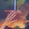
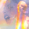
1
Spuffy Hand Banner v.1 - 3 (2015). 750x300
All banners on this post by yours truly. Click the images below to view full-size:
[ALL OF YOUR FLAWS AND ALL OF MY FLAWS THEY LIE THERE HAND IN HAND]


2 - 3
Spuffy Hand Banner (what else could I possibly title it? I think that says it all) is still one of my favorite and, I dare say, best things I've made yet. I was nervous about entering the round because it's difficult for me to express my views on Buffy&Spike. How in the world could I encapsulate my complex feelings for two insanely, deliciously complex characters in a single banner? But this is IT for me in terms of my feelings for the pairing. I was determined to avoid using the flaming handfasting in Chosen because I've seen it used so often in fanart, but I wanted to depict Spuffy hand imagery and I couldn't not use it. There's "iconic" and then there's beyond "iconic". Know what I mean?
For this particular project I got a lot of my inspiration from the music I was listening to at the time. The lyrics in this banner are from "Flaws" performed by Bastille (Writer: Daniel Smith Copyright: Wwkd Ltd.) The backdrop is one or two of my sweetheart's photos of - you guessed it - a New England autumn sunset that's come in handy so many times before and since. In this instance I used it as a backdrop then I layered it over the screencaps a second time, turned in a different direction to "fill the gaps" and create continuity across the image. Then I used Sharpen, Glow and various other filters to make the caps look less photographic and more painterly.
The cap from Listening to Fear was the most difficult to adjust in terms of brightness and contrast because that scene is so damn dark. Layering on the cloudscapes was pretty much a necessity. It ended up being my favorite portion of the banner - the icon I made from it (#8 below) is still one of my all-time favorite icons I've made.
I entered both 1 & 2 to the contest; I have no idea what I was thinking. I also entered my first version of this design which was very bright, over-saturated, had a triangle in the center and was just a hot freakin' mess; I'll be damned if I'm going to repost it here. I have no idea what I was thinking.
~~~~~~~~~~~~~~~~~~~~~~~~~~~


4 - 5
That Sad Earthly Scene v.1-2 (2015) 750x422 & 750x400
Figuring out sizing and proportion was something I was still strugling with at the time.
My second-favorite design. I was intrigued by the resemblance between the Normal Again and Beneath You images. Madness, insanity, depression, the damaged caused by experience and memory, by a life of violence, is another of my favorite themes when thinking about the Buffyverse although part of my interest lies in how Mutant Enemy sometimes gets it all wrong.
Add the handoff of the amulet from Chosen, an image of a shattered mirror by Lauren Elisabeth Photography, and stir. I was really pleased with how the images came together here. The place where their hands come together and the glow from the amulet just happened to fall pretty much in the center of the banner; and the fact that Spike's face seems to be tucked into or leaning against his own body from the later episode was pure serendipity. Lyrics on #5 from "Flaws" and "Take Me to Church" by Hozier. (Writer(s): Andrew Hozier Byrne. Copyright: The Evolving Music Company Limited)
#4 was preferred by the voters in the poll over 5 by a slight margin; I think the voters were right but I really do love both versions for different reasons and go back and forth as to which is "best" - probably six of one, half a dozen of the other. Once again I submitted both versions to the poll. What in the world was I thinking at the time?
~~~~~~~~~~~~~~~~~~~~~~~~~~~

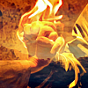
6
The Work I Have to Do (2015), 750x300
I wanted to compare Buffy's sacrifice in The Gift with Spike's in Chosen because they are after all parallel events. This is perfectly obvious and yet somehow doesn't get discussed all that much. Or when it does, it's in terms of a competition: this person's sacrifice was just "suicide" and therefore not really all that heroic compared to that person's sacrifice, blah blah bitty blah. Whatever.
The design turned out to be rather simple - the image of Buffy leaping into the exploding portal is well, a gift to the fan artist because it's such an incredible visual. Layer it with the image of Spike's soul "effulgent" in Chosen, add a Shine filter, balance warm and cool color layers and tah-dah! It just glows. Instead of song lyrics I used dialogue from The Gift and Chosen. Once again, the way that the lines in different fonts and colors intersect with one another ("This the work I have to do" / "I have to do this") was a very happy accident.
~~~~~~~~~~~~~~~~~~~~~~~~~~~~

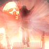
7
How to Save a Life (2015), 532x512
This banner received zero entries in the poll - and it shouldn't have. This was the first banner I made for the round, and I was worried I wouldn't be able to make anything in time (hah); so I adapted the composition of the awards banner I made for oh_cheezit for Round 6 of btvsats20in20, using a different image of Spike. So it wasn't a strict cheat in the sense that yes, I had to go back to my original source images and make the whole thing from scratch; but I was ripping ("riffing"?) off my own work - and I did it better the first time.
Lyrics: "How to Save A Life" performed by The Fray (Writer(s): Joseph King, Isaac Slade Copyright: Aaron Edwards Publishing, Emi April Music Inc.)
~~~~~~~~~~~~~~~~~~~~~~~~~~~~~~
Icons from the banners: I wish #9 had come out a bit better (there are superior icons of that image out there) but I was thrilled with how well #8 worked as an icon.

8 - 11
~~~~~~~~~~~~~~~~~~~~~~~~~~~~~~


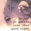

12 - 16
12 - 16 is based off a banner idea I rejected; more The Gift/Chosen parallels. Good idea but the execute of the banner was a mess (to be polite), so I settled for an icon instead. I'd still like to return to the idea for a banner at some point. Dylan Thomas' poem seemed like a natural here. Light texture in #15 by colorfilter.
Check out my Resource post for some of my image sources.
A Vague Disclaimer is No One's Friend:
~ DO NOT RE-POST TO OTHER SITES (INCL. FANPOP) OR LJ COMMUNITIES WITHOUT MY PERMISSION!
~ Take what icons you like for personal use but please credit if used :)
~ No hotlinking!
~ Comments however are appreciated :)
~ All artwork by yours truly except where otherwise indicated.