Destruction, Absolute...(or, I did not mean to hit THAT button) * ETA two edited banners*
bangel_4e put up the voting polls for Round 4 of btvsats20in20 yesterday but if you haven't checked it out and cast your votes: Themes, Category Sets & AC sets.
I have also been remiss in: Not having replied yet to everyone who so kindly came to give feedback for my Normal Again 20in20 set; I will amend that if after the weekend. I really appreciate everyone's comments. And for not mentioning that kwritten was the inspiration for my Normal Again claim because I was working on some images from that episode for some fanfiction posters for her "Blurring the Lines" series (AU Buffy/Tara, Dawn), which I've not rolled out yet but she has given me her blessing to do so. Soon, very soon. Speaking of Kelsey, she is accepting fic prompt requests all this month; give her a shout.
It turned out that doing this ep was another case of life mirroring (not necessarily imitating) art; the icon I've ended up snagging for myself turned out to be a more accurate reflection of where I'm at lately than I'd like to admit. So, if I seem strange lately, don't pick up on irony or obvious humor, or burst into tears if you look at me cross-eyed*** politely ignore me and help yourself to another slice of cake.
Having said that: *deep breath*
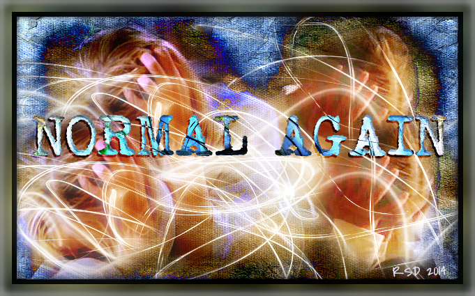
01[Spoiler (click to open)]
Please feel free to offer constructive criticism should you have it of my 20in20set. Am I doing something wrong? What could I improve? Do I think they look better than they actually do? What obvious errors am I making that I'm not aware of? Am I repeating certain things far too often? I'm not speaking so much of the limitations of my tools as things like color, tone, light, composition - the basics. I don't know how to get the incredible clarity that many of y'all achieve and I am not going to get Topaz or any such but I would like to learn how to get there with ipiccy and/or Photoshop Elements (which my sweetie purchased for the computer, yay!) And FYI, I do try to use the thinnest, most elegant and simplest font I can in any situation, but I sometimes sacrificed elegance for legibility; ipiccy's font options are very limited.
This is not about me putting my work down but about saying, yes I've improved but I want to get better. And we all have blind spots in our own mirrors.
Just don't tear into me like a chainsaw,; constructive criticism if you please.
*******************************************
But that's not what the title of this post is about. It's about the fact that I was looking over the upcoming and belated birthdays I've missed on my f'list and somehow managed to delete all of them. Except spikesredqueen, of about a month ago and I think I sent her birthday wishes (maybe?) And I didn't memorized the ones I'd deleted so here's what I do remember: wickedbish, Beta Lord on High *heh*, the_royal_anna, rebcake, dragonydreams, goddesses of this fandom who need no introduction and if they do, you need to fix that oversight; pprfaith (who writes beautiful Buffy/Loki fic and who I found out about via endeni in her usual brilliant way) and....the other people whose names I deleted and can't remember right now. *hangs head* To all my friends celebrating birthdays, Happy Release from the Womb Day!
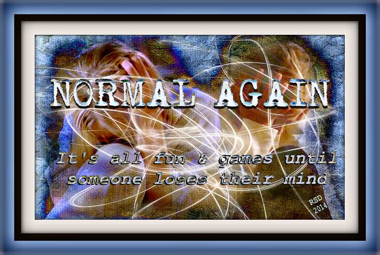
02
No, this has nothing to do with anyone's birthdays. I just had fun.
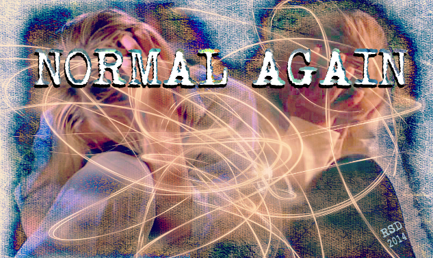
03
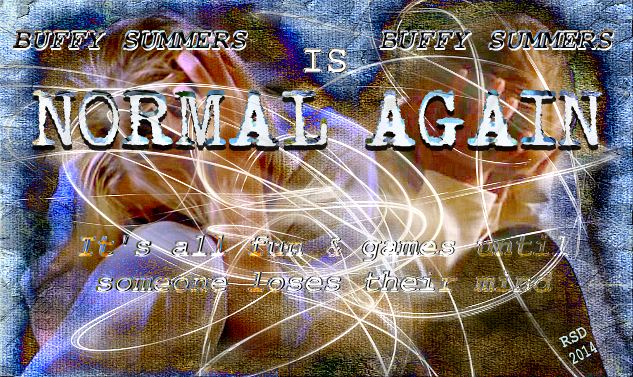
04
***********************
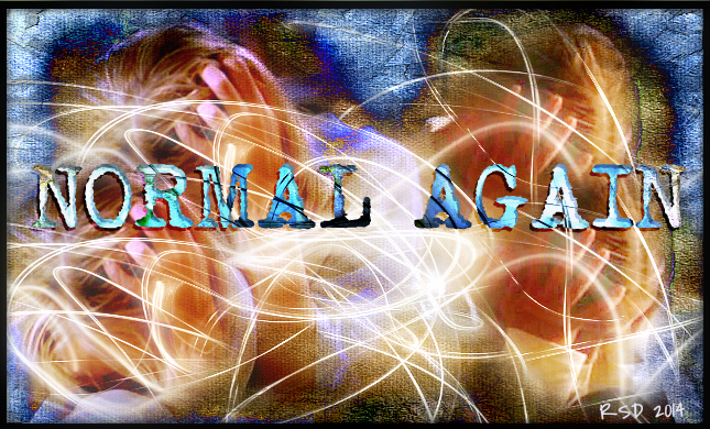
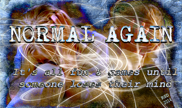
ETA: Number the banners, and also velvetwhip made an excellent point about the frames being unnecessary in the first two banners, which I sort of suspected in the case of #2 at least. For #5 I cropped the outer frame off #1 but left the black inner border and I like it better this way. Oddly enough I didn't save a version before i added the frame in ipiccy and I say oddly because that's become my habit SAVE EVERY STEP. So #2 is actually #6 with a frame tacked on.Because ipiccy isn't PS, you can't go back in and continue to make edits once you "save" and then close a file you're working on.
05
06
Which, granted, is the same as #4 but with diffferent text. Or, #3 is this before the addition of text, the crinkle texture and with a vintage coloring filter added (and I actually like the coloring in #3 better but if you're wondering HOW many variations do I really really need...you haven't seen my alts and extras for Round 4 yet, apparently.) :-P
I have also been remiss in: Not having replied yet to everyone who so kindly came to give feedback for my Normal Again 20in20 set; I will amend that if after the weekend. I really appreciate everyone's comments. And for not mentioning that kwritten was the inspiration for my Normal Again claim because I was working on some images from that episode for some fanfiction posters for her "Blurring the Lines" series (AU Buffy/Tara, Dawn), which I've not rolled out yet but she has given me her blessing to do so. Soon, very soon. Speaking of Kelsey, she is accepting fic prompt requests all this month; give her a shout.
It turned out that doing this ep was another case of life mirroring (not necessarily imitating) art; the icon I've ended up snagging for myself turned out to be a more accurate reflection of where I'm at lately than I'd like to admit. So, if I seem strange lately, don't pick up on irony or obvious humor, or burst into tears if you look at me cross-eyed*** politely ignore me and help yourself to another slice of cake.
Having said that: *deep breath*

01[Spoiler (click to open)]
Please feel free to offer constructive criticism should you have it of my 20in20set. Am I doing something wrong? What could I improve? Do I think they look better than they actually do? What obvious errors am I making that I'm not aware of? Am I repeating certain things far too often? I'm not speaking so much of the limitations of my tools as things like color, tone, light, composition - the basics. I don't know how to get the incredible clarity that many of y'all achieve and I am not going to get Topaz or any such but I would like to learn how to get there with ipiccy and/or Photoshop Elements (which my sweetie purchased for the computer, yay!) And FYI, I do try to use the thinnest, most elegant and simplest font I can in any situation, but I sometimes sacrificed elegance for legibility; ipiccy's font options are very limited.
This is not about me putting my work down but about saying, yes I've improved but I want to get better. And we all have blind spots in our own mirrors.
Just don't tear into me like a chainsaw,; constructive criticism if you please.
*******************************************
But that's not what the title of this post is about. It's about the fact that I was looking over the upcoming and belated birthdays I've missed on my f'list and somehow managed to delete all of them. Except spikesredqueen, of about a month ago and I think I sent her birthday wishes (maybe?) And I didn't memorized the ones I'd deleted so here's what I do remember: wickedbish, Beta Lord on High *heh*, the_royal_anna, rebcake, dragonydreams, goddesses of this fandom who need no introduction and if they do, you need to fix that oversight; pprfaith (who writes beautiful Buffy/Loki fic and who I found out about via endeni in her usual brilliant way) and....the other people whose names I deleted and can't remember right now. *hangs head* To all my friends celebrating birthdays, Happy Release from the Womb Day!

02
No, this has nothing to do with anyone's birthdays. I just had fun.

03

04
***********************
ETA: Number the banners, and also velvetwhip made an excellent point about the frames being unnecessary in the first two banners, which I sort of suspected in the case of #2 at least. For #5 I cropped the outer frame off #1 but left the black inner border and I like it better this way. Oddly enough I didn't save a version before i added the frame in ipiccy and I say oddly because that's become my habit SAVE EVERY STEP. So #2 is actually #6 with a frame tacked on.Because ipiccy isn't PS, you can't go back in and continue to make edits once you "save" and then close a file you're working on.

05

06
Which, granted, is the same as #4 but with diffferent text. Or, #3 is this before the addition of text, the crinkle texture and with a vintage coloring filter added (and I actually like the coloring in #3 better but if you're wondering HOW many variations do I really really need...you haven't seen my alts and extras for Round 4 yet, apparently.) :-P