{tutorial} mytyl - manga colouring
A COLOURING TUTORIAL : MYTYL
As requested by tyltyl. I hope I can do this clearly, if there's any confusion I'll do my best to answer whatever questions people might have. Image heavy behind the cut.
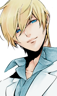
1. You crop and clean the image you're going to be colouring. It was pretty simple for this picture since I had excellent scans. That done you're ready to really start.
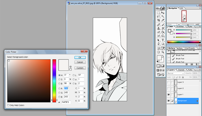
2. This step can be skipped depending on the picture or personal preference. Make a new layer and set it to Linear Burn over the lineart. What I did here was put down a single base colour for the skin and hair then a second base colour for the clothing. With blondes I find a lot of the times I have trouble matching up the skin and the hair so putting down this base layer ensures that whatever colours I choose there will still be a similar base tone to keep it from clashing too much. Same with the clothes. If the picture has a background I use the same idea to establish perspective and depth. This one has no background so we can move on.
Btw the colours I use vary for every manga or character I colour. I have included them just so that people can have an idea how the picture is progressing with each addition but just pick something that you like. For referrence this is the base colour I used for the clothes.
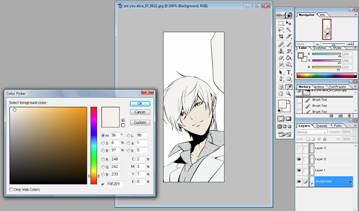
3. Next step is to pick a colour for the skin. Other than whether the character is pale or tan I also try to take into account the mood of the series or the picture itself when picking my colours. For this one I chose a fairly pale skin tone that was more on the yellow side. Make another Linear Burn layer and fill out the skin evenly.
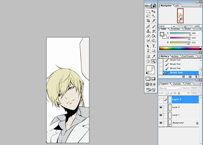
4. Now choose the hair colour and fill out the hair in the same layer as the base skin tone. Try to find something that stands out with the skin. You might have to go through a few colours to find one you like. Also have some idea at this point what colours you'll be using for shading. The yellow here looks kind of green/yellow but in the finished it's a warmer tone. What you layer on top changes the appearance a lot.

5. Make another Linear Burn layer. This is going to be the midtone shading, pick a colour around the same as the base skin, because the layer goes on top even if it's the same colour it'll show darker. I do it this way because mixing colours become easier like that for me.
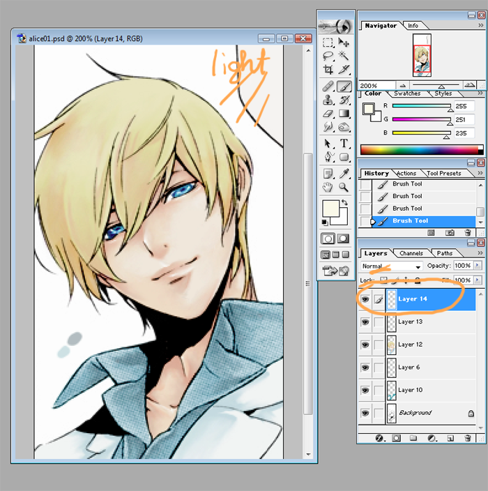
I drew in where the light is generally coming from in this image. Just keep in mind around where the light is. It's not something I follow strictly but it helps to keep the picture uniform. But a lot of it is really just...whatever looks pretty. With a solid brush just block out where you want the biggest shadows to be.
6. Looks pretty gross, right? That's okay. Take the smudge brush to it and smooth out the edges. You can also use it to push some of the colour to blend the skin colour. I zoom in when I do this so that I can make sure everything is smooth but remember to zoom out once in a while so that you can see what it looks like overall.
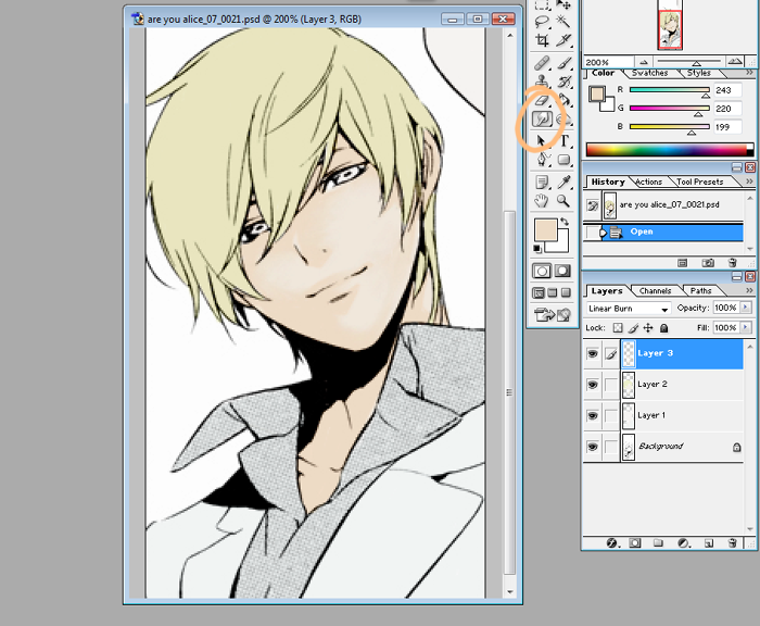
After doing that this is what it should look like.
7. Now pick a slightly darker shade. You'll notice the colours I'm picking are going more towards the pink/red side. On the same layer pick out places where an even darker shadow would be cast. Under the bangs, the folds of the eyes. A lot of times I touch my own face to feel out the contours, where it dips there should be more shadow usually. I also draw a dark edge around places where I want the shadow emphasized.
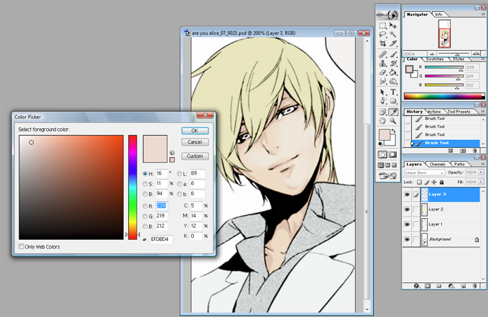
Then like the previous step smooth out these new shadows with the smudge brush again. After doing that it looks like this.
8. Make a new Linear Burn layer! This is the last layer of shading for the skin, I promise! Again the reason I used a new layer here is because it's easier. Rather than mixing a colour I just pick a tint I want to add to the picture. I wanted more pink, so I picked a pink. This is the shadow I use to accentuate the last basically. You'll be colouring in around the same areas but using smaller strokes. Again, smudge to smooth the colour out.
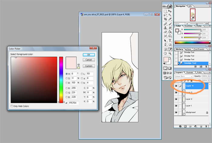
That's what you'll end up with. Rejoice! The skin is done and that's really the most detailed part.
9. ONTO THE HAIR. Make another new Linear Burn layer, you'll notice I started naming the layer at this point. Do this whenever you need to, it's just an organizational thing to keep it less confusing. The process is similar to skin. Pick a colour and block out the big shadows.
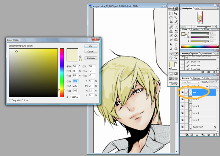
And then? Smudge, the same idea as what I did for skin. I know hair isn't as smooth as skin but I draw in the strands and chunks with the darker shades. After the smudging it looks like this.
10. Make a new Linear Burn layer. It's easier than mixing a colour and colouring it directly, it's also easier to correct mistakes when it's on a separate layer.
I picked a very pink colour for the next shade. This is okay because as you can see when you paint it on it looks more orange because of the previous layers. Unlike with skin where you have to imagine the planes of the face with the hair usually you can follow the line art. The shadows can be extensions of the lines to pick out the larger chunks. Where there's a loose strand colour a dark shadow under it as shown in the arrows.
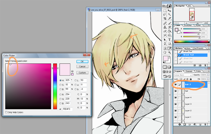
11. Optional step here. If you're pleased with the overall colour after the last step you don't need this. But here I made yet another Linear Burn layer. Picking a shade of orange I just went over some parts of the hair to create a better colour overall. Like this.
12. So we've collected a lot of layers but now that we're done the main bits of the drawing I merged all the linear burn layers. Before you do this you might want to do a safety save in case there's parts you want to redo. I saved it under two different files so that I have both for referrence.
13. Time to start on the eyes. On top of the background line art layer make a Screen layer. I picked a dark blue and just went over the eye so that it's not black. Like this.
14. I pick a lighter blue and fill it out on a separate Linear Burn layer. Depending on what you want to do the base colour for the eye can be quite different from the rim colour, it's all up to you.
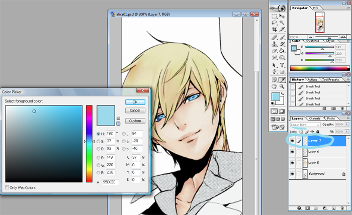
15. I pick another darker blue and paint it in the center, and just under the upper lid. The eyes are still going to look a bit dull at this point but they brighten up a lot once you put in highlights.
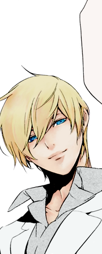
This is what you have now.
16. Make a Soft Light layer. Using the same dark blue I fill out screentone and lines of the dress shirt. Like this.
17. I only use two colours to shade both the dress shirt and the blazer. A lighter one and then a darker shade that I use with the dress shirt only to emphasize the shadows. The base colouring is pretty much the same as how I've done before, blocking out parts you want shadowed. When you get to smudging and smoothing for clothing I only do it in straight lines. Whereas with skin I'll use whatever strokes I need to make it smooth. The clothes don't have to look smooth, it's fabric so it folds and bends in simple ways. Follow the folds and the bends.
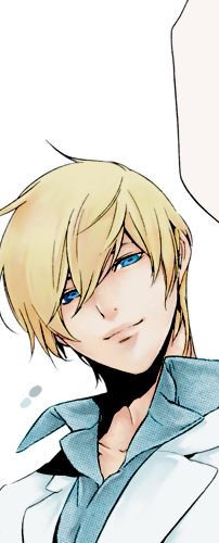
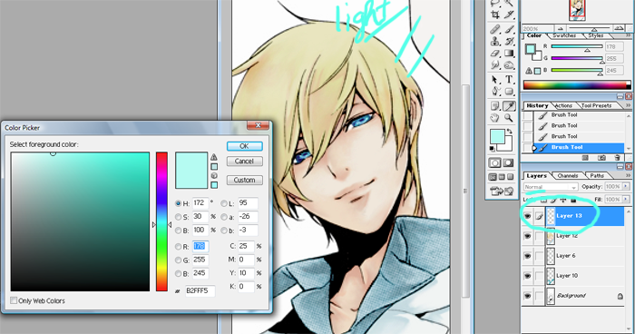
18. Now we're doing highlights, starting from the eyes. Make a new Normal layer, this layer will be for coloured highlights. Pick a lighter colour that will stand out against the overall blue of the eyes. Keep in mind where the light is generally coming from. If you randomly dot it with the colour it can end up looking too googley. So just pick out parts where the light would hit and then smudge it towards the center of the eye, eyeballs are round so smooth it out.
19. Now make another Normal layer, this layer will be for the white highlights. This layer needs to be on top since it is set to normal. Dot the white at the very edges of the blue you put in. If the artist drew in a bubble white that out too or else it'll just look awkward.
While we're on this layer just go ahead and do the skin highlights as well. The skin I usually only use white since my base is usually pretty light to begin with. Even though the skin is a large surface I use a small brush because I find the result is more attractive when I do it this way. So the parts that had no shadow, that were mostly light, you can now add white blocks to it to highlight where light hits. Cheekbones, lips, and wherever it looks pretty ...no really. (while keeping the light in mind of course.)
20. Now on the layer under the white layer pick a light colour that matches the hair. Put in the larger blocks, where the hair is shiny. At the crown of the head and such. Pick out the strands, especially ones the artist has drawn in. After you're done that go back to the white layer and like you did with the eyes, pick out parts you want to emphasize.
21. AND NOW YOU'RE DONE. Pretty much anyways. ZOOM OUT and take a look, clean up the image however you need to. Then...do whatever you want with the image? I didn't put in a background since that isn't about colouring. But if you're making a header then add in textures or whatever you need. Crop to make icons, etc. Adjust curves/colours/etc.
22. Done, done. I think.
fffft. First time writing a tutorial so I apologize if it's confusing. This is just one way I colour, it's one way for anyone to colour. So just take what's useful from it for yourself.
As requested by tyltyl. I hope I can do this clearly, if there's any confusion I'll do my best to answer whatever questions people might have. Image heavy behind the cut.

1. You crop and clean the image you're going to be colouring. It was pretty simple for this picture since I had excellent scans. That done you're ready to really start.

2. This step can be skipped depending on the picture or personal preference. Make a new layer and set it to Linear Burn over the lineart. What I did here was put down a single base colour for the skin and hair then a second base colour for the clothing. With blondes I find a lot of the times I have trouble matching up the skin and the hair so putting down this base layer ensures that whatever colours I choose there will still be a similar base tone to keep it from clashing too much. Same with the clothes. If the picture has a background I use the same idea to establish perspective and depth. This one has no background so we can move on.
Btw the colours I use vary for every manga or character I colour. I have included them just so that people can have an idea how the picture is progressing with each addition but just pick something that you like. For referrence this is the base colour I used for the clothes.

3. Next step is to pick a colour for the skin. Other than whether the character is pale or tan I also try to take into account the mood of the series or the picture itself when picking my colours. For this one I chose a fairly pale skin tone that was more on the yellow side. Make another Linear Burn layer and fill out the skin evenly.

4. Now choose the hair colour and fill out the hair in the same layer as the base skin tone. Try to find something that stands out with the skin. You might have to go through a few colours to find one you like. Also have some idea at this point what colours you'll be using for shading. The yellow here looks kind of green/yellow but in the finished it's a warmer tone. What you layer on top changes the appearance a lot.

5. Make another Linear Burn layer. This is going to be the midtone shading, pick a colour around the same as the base skin, because the layer goes on top even if it's the same colour it'll show darker. I do it this way because mixing colours become easier like that for me.
I drew in where the light is generally coming from in this image. Just keep in mind around where the light is. It's not something I follow strictly but it helps to keep the picture uniform. But a lot of it is really just...whatever looks pretty. With a solid brush just block out where you want the biggest shadows to be.
6. Looks pretty gross, right? That's okay. Take the smudge brush to it and smooth out the edges. You can also use it to push some of the colour to blend the skin colour. I zoom in when I do this so that I can make sure everything is smooth but remember to zoom out once in a while so that you can see what it looks like overall.

After doing that this is what it should look like.
7. Now pick a slightly darker shade. You'll notice the colours I'm picking are going more towards the pink/red side. On the same layer pick out places where an even darker shadow would be cast. Under the bangs, the folds of the eyes. A lot of times I touch my own face to feel out the contours, where it dips there should be more shadow usually. I also draw a dark edge around places where I want the shadow emphasized.

Then like the previous step smooth out these new shadows with the smudge brush again. After doing that it looks like this.
8. Make a new Linear Burn layer! This is the last layer of shading for the skin, I promise! Again the reason I used a new layer here is because it's easier. Rather than mixing a colour I just pick a tint I want to add to the picture. I wanted more pink, so I picked a pink. This is the shadow I use to accentuate the last basically. You'll be colouring in around the same areas but using smaller strokes. Again, smudge to smooth the colour out.

That's what you'll end up with. Rejoice! The skin is done and that's really the most detailed part.
9. ONTO THE HAIR. Make another new Linear Burn layer, you'll notice I started naming the layer at this point. Do this whenever you need to, it's just an organizational thing to keep it less confusing. The process is similar to skin. Pick a colour and block out the big shadows.

And then? Smudge, the same idea as what I did for skin. I know hair isn't as smooth as skin but I draw in the strands and chunks with the darker shades. After the smudging it looks like this.
10. Make a new Linear Burn layer. It's easier than mixing a colour and colouring it directly, it's also easier to correct mistakes when it's on a separate layer.
I picked a very pink colour for the next shade. This is okay because as you can see when you paint it on it looks more orange because of the previous layers. Unlike with skin where you have to imagine the planes of the face with the hair usually you can follow the line art. The shadows can be extensions of the lines to pick out the larger chunks. Where there's a loose strand colour a dark shadow under it as shown in the arrows.

11. Optional step here. If you're pleased with the overall colour after the last step you don't need this. But here I made yet another Linear Burn layer. Picking a shade of orange I just went over some parts of the hair to create a better colour overall. Like this.
12. So we've collected a lot of layers but now that we're done the main bits of the drawing I merged all the linear burn layers. Before you do this you might want to do a safety save in case there's parts you want to redo. I saved it under two different files so that I have both for referrence.
13. Time to start on the eyes. On top of the background line art layer make a Screen layer. I picked a dark blue and just went over the eye so that it's not black. Like this.
14. I pick a lighter blue and fill it out on a separate Linear Burn layer. Depending on what you want to do the base colour for the eye can be quite different from the rim colour, it's all up to you.

15. I pick another darker blue and paint it in the center, and just under the upper lid. The eyes are still going to look a bit dull at this point but they brighten up a lot once you put in highlights.

This is what you have now.
16. Make a Soft Light layer. Using the same dark blue I fill out screentone and lines of the dress shirt. Like this.
17. I only use two colours to shade both the dress shirt and the blazer. A lighter one and then a darker shade that I use with the dress shirt only to emphasize the shadows. The base colouring is pretty much the same as how I've done before, blocking out parts you want shadowed. When you get to smudging and smoothing for clothing I only do it in straight lines. Whereas with skin I'll use whatever strokes I need to make it smooth. The clothes don't have to look smooth, it's fabric so it folds and bends in simple ways. Follow the folds and the bends.

18. Now we're doing highlights, starting from the eyes. Make a new Normal layer, this layer will be for coloured highlights. Pick a lighter colour that will stand out against the overall blue of the eyes. Keep in mind where the light is generally coming from. If you randomly dot it with the colour it can end up looking too googley. So just pick out parts where the light would hit and then smudge it towards the center of the eye, eyeballs are round so smooth it out.

19. Now make another Normal layer, this layer will be for the white highlights. This layer needs to be on top since it is set to normal. Dot the white at the very edges of the blue you put in. If the artist drew in a bubble white that out too or else it'll just look awkward.
While we're on this layer just go ahead and do the skin highlights as well. The skin I usually only use white since my base is usually pretty light to begin with. Even though the skin is a large surface I use a small brush because I find the result is more attractive when I do it this way. So the parts that had no shadow, that were mostly light, you can now add white blocks to it to highlight where light hits. Cheekbones, lips, and wherever it looks pretty ...no really. (while keeping the light in mind of course.)

20. Now on the layer under the white layer pick a light colour that matches the hair. Put in the larger blocks, where the hair is shiny. At the crown of the head and such. Pick out the strands, especially ones the artist has drawn in. After you're done that go back to the white layer and like you did with the eyes, pick out parts you want to emphasize.
21. AND NOW YOU'RE DONE. Pretty much anyways. ZOOM OUT and take a look, clean up the image however you need to. Then...do whatever you want with the image? I didn't put in a background since that isn't about colouring. But if you're making a header then add in textures or whatever you need. Crop to make icons, etc. Adjust curves/colours/etc.
22. Done, done. I think.
fffft. First time writing a tutorial so I apologize if it's confusing. This is just one way I colour, it's one way for anyone to colour. So just take what's useful from it for yourself.