(no subject)
More progress on the comic front, this time on the logo.
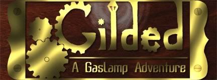
My original idea for the logo was this:

So I sat down with Photoshop and spent about 6 hours trying to make it look pretty. As you can see from the above, it turned out alright, but it's not really a logo you look at and think "wow". Its not really even all that memorable.
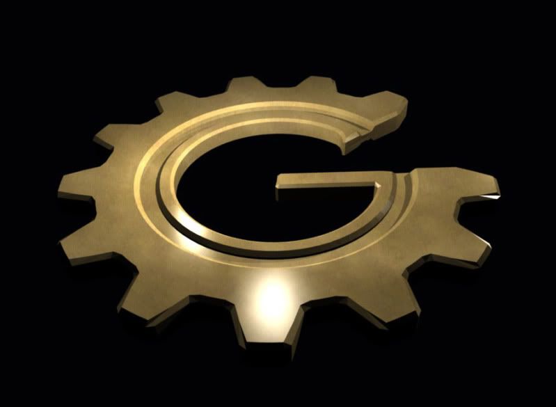
I still liked the general idea of it, so I decided to keep it for the time being. Then I realized that it'd probably not be too difficult to make it in Blender. So I began doing so:

I only have the G done so far, but I also have two different generic gears for use elsewhere. Plus, the G was the hardest letter; the others are low-poly and pretty simple (except the e, but that's using a modified G model). In all I'm pretty pleased with the result so far.
Also, I did up a third draft of the Icarus. It looks a lot bette than the previous version, and I'll be modeling it as well, for other reasons.
My original idea for the logo was this:

So I sat down with Photoshop and spent about 6 hours trying to make it look pretty. As you can see from the above, it turned out alright, but it's not really a logo you look at and think "wow". Its not really even all that memorable.
I still liked the general idea of it, so I decided to keep it for the time being. Then I realized that it'd probably not be too difficult to make it in Blender. So I began doing so:

I only have the G done so far, but I also have two different generic gears for use elsewhere. Plus, the G was the hardest letter; the others are low-poly and pretty simple (except the e, but that's using a modified G model). In all I'm pretty pleased with the result so far.
Also, I did up a third draft of the Icarus. It looks a lot bette than the previous version, and I'll be modeling it as well, for other reasons.