Tutorial #5 - Layers
This is a very simple tutorial - it is going to basically explain the details of layers in PSP, and what they do. PS users, I wouldn't bother looking here for things like Pin light, because I don't have them, haha. Today, I will be writing about the main layers - Darken, Lighten, Colour, Multiply, Screen, Softlight and Exclusion.
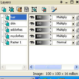
Before we begin, everyone should know how to add a new layout. You can either go to layers - new rastor layer or go to your layers box (bottom corner) and click the icon that looks like a piece of white paper with a piece of green paper, their corners touching. K? :D
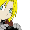
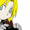
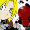
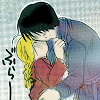
1. "Darken" Layer. Darken does exactly what it says on the tin - you can use something to darken the image. For example, if I use this adorable little chibi ed:
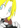
Now, the darken layer can be used in a good way and a bad way. Say, for instance, your icon is seriously bright:
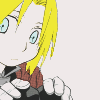
So, you want to make it darker, right? So, you get a nice dark colour, such as #efe9e9. use the bucket tool and fill the darken layer with this colour. I ended up with this:
and/or this with opacities and other colours: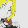
and
If you're not careful, however, your icon can turn out rather skanky:

And that's the darken layer!
2. "Lighten" - again, a 'speaks for itself' layer - one that can be very, very useful when it comes to making icons. If we start of with the same little Ed as before, we can have a look and see what we can do!
My favourite way of using the lighten tool is to add colour splodges, haha. These are bright colours that are used to accent the icon itself. For example:
+ a nice colour splodge =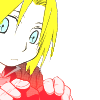
The best way to do a colour splodge youself is to select your paintbrush, make it about.. size 30 - 50, depending on what you want, with hardness 10 - 30. You then make a new layer, set it to lighten, and pain your splodge! An example of an Icon using this idea is:
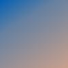
Anoter way to use the lighten tool is to use a gradient or a texture (preferably a light texture)
This is a gradient:
and this is a light texture:
When set on lighten, each has it's own niceness:
For example, with the gradient:
and with the light texture:
So yeah, there is a few nice things you can do!
3. Colour is a really fun layer. It offers you many, many little things that I love. The thing I use it for most, however, is greyscaling. Basically, the colour layer changes your image to that colour. So, for example:
Using a red colour layer:
Blue Colour layer:
and Black Colour layer:
- this grey colouring is grey for adding a little coloured effect to an image, like this:
+
=
- it lowers the sharpness of the colour and adds a nice dark effect - which I love.
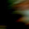
4. Multiply. Oh, the multiply layer - my very favourite layer of them all. It does as it says - Multiplies the colour of whatever image you are setting to multiply. There are so many things you can do, such as adding a background to an image, like this:
All you do is paste [as new layer] the texture/image you want as a background, set it to multiply and rub out any parts covering your characters face!
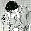
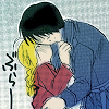
The second thing that is good about the multiply layer is that you can colour black and white images. Take manga for example. Paste a manga scan into your psp, cut out a selection you want to colour, and just use multiply layers to get what you want! For example:
+
=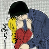
Mines kinda scruffy because I did it really quickly, but If you take your time and do it nice and neatly, it turns out really nice. I used the paintbrush to colour in the manga, but you can use the airbrush and stuff too!
5. Screen is another layer, but it acts a lot like lighten. Screen [which also do exactly as said, screen the layers, ie making them brighter] layers are good for light textures. If you paste one on and set it to screen, it removed the back background without any hassle whatsoever - a really useful thing. For example:
+
( on screen, duh ) + flip on screen layer =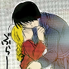
As you scan see, it added a nice little bit of colour that would effect the final outcome of the icon - in a good way. You can use many light textures and sometimes even normal textures to achieve nice effects. Sometimes, you can even use gradients and ajust the opacity to get nicer results. I like using light textures the best, though. Experiment yourself!
6. Soft light. Soft light layers [a layer that when you paste an image/colour add it in a soft overlay, so that it adds a nice effect that is really sweet (lol!)] are wonderful when you want to add gradient colouring to an icon. For example:
+
,
and
=
, and mix that with the screen layer from before:
+
=
And you get the beginnings of a lovely icon! See - you should mix the layers to get the effect and beauty you want :P
6. Exclusion. The exclusion layer takes the colour and literally excludes it, basically oppositing the colour in a nice, easy way that is very good for colouring]. The exclusion layer can add some wonderful effects to your icon, but if you do it right. Some good colour examples are things like this:
#0f2955 =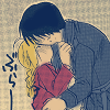
, #2e3848 =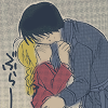
and #032f79 =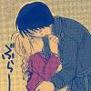
The best colours to use for exclusion are dark blues. Colours that are bad are reds, pinks, bright colours and bright blue, haha. It's very picky, the exclusion layer. You have to be careful.
And that's the end of the layers tut for today, haha. These are the main, good layers that would be useful in icon creation - now go out there and be.. um.. creative? Haha XD Enjoy!
Before we begin, everyone should know how to add a new layout. You can either go to layers - new rastor layer or go to your layers box (bottom corner) and click the icon that looks like a piece of white paper with a piece of green paper, their corners touching. K? :D
1. "Darken" Layer. Darken does exactly what it says on the tin - you can use something to darken the image. For example, if I use this adorable little chibi ed:
Now, the darken layer can be used in a good way and a bad way. Say, for instance, your icon is seriously bright:
So, you want to make it darker, right? So, you get a nice dark colour, such as #efe9e9. use the bucket tool and fill the darken layer with this colour. I ended up with this:
and/or this with opacities and other colours:
and
If you're not careful, however, your icon can turn out rather skanky:
And that's the darken layer!
2. "Lighten" - again, a 'speaks for itself' layer - one that can be very, very useful when it comes to making icons. If we start of with the same little Ed as before, we can have a look and see what we can do!
My favourite way of using the lighten tool is to add colour splodges, haha. These are bright colours that are used to accent the icon itself. For example:
+ a nice colour splodge =
The best way to do a colour splodge youself is to select your paintbrush, make it about.. size 30 - 50, depending on what you want, with hardness 10 - 30. You then make a new layer, set it to lighten, and pain your splodge! An example of an Icon using this idea is:
Anoter way to use the lighten tool is to use a gradient or a texture (preferably a light texture)
This is a gradient:
and this is a light texture:
When set on lighten, each has it's own niceness:
For example, with the gradient:
and with the light texture:
So yeah, there is a few nice things you can do!
3. Colour is a really fun layer. It offers you many, many little things that I love. The thing I use it for most, however, is greyscaling. Basically, the colour layer changes your image to that colour. So, for example:
Using a red colour layer:
Blue Colour layer:
and Black Colour layer:
- this grey colouring is grey for adding a little coloured effect to an image, like this:
+
=
- it lowers the sharpness of the colour and adds a nice dark effect - which I love.
4. Multiply. Oh, the multiply layer - my very favourite layer of them all. It does as it says - Multiplies the colour of whatever image you are setting to multiply. There are so many things you can do, such as adding a background to an image, like this:
All you do is paste [as new layer] the texture/image you want as a background, set it to multiply and rub out any parts covering your characters face!
The second thing that is good about the multiply layer is that you can colour black and white images. Take manga for example. Paste a manga scan into your psp, cut out a selection you want to colour, and just use multiply layers to get what you want! For example:
+
=
Mines kinda scruffy because I did it really quickly, but If you take your time and do it nice and neatly, it turns out really nice. I used the paintbrush to colour in the manga, but you can use the airbrush and stuff too!
5. Screen is another layer, but it acts a lot like lighten. Screen [which also do exactly as said, screen the layers, ie making them brighter] layers are good for light textures. If you paste one on and set it to screen, it removed the back background without any hassle whatsoever - a really useful thing. For example:
+
( on screen, duh ) + flip on screen layer =
As you scan see, it added a nice little bit of colour that would effect the final outcome of the icon - in a good way. You can use many light textures and sometimes even normal textures to achieve nice effects. Sometimes, you can even use gradients and ajust the opacity to get nicer results. I like using light textures the best, though. Experiment yourself!
6. Soft light. Soft light layers [a layer that when you paste an image/colour add it in a soft overlay, so that it adds a nice effect that is really sweet (lol!)] are wonderful when you want to add gradient colouring to an icon. For example:
+
,
and
=
, and mix that with the screen layer from before:
+
=
And you get the beginnings of a lovely icon! See - you should mix the layers to get the effect and beauty you want :P
6. Exclusion. The exclusion layer takes the colour and literally excludes it, basically oppositing the colour in a nice, easy way that is very good for colouring]. The exclusion layer can add some wonderful effects to your icon, but if you do it right. Some good colour examples are things like this:
#0f2955 =
, #2e3848 =
and #032f79 =
The best colours to use for exclusion are dark blues. Colours that are bad are reds, pinks, bright colours and bright blue, haha. It's very picky, the exclusion layer. You have to be careful.
And that's the end of the layers tut for today, haha. These are the main, good layers that would be useful in icon creation - now go out there and be.. um.. creative? Haha XD Enjoy!