photoshop basics tutorial: dark screencaps
from 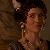
to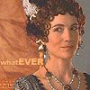
(feel free to use the finished icon with credit)
the recent batch of icons i did were made from incredibly dark screencaps. there is an inevitable loss of quality, but being able to make a murky disaster into a usable icon is really easy.
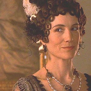
here is the original cap. i've resized it to 600px across because it started at over 1000px. this step isn't necessary unless you're me. :)
the first thing i do with these big screencaps is crop. i suspect that some of these next steps can be done in any order, this is just the way i like to do it.
i cropped this to 300x300 and we're still at the original resolution of 3px/i.
our first touch up is brightness/contrast. you can find this tool under Image > Adjustments
now this is a really dark cap. i would never normally whack the brightness/contrast levels this hard, but i went for a +50 on bright and a +30 on contrast.
when you have to lighten an image that much, you lose a lot of the contrast and the pic looks pale and over-exposed. taking the contrast up is going to enrich your shadows and remove that washed out look.

next, we're going to sharpen twice (Filter > Sharpen > Sharpen x2). again, this isn't something i'd normally do, but with these caps, this is what works. also, remember we're still at a resolution of 3 px/i.
here's a step you can't see. i resized the image from 300x300 @ 3px/i to 300x300 @ 72 px/i. you resize from Image > Image Size
make sure that your proportions are constrained. if they aren't, you're headed for some really bad aspect ratios.
you can't see any difference at all between the two, but i find that the resize makes my computer run faster. no idea why!
the next step for me was to play around with the colour, pick up the sharp tool a couple of times for some details, and generally neaten everything up for the final steps.
this isn't a tutorial about how i get the sharp and colour effects i do, so i'll skip the stuff i did to the img.
now we're finally ready for the final resize to 100x100. again, go to Image > Image Size and change the size to W 100, H 100.
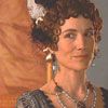
believe it or not, we're going to use the sharpen filter again. i know, crazy. Filter > Sharpen > Sharpen, or since we've already used the sharpen filter for this icon, just ctrl+F
fanny's face is kind of pixel-y now, so i'm going to pick up my blur tool set at 35%, zoom in, and carefully smooth her cheeks, forehead, around her eyes (but not over them), around her lips (but not over them), and her neck and shoulders. anywhere that there's skin but no dark features such as eyes or jewelry.
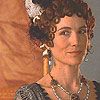
add text and you're done.
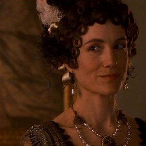
to
(feel free to use the finished icon with credit)
the recent batch of icons i did were made from incredibly dark screencaps. there is an inevitable loss of quality, but being able to make a murky disaster into a usable icon is really easy.
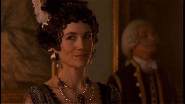
here is the original cap. i've resized it to 600px across because it started at over 1000px. this step isn't necessary unless you're me. :)
the first thing i do with these big screencaps is crop. i suspect that some of these next steps can be done in any order, this is just the way i like to do it.
i cropped this to 300x300 and we're still at the original resolution of 3px/i.
our first touch up is brightness/contrast. you can find this tool under Image > Adjustments
now this is a really dark cap. i would never normally whack the brightness/contrast levels this hard, but i went for a +50 on bright and a +30 on contrast.
when you have to lighten an image that much, you lose a lot of the contrast and the pic looks pale and over-exposed. taking the contrast up is going to enrich your shadows and remove that washed out look.
next, we're going to sharpen twice (Filter > Sharpen > Sharpen x2). again, this isn't something i'd normally do, but with these caps, this is what works. also, remember we're still at a resolution of 3 px/i.
here's a step you can't see. i resized the image from 300x300 @ 3px/i to 300x300 @ 72 px/i. you resize from Image > Image Size
make sure that your proportions are constrained. if they aren't, you're headed for some really bad aspect ratios.
you can't see any difference at all between the two, but i find that the resize makes my computer run faster. no idea why!
the next step for me was to play around with the colour, pick up the sharp tool a couple of times for some details, and generally neaten everything up for the final steps.
this isn't a tutorial about how i get the sharp and colour effects i do, so i'll skip the stuff i did to the img.
now we're finally ready for the final resize to 100x100. again, go to Image > Image Size and change the size to W 100, H 100.
believe it or not, we're going to use the sharpen filter again. i know, crazy. Filter > Sharpen > Sharpen, or since we've already used the sharpen filter for this icon, just ctrl+F
fanny's face is kind of pixel-y now, so i'm going to pick up my blur tool set at 35%, zoom in, and carefully smooth her cheeks, forehead, around her eyes (but not over them), around her lips (but not over them), and her neck and shoulders. anywhere that there's skin but no dark features such as eyes or jewelry.
add text and you're done.