(no subject)
It's time to announce the results of Challenge 5 A.K.A. to know who our finalists are!
ELIMINATED:
By fanplastico.
I'm so sorry to see you go. You're such an amazing icon-maker. Thank you very much for participate!
That means our two finalists are pokecharm and theweasley! Congratulations!
PEOPLE'S CHOICE:
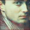
Set 1:
By fanplastico.
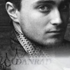
Set 2:
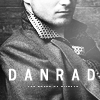
By pokecharm.
TALLIES:
Set 1:
01. -1 +2
02. -2 +1
03. -2 +2
Set 2:
1. +1
2. -5
3. +4
General results:
pokecharm: -1 +4 = +3
fanplastico: +1 -5 = -4
theweasley: +1
Comments:
LEAST FAVOURITE:
Set 1 #03 - The composition is great, I really like the tiny text in the corner, but Dan's skin is unnaturally blue, he looks like a zombie. O_O
Set 1 #02 - The black fadeout on the side is nice, but the cropping is boring and the color is flat.
Set 1 #03 - space on the left doesn't make any sense composition-wise.
Set 1 #02 - it's too dull and flat. a better texture could have been used here.
Set 1 #01 - The shadowing, from the texture, or color that appears on Dan's Face and clothing, don't mix well with the icon... I do like the cropping.
Set 2 #02 - The white bar is too bright. The Brightness takes away from the icon, and the waves/swirls in the left corner, appear to be out of place, not complimenting the icon.
Set 2 #02 - the white at the bottom is a little too distracting from dans face
Set 2 #02 - least interesting of the three choices. the bottom bit seems a little goofy.
Set 2 #02 - Oooh, this is hard... I don't really like the font choice for #3 - the font always seems too blurry, but since it will cancel out my vote for my favorite, I will go with #2 because being so faded, the text is a bit hard to read.
Set 2 #02 - The icon is blurry, it could use sharpenening. Also, the black texture (or is it a brush?) in the left corner is very distracting.
FAVOURITE:
Set 1 #01 - Beautiful coloring and texture use!
Set 1 #01 - I like the cropping in this one. It's a nice close up.
Set 1 #02 - lovely coloring, composition. shadow creates mystery/suspense
Set 1 #03 - nice colouring
Set 1 #03 - The balance of the colors are amazing. and the use of the tiny text on the side of the icon... complement the icon very well.
Set 2 #01 - Great use of lighting, and Grunge! I also love how the cropping gives dan the effect of sitting against a crossword puzzle!
Set 2 #03 - excellent cropping and use of b&w as well as tiny text...overall structure of icon is good!
Set 2 #03 - interesting composition
Set 2 #03 - I really like the contrast and texture use in all three of these, but my favorite is #3 because the cropping is amazing!
Set 2 #03 - Very creative cropping, I like that the icon is crisp without being oversharpened.
Final Challenge will be post in a few minutes.
ELIMINATED:
By fanplastico.
I'm so sorry to see you go. You're such an amazing icon-maker. Thank you very much for participate!
That means our two finalists are pokecharm and theweasley! Congratulations!
PEOPLE'S CHOICE:
Set 1:
By fanplastico.
Set 2:
By pokecharm.
TALLIES:
Set 1:
01. -1 +2
02. -2 +1
03. -2 +2
Set 2:
1. +1
2. -5
3. +4
General results:
pokecharm: -1 +4 = +3
fanplastico: +1 -5 = -4
theweasley: +1
Comments:
LEAST FAVOURITE:
Set 1 #03 - The composition is great, I really like the tiny text in the corner, but Dan's skin is unnaturally blue, he looks like a zombie. O_O
Set 1 #02 - The black fadeout on the side is nice, but the cropping is boring and the color is flat.
Set 1 #03 - space on the left doesn't make any sense composition-wise.
Set 1 #02 - it's too dull and flat. a better texture could have been used here.
Set 1 #01 - The shadowing, from the texture, or color that appears on Dan's Face and clothing, don't mix well with the icon... I do like the cropping.
Set 2 #02 - The white bar is too bright. The Brightness takes away from the icon, and the waves/swirls in the left corner, appear to be out of place, not complimenting the icon.
Set 2 #02 - the white at the bottom is a little too distracting from dans face
Set 2 #02 - least interesting of the three choices. the bottom bit seems a little goofy.
Set 2 #02 - Oooh, this is hard... I don't really like the font choice for #3 - the font always seems too blurry, but since it will cancel out my vote for my favorite, I will go with #2 because being so faded, the text is a bit hard to read.
Set 2 #02 - The icon is blurry, it could use sharpenening. Also, the black texture (or is it a brush?) in the left corner is very distracting.
FAVOURITE:
Set 1 #01 - Beautiful coloring and texture use!
Set 1 #01 - I like the cropping in this one. It's a nice close up.
Set 1 #02 - lovely coloring, composition. shadow creates mystery/suspense
Set 1 #03 - nice colouring
Set 1 #03 - The balance of the colors are amazing. and the use of the tiny text on the side of the icon... complement the icon very well.
Set 2 #01 - Great use of lighting, and Grunge! I also love how the cropping gives dan the effect of sitting against a crossword puzzle!
Set 2 #03 - excellent cropping and use of b&w as well as tiny text...overall structure of icon is good!
Set 2 #03 - interesting composition
Set 2 #03 - I really like the contrast and texture use in all three of these, but my favorite is #3 because the cropping is amazing!
Set 2 #03 - Very creative cropping, I like that the icon is crisp without being oversharpened.
Final Challenge will be post in a few minutes.