Round 2, Challenge 4: Results.
Here are the results for Round 2, Challenge 4.
ELIMINATED:

By azi_69_daniela.
I'm so sorry! I really hate see you go, girl! :( Thanks for participating.
PEOPLE'S CHOICE:

By so_severus. [ BANNER ]
MOD'S CHOICE:

By xthepensivex. [ BANNER ]
TALLIES:
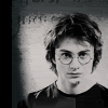
01. -2 +2 = 0
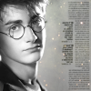
02. +3 -1 = +2
03. -4
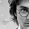
04. -4 +1 = -3
Comments:
01:
+ awesome croppage
+ NO COMMENT
- awkward cropping, overall composition isn't aesthetically unpleasing
- the icon is a bit too sharp
02:
+ Good cropping
+ Nice crop and use of text brush
+ NO COMMENT
- the large block of tiny text crowds the icon somewhat
03:
- texture doesn't do anything for the image
- VOTE NOT COUNTED
- it's grainy and oversharpened, the texture is unflattering
- Skin tone matches background tone, giving the illusion that he has a really thick neck. More contrast would really help here.
- image needs more contrast
04:
- the red of the text is a bit jarring to the icon
- the quality of the text takes away from the icon
- The text is hard to read, and emphasizing "never" rather than "down" would make the phrase more powerful.
- texture makes harry look...well...stripey and the red text detracts from the icon.
+ NO COMMENT
Challenge 5 (Semi-final) will be post in a few minutes.
ELIMINATED:
By azi_69_daniela.
I'm so sorry! I really hate see you go, girl! :( Thanks for participating.
PEOPLE'S CHOICE:
By so_severus. [ BANNER ]
MOD'S CHOICE:
By xthepensivex. [ BANNER ]
TALLIES:
01. -2 +2 = 0
02. +3 -1 = +2
03. -4
04. -4 +1 = -3
Comments:
01:
+ awesome croppage
+ NO COMMENT
- awkward cropping, overall composition isn't aesthetically unpleasing
- the icon is a bit too sharp
02:
+ Good cropping
+ Nice crop and use of text brush
+ NO COMMENT
- the large block of tiny text crowds the icon somewhat
03:
- texture doesn't do anything for the image
- VOTE NOT COUNTED
- it's grainy and oversharpened, the texture is unflattering
- Skin tone matches background tone, giving the illusion that he has a really thick neck. More contrast would really help here.
- image needs more contrast
04:
- the red of the text is a bit jarring to the icon
- the quality of the text takes away from the icon
- The text is hard to read, and emphasizing "never" rather than "down" would make the phrase more powerful.
- texture makes harry look...well...stripey and the red text detracts from the icon.
+ NO COMMENT
Challenge 5 (Semi-final) will be post in a few minutes.