Round 2, Challenge 3: Results
Here are the results for Round 2, Challenge 3.
ELIMINATED:
By pokecharm.
I hate to see you go :(. I loved your entries.
PEOPLE'S CHOICE:
By azi_69_daniela. [ BANNER ]
MOD'S CHOICE:
By pokecharm. [ BANNER ]
TALLIES:
1. -4
2. -4 +1 = -3
3. -3 +4 = 1
4. -3 +2 = -1
Comments:
01:
- oversharpened
- it looks too sharpened compared to the others
- oversharpened and the text is too small
- good cropping but it needs a little more work on the background because the black line on the left looks too heavy and competes with the main aspect (the face).
02:
- I'm not sure Dan should be so red - the colouring is a but much
- oversaturated
- A little too blue. Texture looks weird and doesnt match the picture.
- the coloring is overly saturated
+ nice composition although the coloring is a bit too blue
03:
- oversharpened. Dan's ear looks weird
- the picture was cut out badly and the texture used for the background does not go w/ the image
- The edges of the pic looks too rough, you need to work on the details (the right ear looks too big and it seems that he does not have a left one).
+ NO COMMENT
+ NO COMMENT
+ Coloring and texture match very well. The font matches the picture and its coloring fits the texture very well.
+ NO COMMENT
04:
- the icon is really yellow and I'm not sure about the brush
- text brush is too busy over an already busy tshirt
- The tiny text is barely noticable. The color should be a little darker so that one can really see it.
+ nice colour and texture use
+ the brown tone of the icon looks fine, it makes a good contrast with the turquoise and yellow from the background.
Challenge 4 will be post in a few minutes.
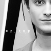
ELIMINATED:
By pokecharm.
I hate to see you go :(. I loved your entries.
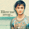
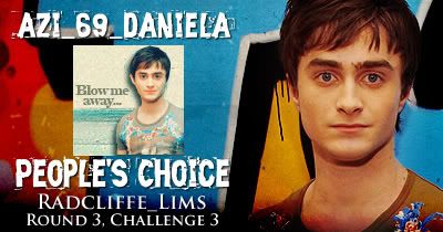
PEOPLE'S CHOICE:
By azi_69_daniela. [ BANNER ]
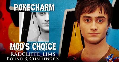
MOD'S CHOICE:
By pokecharm. [ BANNER ]
TALLIES:
1. -4
2. -4 +1 = -3
3. -3 +4 = 1
4. -3 +2 = -1
Comments:
01:
- oversharpened
- it looks too sharpened compared to the others
- oversharpened and the text is too small
- good cropping but it needs a little more work on the background because the black line on the left looks too heavy and competes with the main aspect (the face).
02:
- I'm not sure Dan should be so red - the colouring is a but much
- oversaturated
- A little too blue. Texture looks weird and doesnt match the picture.
- the coloring is overly saturated
+ nice composition although the coloring is a bit too blue
03:
- oversharpened. Dan's ear looks weird
- the picture was cut out badly and the texture used for the background does not go w/ the image
- The edges of the pic looks too rough, you need to work on the details (the right ear looks too big and it seems that he does not have a left one).
+ NO COMMENT
+ NO COMMENT
+ Coloring and texture match very well. The font matches the picture and its coloring fits the texture very well.
+ NO COMMENT
04:
- the icon is really yellow and I'm not sure about the brush
- text brush is too busy over an already busy tshirt
- The tiny text is barely noticable. The color should be a little darker so that one can really see it.
+ nice colour and texture use
+ the brown tone of the icon looks fine, it makes a good contrast with the turquoise and yellow from the background.
Challenge 4 will be post in a few minutes.