Icon Coloring Tutorial
Here's an icon coloring tutorial.
Showing again how to use some adjustment layers again.
Don't be scared, it's not really complicated. ;D
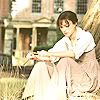
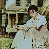
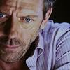
How to go from
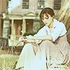
to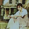
You can open that pic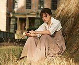
of Lizzy or just start with my cropping. :)
Okay.
*When using the pic...
...Crop to your liking and sharpen once.
:)
*Duplicate once and set to screen 100%.
*New adjustmentlayer > Brightness/Contrast > set brightness to +20.
*New filllayer > color #260D00 > set to exclusion 100%.
*New adjustmentlayer > channelmixer:
Red
+96%
-10%
+13%
Blue
+7%
-5%
+100%
Set to multiply 100%.
*New adjustmentlayer > colorbalance
Midtones
+10; +10; 0
Shadows
+5; 0; 0
Highlights
0; 0; +20
Set to softlight 50%.
*I know. It's not a big difference, but that depends on the image you're using. ;)
*Add a black/white gradient map > set to exclusion set to 25%.
You need to play with the oppacity. Between 20% - 30%.
*Merge layers and that's it. You can add some text or textures, bruhes or anything else.
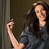
Result:
And it will always look a bit different. Like always, depends on the image.
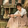
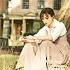
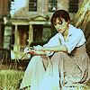
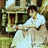
Examples:
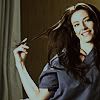


And that black/white gradient map set to exclusion thing works with other colorings as well. Just shouldn't be too dark.
Showing again how to use some adjustment layers again.
Don't be scared, it's not really complicated. ;D
How to go from

to

You can open that pic

of Lizzy or just start with my cropping. :)
Okay.
*When using the pic...
...Crop to your liking and sharpen once.
:)
*Duplicate once and set to screen 100%.

*New adjustmentlayer > Brightness/Contrast > set brightness to +20.

*New filllayer > color #260D00 > set to exclusion 100%.

*New adjustmentlayer > channelmixer:
Red
+96%
-10%
+13%
Blue
+7%
-5%
+100%
Set to multiply 100%.

*New adjustmentlayer > colorbalance
Midtones
+10; +10; 0
Shadows
+5; 0; 0
Highlights
0; 0; +20
Set to softlight 50%.

*I know. It's not a big difference, but that depends on the image you're using. ;)
*Add a black/white gradient map > set to exclusion set to 25%.
You need to play with the oppacity. Between 20% - 30%.

*Merge layers and that's it. You can add some text or textures, bruhes or anything else.
Result:
And it will always look a bit different. Like always, depends on the image.
Examples:


And that black/white gradient map set to exclusion thing works with other colorings as well. Just shouldn't be too dark.