"Show me the stars" blend tutorial
I asked.
You guys said yes. ♥
Here we go. :D
How to make something like this:

Made in PS CS3
Pictures needed:
Ink Stock by On-the-fence-stock | Watch Stock by Pans-Music-Box
London Stock by BaB-Jane | Doctor Who Promo from WhoIsMattSmith
Texture 1 by Daydreaming | Texture 2 by Shadow Of The Day
(CLICK PICS TO ENLARGE!)
BASE
Step 1
New canvas 800x600px.
Or whatever size you need.
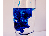
Take the ink stock first.
Place it on your canvas and resize it to your liking.
I copied the layer twice.
First one: screen 50%.
Second one soft light 100%.
Step 2
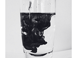
Above the ink stock I created a gradient map
from #16161d to #ffffff.
I wanted it to be black an white...but with a hint of greyish coloring.
Step 3
Now the pic of Clara and the Doctor.
Put it on top, resize to your liking and set
it to lighten. Make a new layer UNDERNEATH it
and paint the areas you'd like to have more visible
with a black color.

Step 4
Next step. Texture 1. Desaturate it.
I think you know how this works by now. ^_^
Put it top and resize/scale/move the way you like it.
Difference 100%. (I'm in love with difference layers lately!)
Earse everything you don't like.

Step 5
The WATCH. Simply repeat Step 4...but 50% difference this time. ;D

Step 6
Copy the layer of the Clara/Doctor pic, put it top and set
it to about 50%. For more contrast reasons. :)

Step 7
TEXT. I kept it simple, it just looked better like that.
There's hardly anything to explain I think.
Just a simple quote in a simple font, like Georgia or Garamond.

Step 8
Texture 2. Also desaturate it. Same as Step 4 and 5.
But difference to 100% again.

Step 9
The LONDON stock. I didn't like how empty the top of
the blend looked, so I decided to use that London skyline stock. ?
Use it twice. Both layers on hard light 100%.
Feel free to erase things again.

Step 10
Use Texture 1 again. I rotated it 180°.
As usual you know. Resizing/scaling/moving...
what a surprise. Difference 100%. :P
That's the base.

COLORING
I tried to recreate it as good as possible.
And I'm giving you the PSD.
If you like, I can do a step by step tut for it.
I'm just lazy now. ^_^

FILTERING
I used topaz clean. Crisp style. And I used it carefully.
Merge all layers.
Copy the layer before you apply the topaz clean.
Crisp style. Just like it is. I didn't change the settings.
Set this layer to about 50 - 60%.
Erase the eyes and lips, so they look sharper.
I also erased the text parts.
Merge everything again.
Copy again.
Apply paint daubts (artistic filter).
Both settings to 1.
Set the layer to about 30%.
And done.
That's how I do filtering sometimes. *snorts*
And you're done.

I hope everything make sense. If you've got any questions,
please feel free to YELL at me! ?
You guys said yes. ♥
Here we go. :D
How to make something like this:

Made in PS CS3
Pictures needed:
Ink Stock by On-the-fence-stock | Watch Stock by Pans-Music-Box
London Stock by BaB-Jane | Doctor Who Promo from WhoIsMattSmith
Texture 1 by Daydreaming | Texture 2 by Shadow Of The Day
(CLICK PICS TO ENLARGE!)
BASE
Step 1
New canvas 800x600px.
Or whatever size you need.
Take the ink stock first.
Place it on your canvas and resize it to your liking.
I copied the layer twice.
First one: screen 50%.
Second one soft light 100%.

Step 2
Above the ink stock I created a gradient map
from #16161d to #ffffff.
I wanted it to be black an white...but with a hint of greyish coloring.

Step 3
Now the pic of Clara and the Doctor.
Put it on top, resize to your liking and set
it to lighten. Make a new layer UNDERNEATH it
and paint the areas you'd like to have more visible
with a black color.

Step 4
Next step. Texture 1. Desaturate it.
I think you know how this works by now. ^_^
Put it top and resize/scale/move the way you like it.
Difference 100%. (I'm in love with difference layers lately!)
Earse everything you don't like.

Step 5
The WATCH. Simply repeat Step 4...but 50% difference this time. ;D

Step 6
Copy the layer of the Clara/Doctor pic, put it top and set
it to about 50%. For more contrast reasons. :)

Step 7
TEXT. I kept it simple, it just looked better like that.
There's hardly anything to explain I think.
Just a simple quote in a simple font, like Georgia or Garamond.

Step 8
Texture 2. Also desaturate it. Same as Step 4 and 5.
But difference to 100% again.

Step 9
The LONDON stock. I didn't like how empty the top of
the blend looked, so I decided to use that London skyline stock. ?
Use it twice. Both layers on hard light 100%.
Feel free to erase things again.

Step 10
Use Texture 1 again. I rotated it 180°.
As usual you know. Resizing/scaling/moving...
what a surprise. Difference 100%. :P
That's the base.

COLORING
I tried to recreate it as good as possible.
And I'm giving you the PSD.
If you like, I can do a step by step tut for it.
I'm just lazy now. ^_^

FILTERING
I used topaz clean. Crisp style. And I used it carefully.
Merge all layers.
Copy the layer before you apply the topaz clean.
Crisp style. Just like it is. I didn't change the settings.
Set this layer to about 50 - 60%.
Erase the eyes and lips, so they look sharper.
I also erased the text parts.
Merge everything again.
Copy again.
Apply paint daubts (artistic filter).
Both settings to 1.
Set the layer to about 30%.
And done.
That's how I do filtering sometimes. *snorts*
And you're done.

I hope everything make sense. If you've got any questions,
please feel free to YELL at me! ?