SHERLOCK SIGNATURE TUTORIAL
- I posted THAT graphic (IT'S NOT SPOILER FREE!) some time ago @ tumblr.
- And got an amazing feedback for it!
- So I decided to make a tuorial for that kind of shaping effect I used.
How to make something like that:

click to enlarge (ONCE AGAIN: SPOILER AHEAD!)
The Sherlock caps I used can be found HERE!
BASE
The whole thing is actually quite simple. For that kind of signature it's important to use a silhouette pic with a light background.
Step 1

Step 2
Dublicate that layer and set it to multiply to make Sherlock darker...it's quite important for Step 3.

Step 3
I took a pic of John Watson, put it on top and set it to lighten
Erase everything around the silhouette you don't like.
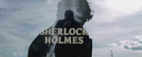
Step 4
Dublicate that John layer and set it to soft light 60 %. Erase what you don't like once again.
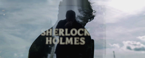
Step 5
That one's optional. I used a COLOR BALANCE layer, because it looked too blueish for the coloring I wanted to do. ;D
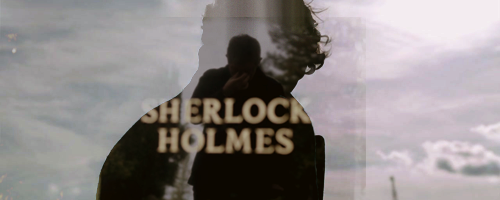
TEXTURES
Step 6
Put that TEXTURE on top, set to soft light.
Put that TEXTURE (by SLAYGROUND) on top an set it to hard light 80 %.
Dublicate that layer and change it to 25%.

TEXT
Step 7
I can't remember exactly...but I'm sure it's 28 Days Later. I set the text layer to soft light and dublicated it.
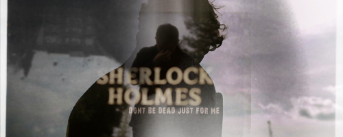
COLORING
Step 8
I don't have much time to make a complete tutorial for the coloring, so I give you the PSD. :P
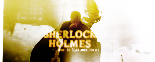
Step 9
You see that white part on the left? It looked weird like that...so I chose a color from the sig and created a something like that on the right side.
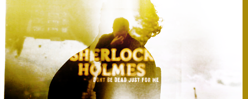
OPTIONAL STEPS
You can use filters if you like.
I used topaz clean...crisp style. But I can't remember the settings...so you have to play with it yourself. o.o
And that's it! :D
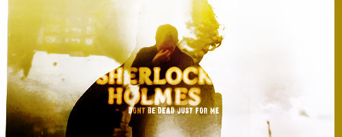
If you have any questions, please don't be too shy to ask. ♥