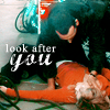
Icon Tutorial #2: The Parting of the Ways
From 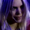
--->
For Photoshop 7. Non-translatable as it uses Selective Coloring.
This works best on images that have odd lighting across them. It shows you how to remove that so it doesn't look like there's big splotches of color across your image.
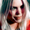
01. I took this image, cropped and resized it, duplicated the base layer twice and set both to screen, then flattened the image.
--->
02. Next I added a Selective Color adjustment layer over my base by clicking the half black/half white circle at the bottom of my layers palette and choosing selective color. This will place a new layer over the base layer, so I can adjust it later if I need to. If I had gone up in the toolbar and choosen Image > Adjustments > Selective Color, it would change my layer and I couldn't edit it if I messed up.
So here were my settings; under the dropdown menu I chose a color and did this:
Yellows:
-Cyan (-100)
-Magenta (+100)
-Yellow (-100)
-Black (+100)
Blues:
-Cyan (-12)
-Magenta (-30)
-Yellow (+50)
-Black (+11)
Magentas:
-Cyan (-29)
-Magenta (-7)
-Yellow (+100)
-Blacks (+10)
Whites:
-Cyan (-3)
-Magenta (-2)
-Yellow (-2)
-Black (-3)
Neutrals:
-Cyan (-2)
-Magenta (-7)
-Yellow (-6)
-Black (+3)
Blacks:
-Cyan (0)
-Magenta (0)
-Yellow (0)
-Black (+3)
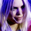
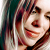
Basically what I did here was select a color from the dropdown menu that appeared in the image, then moved the sliders back and forth until the odd lighting against her face and hair started to disappear and blended more with her natural skin and hair tones. That's the key to removing weird lighting pretty much: experiment by moving the sliders. You can always go back and readjust later if you need to.
So now we've gone from:
--->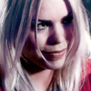
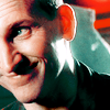
Now this is something I do alot after I make a selective color layer.
03. Duplicate the selective color layer you just made and set it to Color. I left it at 100% but depending on the image, you can lower the opacity until you're satisfied.
That took a bit of the blue/magenta out of her hair, thusly:
--->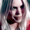
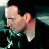
04. Add a Hue/Saturation adjustment layer, found under the same place at the bottom of the layers palatte as selective color. Set the Saturation to +35.
This obviously adds color since it was looking kind of bland.
--->
I wanted this icon to have more yellow/green tones to bring out her hair more, so...
05. Make another Selective Color adjustment layer with these settings:
Reds:
-Cyan (-25)
-Magenta (-15)
-Yellow (+10)
-Black (+1)
Neutrals:
-Cyan (+3)
-Magenta (+1)
-Yellow (+6)
-Black (-4)
Blacks:
-Cyan (0)
-Magenta (0)
-Yellow (+10)
-Black (+3)
--->
I could have stopped there, but I wasn't wholly satisfied so...
06. Duplicate the selective color layer you just made and leave it at Normal but drop the opacity down to 40%. Obviously you can play with the opacity until you're happy with the coloring.
--->
Sometimes I get paranoid that on monitors with crisper pictures than mine my icons will look pixelated, as it's happened it the past, so when I make an icon with bright colors, I'll usually go back to my base image, duplicate it, zoom in, then use the smudge tool to smooth the brighter pixel squares so they don't stand out as much. This step is purely up to you if you feel you need it.
Also, if after you flatten your image you feel the need to sharpen, go ahead. I usually do, then go to Edit > Fade Sharpen and lower the opacity quite a bit, since I found that on crisper monitors I was oversharpening, but surprisingly with this image I didn't feel the need to sharpen at all.
--->
And that's it! Hope it was helpful!
Similar icons using same technique:
(this one only had one screen layer at the start, not two, and I smoothed out her skin)
(this one I sharpened at the end after I'd flattened the image [Layer > Flatten Image], then I went to Edit > Fade Sharpen and put it at 35%)
(this one I smoothed out his skin, then flattened, sharpened, and faded the sharpen to 50%)
(no smoothing was done and after I flattened I sharpened, then faded it to 40%)

<<<< Icon Tutorial #1: End of the World

--->

For Photoshop 7. Non-translatable as it uses Selective Coloring.
This works best on images that have odd lighting across them. It shows you how to remove that so it doesn't look like there's big splotches of color across your image.
01. I took this image, cropped and resized it, duplicated the base layer twice and set both to screen, then flattened the image.
--->

02. Next I added a Selective Color adjustment layer over my base by clicking the half black/half white circle at the bottom of my layers palette and choosing selective color. This will place a new layer over the base layer, so I can adjust it later if I need to. If I had gone up in the toolbar and choosen Image > Adjustments > Selective Color, it would change my layer and I couldn't edit it if I messed up.
So here were my settings; under the dropdown menu I chose a color and did this:
Yellows:
-Cyan (-100)
-Magenta (+100)
-Yellow (-100)
-Black (+100)
Blues:
-Cyan (-12)
-Magenta (-30)
-Yellow (+50)
-Black (+11)
Magentas:
-Cyan (-29)
-Magenta (-7)
-Yellow (+100)
-Blacks (+10)
Whites:
-Cyan (-3)
-Magenta (-2)
-Yellow (-2)
-Black (-3)
Neutrals:
-Cyan (-2)
-Magenta (-7)
-Yellow (-6)
-Black (+3)
Blacks:
-Cyan (0)
-Magenta (0)
-Yellow (0)
-Black (+3)
Basically what I did here was select a color from the dropdown menu that appeared in the image, then moved the sliders back and forth until the odd lighting against her face and hair started to disappear and blended more with her natural skin and hair tones. That's the key to removing weird lighting pretty much: experiment by moving the sliders. You can always go back and readjust later if you need to.
So now we've gone from:
--->

Now this is something I do alot after I make a selective color layer.
03. Duplicate the selective color layer you just made and set it to Color. I left it at 100% but depending on the image, you can lower the opacity until you're satisfied.
That took a bit of the blue/magenta out of her hair, thusly:
--->

04. Add a Hue/Saturation adjustment layer, found under the same place at the bottom of the layers palatte as selective color. Set the Saturation to +35.
This obviously adds color since it was looking kind of bland.
--->

I wanted this icon to have more yellow/green tones to bring out her hair more, so...
05. Make another Selective Color adjustment layer with these settings:
Reds:
-Cyan (-25)
-Magenta (-15)
-Yellow (+10)
-Black (+1)
Neutrals:
-Cyan (+3)
-Magenta (+1)
-Yellow (+6)
-Black (-4)
Blacks:
-Cyan (0)
-Magenta (0)
-Yellow (+10)
-Black (+3)
--->

I could have stopped there, but I wasn't wholly satisfied so...
06. Duplicate the selective color layer you just made and leave it at Normal but drop the opacity down to 40%. Obviously you can play with the opacity until you're happy with the coloring.
--->

Sometimes I get paranoid that on monitors with crisper pictures than mine my icons will look pixelated, as it's happened it the past, so when I make an icon with bright colors, I'll usually go back to my base image, duplicate it, zoom in, then use the smudge tool to smooth the brighter pixel squares so they don't stand out as much. This step is purely up to you if you feel you need it.
Also, if after you flatten your image you feel the need to sharpen, go ahead. I usually do, then go to Edit > Fade Sharpen and lower the opacity quite a bit, since I found that on crisper monitors I was oversharpening, but surprisingly with this image I didn't feel the need to sharpen at all.
--->
And that's it! Hope it was helpful!
Similar icons using same technique:

(this one only had one screen layer at the start, not two, and I smoothed out her skin)

(this one I sharpened at the end after I'd flattened the image [Layer > Flatten Image], then I went to Edit > Fade Sharpen and put it at 35%)

(this one I smoothed out his skin, then flattened, sharpened, and faded the sharpen to 50%)

(no smoothing was done and after I flattened I sharpened, then faded it to 40%)
<<<< Icon Tutorial #1: End of the World