Tutorial: Sam from Supernatural
We're going from: 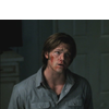
to:
Requested by gigi737
SUPER IMPORTANT NOTE: PLEASE TAKE A MOMENT TO READ
As some of you may have noticed, I opened a shop @IQ and among the items I sell there are also tutorials, guides, tips&tricks and psds.
Does that mean that you will have to buy them from the shop or that I will judge you if don't?
HELL, NO. If you are a participant of IQ and have ten thousands points in your pocket, it's still FAIR GAME to ask for tuts, psds, guides and whatnot HERE, FOR FREE.
I know this will probably mean I won't get a single request for those items but I honestly don't care. And please believe me when I say that you're still welcome to ask here, for free. It's something I'm willing to sell so I listed them among the other goods, that's all.
Thank you so much for your attention, now moving on! c:
STEP ONE

>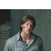
I created a new Curves layer and I set it to Screen, 100% opacity, to brighten my base.
As I've said in other tutorials, you can use any Adjustment Layer to do this. You're going to leave the settings untouched, so it doesn't matter if it's a Selective Color layer or a Hue/Saturation layer.
STEPS TWO TO FOUR

>
>
>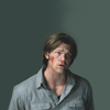
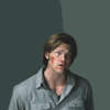
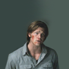
I needed to cover the empty space on top and to even out the background so I created a new layer and painted all around subject. I picked two colors from the original backround, so that the left side of the icon would be darker than the right side. At first I was pretty inaccurate, and the border between the two colors looked abrupt:

Then I created another layer and I picked a soft round brush; with the Smudge tool (Sample All Layers checked) I proceeded to even out the harsh border. Again, I wan't accurate and some of Sam's head got smudged in the process:
Now, a nifty trick I learnt some time ago: you can use a layer to mask another layer. It works like this:
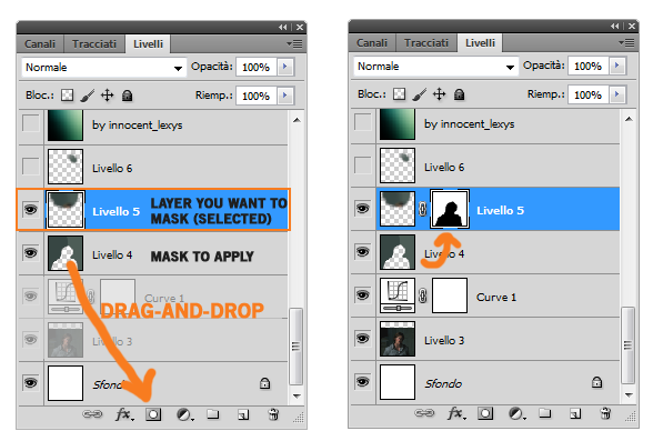
Basically, the transparent area becomes your mask. If I had wanted to mask the background instead of Sam, I would have used the same trick and then inverted the mask.
Then I created another layer and fixed the small darker spot on the right of Sam's head:

STEP FIVE

>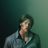
Picking two colors for the background (instead of a single color) helps making it more interesting and with less effort. It also gives you something to begin with: in my case, I built the contrast from there, so that the left side would have been the darker one, while the right side needed to be brighter. That's why I picked this texture by innocent-lexys:
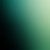
I set it to Soft Light, 100% opacity.
STEP SIX

>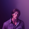
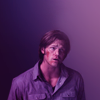
I created a copy-merged layer and opened the Variation panel. Now, the reason why I love Variations so much is that you can make both subtle and dramatic changes with a couple of clicks. And that's what I did here:
Fine ||||| x | Coarse
Midtones: More Magenta x1
Fine || x |||| Coarse
Saturation: Less Saturation x1
From green to purple in two clicks! Amazing. I love Variations. Use Variations.
STEP SEVEN

>
I used this texture by innocent-lexys to brighten up a tad the upper side of the icon:
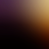
The effect is very subtle because I lowered the opacity to 39% and fill to 24%.
STEP EIGHT

>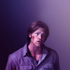
The contrast was gone, so I created a Curves layer and clicked on Auto. It removed too much lovely purple, so I lowered the opacity of this layer to 47%.
STEP NINE

>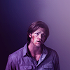
I created a copy-merged layer and I sharpened it with Paint Daubs (Brush type: Simple, Size: 1, Sharpness: 1). I lowered the opacity to 50%.
STEP TEN

>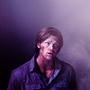
Another texture by innocent-lexys to play with the contrast/lighting:
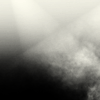
Soft Light, 95% opacity.
STEP ELEVEN

>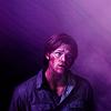
At this point the contrast was nice, but the Saturation was almost gone. So I picked this texture of mine:
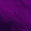
I set it to Soft Light, 100% opacity and I masked the bit covering his shirt.
STEP TWELVE

>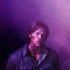
I picked this texture by raiindust:
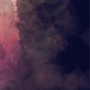
The brighter part was on the wrong side so I flipped it horizontally and then set it to Screen, 30% opacity.
STEP THIRTEEN

>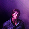
Again, I wasn't happy with the contrast and his face had become a tad too washed out. So I used a previous partial result to fix both issues. Basically, I created a copy-merged layers of the first layers (partial result of step four) and I set it to Soft Light, 76% opacity.
I often do this when something was right in the beginning but got wrong during the process: I go back to a previous partial result and play with the blanding mode till I'm satisfied with the outcome.
STEP FOURTEEN

>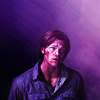
I created another Curves layer to increase the contrast:
RGB - Point One: O 49 I 48, Point Two: O 181 I 165
STEP FIFTEEN

>
I wanted to brighten up a bit his shirt, so I picked this texture of mine:
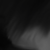
And I set it to Screen, 40% opacity, 33% fill.
STEP SIXTEEN

>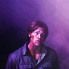
Another texture of mine, to brighten up the icon and to add some subtle cyan hues and a grunge quality:
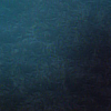
Screen, 25% opacity.
STEP SEVENTEEN

>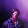
I added a Brightness/Contrast layer because I'm obsessed with contrast. c:
Brightness: 0
Contrast: 25
For previous versions of PS:
Brightness: 0
Contrast: 7
STEP EIGHTTEEN

>
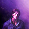
Obsessed with contrast, I was saying. So time to check it with an Auto-Curves layer!
However, the result was a bit to strong, so I masked the right side of this layer because it brightened that part of the icon a bit too much. I also lowered the opacity to 68%.
STEP NINETEEN

>
I spotted this texture of innocent-lexys:
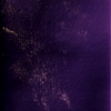
It was purple and dark so it wouldn't mess up with the coloring/contrast, plus it had those pale yellow details that were perfect to make the dark side of the icon more interesting.
I set it to Screen, 72% opacity.
STEP TWENTY

>
Last layer, what could it possibly do? Fix the contrast, right. c:
I used Levels for a change:
Input: 0 0.91 255
And done! o/
DOWNLOAD PSD @BOX.NET
- PS CS4+
- Previous versions

to:

Requested by gigi737
SUPER IMPORTANT NOTE: PLEASE TAKE A MOMENT TO READ
As some of you may have noticed, I opened a shop @IQ and among the items I sell there are also tutorials, guides, tips&tricks and psds.
Does that mean that you will have to buy them from the shop or that I will judge you if don't?
HELL, NO. If you are a participant of IQ and have ten thousands points in your pocket, it's still FAIR GAME to ask for tuts, psds, guides and whatnot HERE, FOR FREE.
I know this will probably mean I won't get a single request for those items but I honestly don't care. And please believe me when I say that you're still welcome to ask here, for free. It's something I'm willing to sell so I listed them among the other goods, that's all.
Thank you so much for your attention, now moving on! c:
STEP ONE

>

I created a new Curves layer and I set it to Screen, 100% opacity, to brighten my base.
As I've said in other tutorials, you can use any Adjustment Layer to do this. You're going to leave the settings untouched, so it doesn't matter if it's a Selective Color layer or a Hue/Saturation layer.
STEPS TWO TO FOUR

>

>

>

I needed to cover the empty space on top and to even out the background so I created a new layer and painted all around subject. I picked two colors from the original backround, so that the left side of the icon would be darker than the right side. At first I was pretty inaccurate, and the border between the two colors looked abrupt:

Then I created another layer and I picked a soft round brush; with the Smudge tool (Sample All Layers checked) I proceeded to even out the harsh border. Again, I wan't accurate and some of Sam's head got smudged in the process:

Now, a nifty trick I learnt some time ago: you can use a layer to mask another layer. It works like this:

Basically, the transparent area becomes your mask. If I had wanted to mask the background instead of Sam, I would have used the same trick and then inverted the mask.
Then I created another layer and fixed the small darker spot on the right of Sam's head:

STEP FIVE

>

Picking two colors for the background (instead of a single color) helps making it more interesting and with less effort. It also gives you something to begin with: in my case, I built the contrast from there, so that the left side would have been the darker one, while the right side needed to be brighter. That's why I picked this texture by innocent-lexys:

I set it to Soft Light, 100% opacity.
STEP SIX

>

I created a copy-merged layer and opened the Variation panel. Now, the reason why I love Variations so much is that you can make both subtle and dramatic changes with a couple of clicks. And that's what I did here:
Fine ||||| x | Coarse
Midtones: More Magenta x1
Fine || x |||| Coarse
Saturation: Less Saturation x1
From green to purple in two clicks! Amazing. I love Variations. Use Variations.
STEP SEVEN

>

I used this texture by innocent-lexys to brighten up a tad the upper side of the icon:

The effect is very subtle because I lowered the opacity to 39% and fill to 24%.
STEP EIGHT

>

The contrast was gone, so I created a Curves layer and clicked on Auto. It removed too much lovely purple, so I lowered the opacity of this layer to 47%.
STEP NINE

>

I created a copy-merged layer and I sharpened it with Paint Daubs (Brush type: Simple, Size: 1, Sharpness: 1). I lowered the opacity to 50%.
STEP TEN

>

Another texture by innocent-lexys to play with the contrast/lighting:

Soft Light, 95% opacity.
STEP ELEVEN

>

At this point the contrast was nice, but the Saturation was almost gone. So I picked this texture of mine:

I set it to Soft Light, 100% opacity and I masked the bit covering his shirt.
STEP TWELVE

>

I picked this texture by raiindust:

The brighter part was on the wrong side so I flipped it horizontally and then set it to Screen, 30% opacity.
STEP THIRTEEN

>

Again, I wasn't happy with the contrast and his face had become a tad too washed out. So I used a previous partial result to fix both issues. Basically, I created a copy-merged layers of the first layers (partial result of step four) and I set it to Soft Light, 76% opacity.
I often do this when something was right in the beginning but got wrong during the process: I go back to a previous partial result and play with the blanding mode till I'm satisfied with the outcome.
STEP FOURTEEN

>

I created another Curves layer to increase the contrast:
RGB - Point One: O 49 I 48, Point Two: O 181 I 165
STEP FIFTEEN

>

I wanted to brighten up a bit his shirt, so I picked this texture of mine:

And I set it to Screen, 40% opacity, 33% fill.
STEP SIXTEEN

>

Another texture of mine, to brighten up the icon and to add some subtle cyan hues and a grunge quality:

Screen, 25% opacity.
STEP SEVENTEEN

>

I added a Brightness/Contrast layer because I'm obsessed with contrast. c:
Brightness: 0
Contrast: 25
For previous versions of PS:
Brightness: 0
Contrast: 7
STEP EIGHTTEEN

>

Obsessed with contrast, I was saying. So time to check it with an Auto-Curves layer!
However, the result was a bit to strong, so I masked the right side of this layer because it brightened that part of the icon a bit too much. I also lowered the opacity to 68%.
STEP NINETEEN

>

I spotted this texture of innocent-lexys:

It was purple and dark so it wouldn't mess up with the coloring/contrast, plus it had those pale yellow details that were perfect to make the dark side of the icon more interesting.
I set it to Screen, 72% opacity.
STEP TWENTY

>

Last layer, what could it possibly do? Fix the contrast, right. c:
I used Levels for a change:
Input: 0 0.91 255
And done! o/
DOWNLOAD PSD @BOX.NET
- PS CS4+
- Previous versions