19 icons + pimping
12 icons for the last round @turbo_rumble + 7 alts
+ some pimping
01 - 04
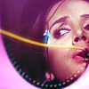
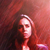
01 | 100x100
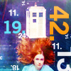
A 100x100 canvas may seem tiny, but it isn't, actually.
I chose the TARDIS to convey the basic idea "It's bigger on the inside!", and I picked that picture of Amy because she's floating in the outer space, and the outer space just fits perfectly in a 100x100 canvas.
And numbers are book references: 19 and 42 are significant for those who read The Dark Tower and The Hitchhiker's Guide to the Galaxy, as well as 100x100 is significant to those who make icons.
02 | Square
The concept behind this one is related to the idea I tried to convey with the 100x100 icon. Icons are square boxes, but the square is only the frame, the external shape of the icon.
Somehow, it's like Echo's body. It's the external shape, but she can be so many people at once! You put your own tastes, your own personality in the icons you make.
And icons don't even have to be square. The 100x100 canvas is square, but the actual shape of the icon is up to you. This is the reason why I used that half oval-shaped texture.
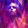
03 | Color you like the most
The Color Wheel was amazing here, it gave me three shades of purple. And purple is the color I like the most, period.
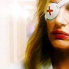
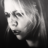
04 | Color you like the least
I spinned the Wheel and I had a blue, a vibrant fuchsia and a pale grey-ish brown. The latter was totally my least favourite so I picked a brown-y cap of Legend of the Seeker.
The actual icon is not so beige-ish, so I guess I kind of cheated here. But I did use a couple of beige-ish textures!
05-08
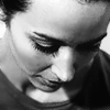
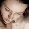
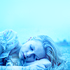
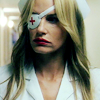
05 | Monochromatic
To me, monochromatic somehow means simple and elegant. I'm quite out of my comfort zone here, because muted coloring isn't my cup of tea. While making this icon I had to restrain myself from pimping the Vibrance up and go crazy with the coloring.
But in the end, I'm pretty satisfied with the outcome. LOL this is what I thought at first. Now I think she looks like a corpse, but never mind.
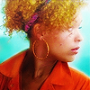
06 | Trend
COLORFUL! VIBRANT! SACCHARINE!
07 | Texture
I LOVE TEXTURES. I love subtle b/w textures as well as freakingly colorful ones. I couldn't live without textures.
And lately, I've been using a lot of brush strokes textures. I just adore the painting look you can achive with them.
08 | Inspiration
There were some beautiful b/w icons in the inspirational posts, and I love b/w icons, but I don't go the b/w way unless anything else fails. Which is too bad, because really, b/w icons can be so beautiful.

09-12
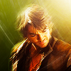
09 | Emulation
It's supposed to be phaust_-ish?
You know, that unique rough look, like the icon got scratched by Wolverine? His icons look like watercolour paintings on that kind of thick, coarse paper, but more vivid and grungy. Tried to re-create that look, not sure I managed to.
10 | Re-create
I usually don't work on the same cap twice, no matter what. Don't know why, I just don't.
But for this challenge I had to, so I picked this icon of Elle Driver.
The crop of the old icon was a bit awkward and the coloring was nice, but a tad bland. For the new one, I went for a close up and a warmer, more vibrant coloring.
And lately I've been experimenting with PS Filters - thanks to this AMAZING guide by Jess, also - so I tried to incorporate this new element of my still-evolving style as well.
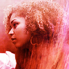
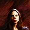
11 | Distinctive
Distinctive coloring (almost monochromatic, vibrant, warm), distinctive crop (medium and centered), distinctive contrast (bold). And my current obsession, brush strokes textures!
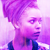
I had to use a Misfits cap here, because I think Misfits is the fandom that made me evolve more as an icon-maker. I found my distinctive style while working with Misfits caps.
Bonus -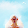
my Distinctive icon for the first round at turbo_rumble: bright colors and bold contrast were already there, but back then I use to work with negative space a lot more!
12 | Out Of My Box
OMG I CAN'T BLEND PROPERLY! I know the theory - Blending Modes & Layer Masks - but I really don't know how to blend. Took me a couple of days to make this icon, I kept trying to blend different caps and failing at it badly!
HOW CAN YOU DO THAT? I hate blending soooo much.
Bonus -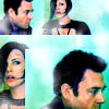
my Out Of Your Box icon for the first round at turbo_rumble: I'm not very confident with blocking still now, but I gave it a try a couple of times and I handle it waaaaay better than blending. BLENDING IS EVIL.
ALTS
100x100, Colour you like the least, Textures, Inspiration
13-16
Emulation, Re-create, Out of your box
17-19
And I'm so proud to tell you that I placed first and I also won the Most Valuable Player award! ♥ ♥ ♥


To reiterate:
Feel free to ask for tuts/psds.
Do not alter | claim as you own | redistribute. And please, do not hotlink!
Comments are ♥ ♥ ♥
PIMPING

Special challenge: 20in20 @trope_overdosed

Group challenge 004: Guess the Maker! @wonderous-stuff
+ some pimping
01 - 04
01 | 100x100
A 100x100 canvas may seem tiny, but it isn't, actually.
I chose the TARDIS to convey the basic idea "It's bigger on the inside!", and I picked that picture of Amy because she's floating in the outer space, and the outer space just fits perfectly in a 100x100 canvas.
And numbers are book references: 19 and 42 are significant for those who read The Dark Tower and The Hitchhiker's Guide to the Galaxy, as well as 100x100 is significant to those who make icons.
02 | Square
The concept behind this one is related to the idea I tried to convey with the 100x100 icon. Icons are square boxes, but the square is only the frame, the external shape of the icon.
Somehow, it's like Echo's body. It's the external shape, but she can be so many people at once! You put your own tastes, your own personality in the icons you make.
And icons don't even have to be square. The 100x100 canvas is square, but the actual shape of the icon is up to you. This is the reason why I used that half oval-shaped texture.
03 | Color you like the most
The Color Wheel was amazing here, it gave me three shades of purple. And purple is the color I like the most, period.
04 | Color you like the least
I spinned the Wheel and I had a blue, a vibrant fuchsia and a pale grey-ish brown. The latter was totally my least favourite so I picked a brown-y cap of Legend of the Seeker.
The actual icon is not so beige-ish, so I guess I kind of cheated here. But I did use a couple of beige-ish textures!
05-08
05 | Monochromatic
To me, monochromatic somehow means simple and elegant. I'm quite out of my comfort zone here, because muted coloring isn't my cup of tea. While making this icon I had to restrain myself from pimping the Vibrance up and go crazy with the coloring.
But in the end, I'm pretty satisfied with the outcome. LOL this is what I thought at first. Now I think she looks like a corpse, but never mind.
06 | Trend
COLORFUL! VIBRANT! SACCHARINE!
07 | Texture
I LOVE TEXTURES. I love subtle b/w textures as well as freakingly colorful ones. I couldn't live without textures.
And lately, I've been using a lot of brush strokes textures. I just adore the painting look you can achive with them.
08 | Inspiration
There were some beautiful b/w icons in the inspirational posts, and I love b/w icons, but I don't go the b/w way unless anything else fails. Which is too bad, because really, b/w icons can be so beautiful.
09-12
09 | Emulation
It's supposed to be phaust_-ish?
You know, that unique rough look, like the icon got scratched by Wolverine? His icons look like watercolour paintings on that kind of thick, coarse paper, but more vivid and grungy. Tried to re-create that look, not sure I managed to.
10 | Re-create
I usually don't work on the same cap twice, no matter what. Don't know why, I just don't.
But for this challenge I had to, so I picked this icon of Elle Driver.
The crop of the old icon was a bit awkward and the coloring was nice, but a tad bland. For the new one, I went for a close up and a warmer, more vibrant coloring.
And lately I've been experimenting with PS Filters - thanks to this AMAZING guide by Jess, also - so I tried to incorporate this new element of my still-evolving style as well.
11 | Distinctive
Distinctive coloring (almost monochromatic, vibrant, warm), distinctive crop (medium and centered), distinctive contrast (bold). And my current obsession, brush strokes textures!
I had to use a Misfits cap here, because I think Misfits is the fandom that made me evolve more as an icon-maker. I found my distinctive style while working with Misfits caps.
Bonus -
my Distinctive icon for the first round at turbo_rumble: bright colors and bold contrast were already there, but back then I use to work with negative space a lot more!
12 | Out Of My Box
OMG I CAN'T BLEND PROPERLY! I know the theory - Blending Modes & Layer Masks - but I really don't know how to blend. Took me a couple of days to make this icon, I kept trying to blend different caps and failing at it badly!
HOW CAN YOU DO THAT? I hate blending soooo much.
Bonus -
my Out Of Your Box icon for the first round at turbo_rumble: I'm not very confident with blocking still now, but I gave it a try a couple of times and I handle it waaaaay better than blending. BLENDING IS EVIL.
ALTS
100x100, Colour you like the least, Textures, Inspiration
13-16
Emulation, Re-create, Out of your box
17-19
And I'm so proud to tell you that I placed first and I also won the Most Valuable Player award! ♥ ♥ ♥
To reiterate:
Feel free to ask for tuts/psds.
Do not alter | claim as you own | redistribute. And please, do not hotlink!
Comments are ♥ ♥ ♥
PIMPING
Special challenge: 20in20 @trope_overdosed
Group challenge 004: Guess the Maker! @wonderous-stuff