Rachael from Blade Runner
We're going from: 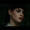
to: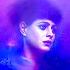
or: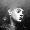
STEP ONE

>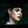
You know what I did here. Step one is always Auto-Curves!
STEP TWO

>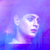
To hide the black borders I decided to use this texture by innocent_lexys:
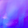
I picked this one because I needed a texture bright enough to hide the borders, but not so bright that it would hid the subject too, if set to Screen.
I chose it also because of its cold hues: I wanted the coloring to match the theme, which was Defrosting Ice Queen.
STEP THREE

>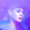
The borders were still visible, especially the bottom one, so I created a new layer and I used this technique to make the whole thing look more even. I worked on the background mostly, but I also smudged her neck to hide the border between her skin and her blouse.
STEP FOUR

>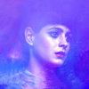
It was a little too bright, so I created a Curves layer to darken the picture:
RGB - One point: O: 145 I: 178
STEP FIVE

>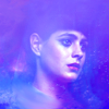
A little more smudging/blurring to even out the area around her neck.
STEP SIX

>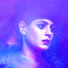
At this stage I was satisfied with the overall look, but I needed to work on the contrast because the icon was a tad plain. So went to Select > All, Edit > Copy Merged, Edit > Paste and I set this layer to Overlay, 51% opacity. This way, I also enhanced the colors a little.
STEP SEVEN

>
The bottom left area still looked a tad too bright, so I picked this texture by innocent_lexys:
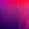
And I set it to Overlay, 65% opacity. I masked the right part of it because the effect on her face was a tad overwhelming and I didn't need to darken the background on the right side.
STEP EIGHT

>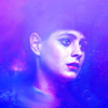
I created a Gradient Fill layer, a simple black and white one, going from bottom to top. I set it to Soft Light, 56% opacity, to have a brighter area on top and a darker area on the bottom. This is something I often do, because usually, when you're working with a close/medium crop, you have the eyes/hair on top and the neck on the bottom. Setting a b/w gradient to Soft Light brightens the eyes area and enhances the natural shadows that the chin casts on the neck.
COLOUR VERSION
STEP NINE

>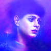
It still lacked some contrast in my opinion, so I created three layers and used a soft round brush to add some darker spots:
1 -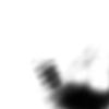
To enhance the shadow on the bottom right corner. Hard Light, 28% opacity.
2&3 -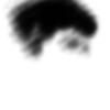
To add some depth to her eyes and to recreate some kind of hair shape - her hairdo was pretty round and regular to begin with, so it wasn't that difficult. Both those layers are set to Soft Light, 100% opacity.
STEP TEN

>
I created a Vibrance layer:
Vibrance: +36
If you don't have Vibrance:
Create a Hue/Saturation layer instead:
Master: 0 +13 0
Blue: 0 +13 0
Magenta: 0 +5 0
STEP ELEVEN

>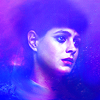
Copy Merged & Paste. I wanted to sharpen it so I went to Filter > Artistic > Paint Daubs:
Brush Size: 1
Sharpness: 1
I set this layer to Normal, 63% opacity. I used Paint Daubs instead of the Sharpen Filter because I think it makes the icon look more like a painting.
STEP TWELVE

>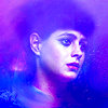
Still lacked some contrast, so I created a new Levels layer:
RGB - Input: 23 1.33 255
I darkened shadows and brightened midtones, but I didn't work on highlights because they were already bright.
STEP THIRTEEN

>
A couple of layers to add the final touches:
1 -
Again, to add some darker spots on her fake!hair. Set to Normal, 18% opacity.
2. I used the Blur Tool on a new layer with the Sample All Layers feature checked to soften the line of her jaw and the pretty grainy spot on her neck.
DOWNLOAD PSD @BOX.NET
- PS CS4+
- Vibrance free
B&W VERSION
STEP NINE

>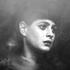
I created a new Gadient Map layer to desaturate the picture (from black to white). I set it to Normal, 100% opacity.
STEP TEN

>
I created a new Curves layer and clicked on Auto to check the contrast. I lowered the opacity of this layer to 73%.
STEP ELEVEN

>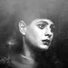
Copy Merged & Paste. I used Paint Daubs to sharpen the picture (with the same settings) but I lowered the opacity to 46% instead of 63%, because I wanted the b/w version to look softer.
STEP TWELVE

>
I increased the contrast a little with a Brightness/Contrast layer:
Contrast: +26
Previous versions of PS
Contrast: +6
DOWNLOAD PSD @BOX.NET
- PS CS4+
- Vibrance free
♥ No need to credit.
♥ Comments are much appreciated, but don't feel compelled to. I won't go the pw protected way, no matter how low is the comments/downloads ratio.
♥ Feel free to ask for more tuts/psds.
♥ Got any questions? Ask!

to:

or:

STEP ONE

>

You know what I did here. Step one is always Auto-Curves!
STEP TWO

>

To hide the black borders I decided to use this texture by innocent_lexys:

I picked this one because I needed a texture bright enough to hide the borders, but not so bright that it would hid the subject too, if set to Screen.
I chose it also because of its cold hues: I wanted the coloring to match the theme, which was Defrosting Ice Queen.
STEP THREE

>

The borders were still visible, especially the bottom one, so I created a new layer and I used this technique to make the whole thing look more even. I worked on the background mostly, but I also smudged her neck to hide the border between her skin and her blouse.
STEP FOUR

>

It was a little too bright, so I created a Curves layer to darken the picture:
RGB - One point: O: 145 I: 178
STEP FIVE

>

A little more smudging/blurring to even out the area around her neck.
STEP SIX

>

At this stage I was satisfied with the overall look, but I needed to work on the contrast because the icon was a tad plain. So went to Select > All, Edit > Copy Merged, Edit > Paste and I set this layer to Overlay, 51% opacity. This way, I also enhanced the colors a little.
STEP SEVEN

>

The bottom left area still looked a tad too bright, so I picked this texture by innocent_lexys:

And I set it to Overlay, 65% opacity. I masked the right part of it because the effect on her face was a tad overwhelming and I didn't need to darken the background on the right side.
STEP EIGHT

>

I created a Gradient Fill layer, a simple black and white one, going from bottom to top. I set it to Soft Light, 56% opacity, to have a brighter area on top and a darker area on the bottom. This is something I often do, because usually, when you're working with a close/medium crop, you have the eyes/hair on top and the neck on the bottom. Setting a b/w gradient to Soft Light brightens the eyes area and enhances the natural shadows that the chin casts on the neck.
COLOUR VERSION
STEP NINE

>

It still lacked some contrast in my opinion, so I created three layers and used a soft round brush to add some darker spots:
1 -

To enhance the shadow on the bottom right corner. Hard Light, 28% opacity.
2&3 -

To add some depth to her eyes and to recreate some kind of hair shape - her hairdo was pretty round and regular to begin with, so it wasn't that difficult. Both those layers are set to Soft Light, 100% opacity.
STEP TEN

>

I created a Vibrance layer:
Vibrance: +36
If you don't have Vibrance:
Create a Hue/Saturation layer instead:
Master: 0 +13 0
Blue: 0 +13 0
Magenta: 0 +5 0
STEP ELEVEN

>

Copy Merged & Paste. I wanted to sharpen it so I went to Filter > Artistic > Paint Daubs:
Brush Size: 1
Sharpness: 1
I set this layer to Normal, 63% opacity. I used Paint Daubs instead of the Sharpen Filter because I think it makes the icon look more like a painting.
STEP TWELVE

>

Still lacked some contrast, so I created a new Levels layer:
RGB - Input: 23 1.33 255
I darkened shadows and brightened midtones, but I didn't work on highlights because they were already bright.
STEP THIRTEEN

>

A couple of layers to add the final touches:
1 -

Again, to add some darker spots on her fake!hair. Set to Normal, 18% opacity.
2. I used the Blur Tool on a new layer with the Sample All Layers feature checked to soften the line of her jaw and the pretty grainy spot on her neck.
DOWNLOAD PSD @BOX.NET
- PS CS4+
- Vibrance free
B&W VERSION
STEP NINE

>

I created a new Gadient Map layer to desaturate the picture (from black to white). I set it to Normal, 100% opacity.
STEP TEN

>

I created a new Curves layer and clicked on Auto to check the contrast. I lowered the opacity of this layer to 73%.
STEP ELEVEN

>

Copy Merged & Paste. I used Paint Daubs to sharpen the picture (with the same settings) but I lowered the opacity to 46% instead of 63%, because I wanted the b/w version to look softer.
STEP TWELVE

>

I increased the contrast a little with a Brightness/Contrast layer:
Contrast: +26
Previous versions of PS
Contrast: +6
DOWNLOAD PSD @BOX.NET
- PS CS4+
- Vibrance free
♥ No need to credit.
♥ Comments are much appreciated, but don't feel compelled to. I won't go the pw protected way, no matter how low is the comments/downloads ratio.
♥ Feel free to ask for more tuts/psds.
♥ Got any questions? Ask!