Three tutorials (+ .psds)
TUTORIAL #1
We're going from: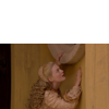
to: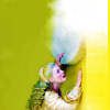
STEP ZERO

>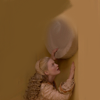
First of all, the crop I chose didn't cover all the 100*100 canvas, so I had to extend the background. I decided not to use the Smudge tool here, because the background of my picture was pretty uneven. You can notice some darker veins, and using the Smudge tool on this kind of background without ending up with a grainy outcome is quite difficult.
So I duplicated my base and painted over it with a soft round brush. I used the Eyedropper tool to pick the colors from my base. As you can see, there are approximately three different areas: you have a light brown on the right side, a darker brown on the left and then there is the grey-ish hue of the window ledge.
I settled for a pretty rought result and dediced to fix it later on.
STEP ONE

>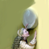
Oh, look, I got rid of all that brown in only one step! How could I possibly do that? Of course, I used Auto-Curves! (Layer > New Adjustment Layer > Curves > Click on Auto)
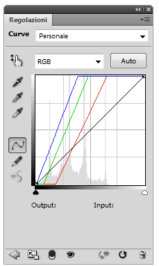
What's amazing about Auto-Curves is that you never know which colors it may bring out. Look how the light brown turned into a pale yellow and more surprisingly, the dark brown is now a navy green!
STEP TWO

>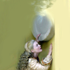
At this stage, I decided to fix the abrupt border between the yellow area and the green area. I created a new layer, and picked the Smudge tool with the Sample All Layers feature checked. I selected this brush:
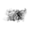
It's called "Big Coal Blot" or something like that (hover over the brushes to read their name).
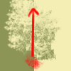
The effect of the Smudge tool with this brush at 100% opacity is quite interesting. Here's an example with a simple two color canvas:

>
>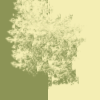
It's just one single stroke from the bottom to the top. As you can see, it provokes some sort of scattering, and in the end you can't see the border between the two colors anymore. And yet, it's very different from the effect of the Blur tool, because the two colors aren't actually blended. I think it's a great tool to add some interest to backgrounds.
And this is exactly what I did to fix that border. It looks like this on a white background:
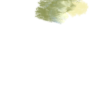
You may not get what you want at your first attempt because it's difficult to anticipate the effect of this brush. It's pretty random, so it might take you a few tries to get it right.
STEP THREE

>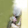
I wasn't happy with the result, so I took this texture by juanxyo:
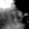
I went to Edit > Transform > Flip Horizontal so that the white spot was exactly above the bit I wanted to fix. I set it to Screen, 100% opacity and masked the part covering the subject.
STEP FOUR

>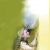
I started working on the coloring. Since the colors were pretty washed out, I began with a Vibrance layer:
Vibrance: +100
Saturation: 0
If you don't have Vibrance:
Create a Hue/Saturation layer instead:
Master: 0 +39 0
Yellow: 0 +11 0
STEP FIVE & SIX

>
>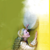
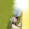
I wanted to enhance the yellow hue, so I created a new layer and painted it a little with a light brown (#a37546). It looks like this on a white background:
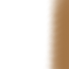
I set this layer to Overlay, 100% opacity and then I duplicated it to make the effect stronger.
STEP SEVEN

>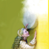
At this point I wanted to fix the background on the left side. There was a darker area around her, with some of the veins of the wall still visible. So I used the Eyedropper tool to select the color and painted a little to even out the area. It looks like this on a white background:
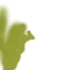
I used a soft brush to fix the background and a hard brush to refine the borders when I got closer to her figure.
STEP EIGHT

>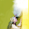
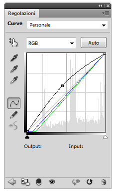
I created a new Curves layer, clicked on Auto to check the contrast and then brightned the picture a little more:
RGB - One point: O 150 I 115
STEP NINE & TEN

>
>
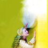
I was happy with the coloring, so I enhanced the colors with two Vibrance layers:
1. Vibrance: +100
2. Vibrance: +62
If you don't have Vibrance:
Replacing the first Vibrance layer with a Hue/Saturation one must have caused a little change in the hues and the contrast so this one is a little tricky, but don't worry, you can still get a pretty close result!
First of all, you need a Levels layer below the Curves one to darken the shadows a little:
RGB, input: 15 1.00 255
Then create a new Hue/Saturation layer above the Curves one:
Master: 0 +19 0
Yellow: +2 0 -13
Now you need a Selective Color layer to enhance the colors a little more. You can't do that with another Hue/Saturation layer because the colors get pretty over-saturated and you also lose some constrast/depth - yeah, I tried and didn't work :D
Reds: 0 +79 0 0
Yellows: 0 0 +75 0
Greens: -81 +70 +11 0
Cyan: +100 +29 0 0
Neutrals: +10 0 +15 0
And finally, if you want her hair to have the same bright, yellow-ish tone of the Vibrance version, you have to create a new layer, pick a green-ish yellow and paint a bit over her hair:
Set this layer to Soft Light, 100% opacity, and you're done!
Oh, and you may notice that I had to adapt the color I picked for this layer:

>
DOWNLOAD PSD @BOX.NET
- PS CS4+
- Vibrance free
TUTORIAL #2
We're going from: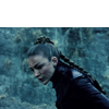
to: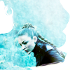
STEP ZERO

>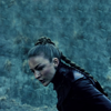
Again, I had to extend the background, but I couldn't use the Smudge tool because the background was very uneven. And I didn't want to paint over the background this time, because I liked the way it looked like - almost like a pattern, somehow texturized.
So I used the Clone Stamp tool! If you're not familiar with this tool, you can check this section of this awesome guide on how to extend backgrounds written by shoqolad.
STEP ONE

>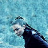
I wanted to brighten up the picture, so I created a Curves layer:
RGB - One point: O 169 I 90

STEP TWO

>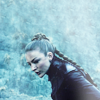
It was lacking contrast and it was a bit flat so I decided to add a light texture to play with the lighting. I picked this one by eamesie:
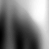
And I set it to Screen, 67% opacity.
STEP THREE

>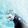
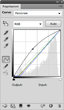
Better, but I wanted more contrast. I added another Curves layer and clicked on Auto. I also brightened up the picture a tad more:
RGB - One point: O 150 I 104
STEP FOUR

>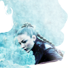
At this stage, I was quite happy with the contrast and lighting, but it still looked flat, somehow. So I decided to add some interest to the composition. I picked this texture by innocent_lexys:

I flipped it horizontally and set it to Screen, 100% opacity.
STEP FIVE

>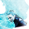
I wanted the cyan hues to be more vivid and bright, so I created a Vibrance layer:
Vibrance: +48
Saturation: +18
If you don't have Vibrance:
Create a Hue/Saturation layer instead:
Master: 0 +39 0
STEP SIX

>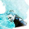
I created a Color Balance layer and I added some green/yellow tones to Midtones and Shadows, mostly.
Midtones: +17 +22 +20
Shadows: +15 +8 -29
STEP SEVEN

>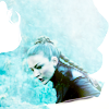
It was still a bit dark and I wanted it to be brighter and colder, so I picked this texture by nokitas:
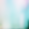
I set it to Soft Light, 100% opacity and masked it a little.
STEP EIGHT

>
Now it was a tad too bright, so I duplicated the base, dragged it to the top and set it to Soft Light, 52% opacity.
And we're done!
DOWNLOAD PSD @BOX.NET
- PS CS4+
- Vibrance free
TUTORIAL #3
We're going from: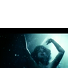
to: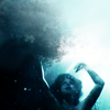
STEP ZERO

>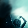
Yeah, guess what, had to extend the background again :D
I used the same technique I used on the first icon - that is, Eyedropper tool to pick colors from the base, and a soft round brush to paint over the empty part of the canvas.
This time it was a little harder to get it right, though, because I had water instead of two walls and a window ledge.
I created a new layer and I painted over the black bar and the white upper part. It looks like this on a white background:
To pick the colors I divided my picture in different areas:
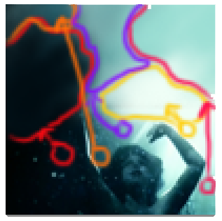
I wasn't very accurate, because all I wanted to do was cover the whole canvas. The outcome of my step zero is often quite rough, because I usually fix things little by little.
STEP ONE

>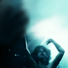
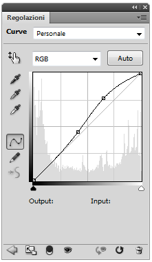
I created a Curves layer to brighten the picture and add some contrast:
RGB - Point one: O 196 I 168; Point two: O 115 I 105
STEP TWO

>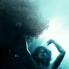
That awesome scattering effect I was talking about in the first tutorial... did I mention that I discovered it while I was working on this icon?
I just wanted to even out the background with the Smudge Tool and I picked that brush by chance. I created another layer, and used the Smudge tool at 100% opacity with the Sample All Layers feature checked. One stroke, and there it was: a wave!
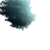
Brilliant, isn't it?
Yeah, I have very little control on my icon-making process. Trials and errors, lucky mistakes, random things all over.
STEP THREE

>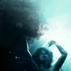
I created another layer and did exactly the same thing on the right side of the icon:
STEP FOUR

>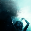
I used this texture found @exposed.com:
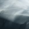
I set it to Soft Light, 73% opacity to add some contrast and make the upper side brighter and the lower side darker.
STEP FIVE

>
At this point I was happy with the coloring, so I created a Curves layer and clicked on Auto to check the contrast. I also used this layer to brighten up the picture a little:
RGB - One point: O 160 I 127
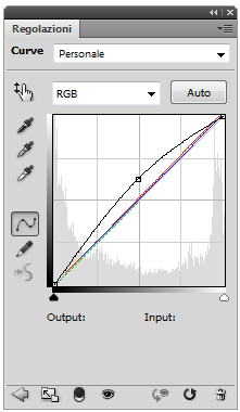
Amd we're done!
DOWNLOAD PSD @BOX.NET
- No Vibrance involved :)
We're going from:

to:

STEP ZERO

>

First of all, the crop I chose didn't cover all the 100*100 canvas, so I had to extend the background. I decided not to use the Smudge tool here, because the background of my picture was pretty uneven. You can notice some darker veins, and using the Smudge tool on this kind of background without ending up with a grainy outcome is quite difficult.
So I duplicated my base and painted over it with a soft round brush. I used the Eyedropper tool to pick the colors from my base. As you can see, there are approximately three different areas: you have a light brown on the right side, a darker brown on the left and then there is the grey-ish hue of the window ledge.
I settled for a pretty rought result and dediced to fix it later on.
STEP ONE

>

Oh, look, I got rid of all that brown in only one step! How could I possibly do that? Of course, I used Auto-Curves! (Layer > New Adjustment Layer > Curves > Click on Auto)

What's amazing about Auto-Curves is that you never know which colors it may bring out. Look how the light brown turned into a pale yellow and more surprisingly, the dark brown is now a navy green!
STEP TWO

>

At this stage, I decided to fix the abrupt border between the yellow area and the green area. I created a new layer, and picked the Smudge tool with the Sample All Layers feature checked. I selected this brush:

It's called "Big Coal Blot" or something like that (hover over the brushes to read their name).
The effect of the Smudge tool with this brush at 100% opacity is quite interesting. Here's an example with a simple two color canvas:

>

>

It's just one single stroke from the bottom to the top. As you can see, it provokes some sort of scattering, and in the end you can't see the border between the two colors anymore. And yet, it's very different from the effect of the Blur tool, because the two colors aren't actually blended. I think it's a great tool to add some interest to backgrounds.
And this is exactly what I did to fix that border. It looks like this on a white background:

You may not get what you want at your first attempt because it's difficult to anticipate the effect of this brush. It's pretty random, so it might take you a few tries to get it right.
STEP THREE

>

I wasn't happy with the result, so I took this texture by juanxyo:

I went to Edit > Transform > Flip Horizontal so that the white spot was exactly above the bit I wanted to fix. I set it to Screen, 100% opacity and masked the part covering the subject.
STEP FOUR

>

I started working on the coloring. Since the colors were pretty washed out, I began with a Vibrance layer:
Vibrance: +100
Saturation: 0
If you don't have Vibrance:
Create a Hue/Saturation layer instead:
Master: 0 +39 0
Yellow: 0 +11 0
STEP FIVE & SIX

>

>

I wanted to enhance the yellow hue, so I created a new layer and painted it a little with a light brown (#a37546). It looks like this on a white background:

I set this layer to Overlay, 100% opacity and then I duplicated it to make the effect stronger.
STEP SEVEN

>

At this point I wanted to fix the background on the left side. There was a darker area around her, with some of the veins of the wall still visible. So I used the Eyedropper tool to select the color and painted a little to even out the area. It looks like this on a white background:

I used a soft brush to fix the background and a hard brush to refine the borders when I got closer to her figure.
STEP EIGHT

>

I created a new Curves layer, clicked on Auto to check the contrast and then brightned the picture a little more:
RGB - One point: O 150 I 115

STEP NINE & TEN

>

>

I was happy with the coloring, so I enhanced the colors with two Vibrance layers:
1. Vibrance: +100
2. Vibrance: +62
If you don't have Vibrance:
Replacing the first Vibrance layer with a Hue/Saturation one must have caused a little change in the hues and the contrast so this one is a little tricky, but don't worry, you can still get a pretty close result!
First of all, you need a Levels layer below the Curves one to darken the shadows a little:
RGB, input: 15 1.00 255
Then create a new Hue/Saturation layer above the Curves one:
Master: 0 +19 0
Yellow: +2 0 -13
Now you need a Selective Color layer to enhance the colors a little more. You can't do that with another Hue/Saturation layer because the colors get pretty over-saturated and you also lose some constrast/depth - yeah, I tried and didn't work :D
Reds: 0 +79 0 0
Yellows: 0 0 +75 0
Greens: -81 +70 +11 0
Cyan: +100 +29 0 0
Neutrals: +10 0 +15 0
And finally, if you want her hair to have the same bright, yellow-ish tone of the Vibrance version, you have to create a new layer, pick a green-ish yellow and paint a bit over her hair:

Set this layer to Soft Light, 100% opacity, and you're done!
Oh, and you may notice that I had to adapt the color I picked for this layer:

>

DOWNLOAD PSD @BOX.NET
- PS CS4+
- Vibrance free
TUTORIAL #2
We're going from:

to:

STEP ZERO

>

Again, I had to extend the background, but I couldn't use the Smudge tool because the background was very uneven. And I didn't want to paint over the background this time, because I liked the way it looked like - almost like a pattern, somehow texturized.
So I used the Clone Stamp tool! If you're not familiar with this tool, you can check this section of this awesome guide on how to extend backgrounds written by shoqolad.
STEP ONE

>

I wanted to brighten up the picture, so I created a Curves layer:
RGB - One point: O 169 I 90

STEP TWO

>

It was lacking contrast and it was a bit flat so I decided to add a light texture to play with the lighting. I picked this one by eamesie:

And I set it to Screen, 67% opacity.
STEP THREE

>

Better, but I wanted more contrast. I added another Curves layer and clicked on Auto. I also brightened up the picture a tad more:
RGB - One point: O 150 I 104

STEP FOUR

>

At this stage, I was quite happy with the contrast and lighting, but it still looked flat, somehow. So I decided to add some interest to the composition. I picked this texture by innocent_lexys:

I flipped it horizontally and set it to Screen, 100% opacity.
STEP FIVE

>

I wanted the cyan hues to be more vivid and bright, so I created a Vibrance layer:
Vibrance: +48
Saturation: +18
If you don't have Vibrance:
Create a Hue/Saturation layer instead:
Master: 0 +39 0
STEP SIX

>

I created a Color Balance layer and I added some green/yellow tones to Midtones and Shadows, mostly.
Midtones: +17 +22 +20
Shadows: +15 +8 -29
STEP SEVEN

>

It was still a bit dark and I wanted it to be brighter and colder, so I picked this texture by nokitas:

I set it to Soft Light, 100% opacity and masked it a little.
STEP EIGHT

>

Now it was a tad too bright, so I duplicated the base, dragged it to the top and set it to Soft Light, 52% opacity.
And we're done!
DOWNLOAD PSD @BOX.NET
- PS CS4+
- Vibrance free
TUTORIAL #3
We're going from:

to:

STEP ZERO

>

Yeah, guess what, had to extend the background again :D
I used the same technique I used on the first icon - that is, Eyedropper tool to pick colors from the base, and a soft round brush to paint over the empty part of the canvas.
This time it was a little harder to get it right, though, because I had water instead of two walls and a window ledge.
I created a new layer and I painted over the black bar and the white upper part. It looks like this on a white background:

To pick the colors I divided my picture in different areas:

I wasn't very accurate, because all I wanted to do was cover the whole canvas. The outcome of my step zero is often quite rough, because I usually fix things little by little.
STEP ONE

>

I created a Curves layer to brighten the picture and add some contrast:
RGB - Point one: O 196 I 168; Point two: O 115 I 105

STEP TWO

>

That awesome scattering effect I was talking about in the first tutorial... did I mention that I discovered it while I was working on this icon?
I just wanted to even out the background with the Smudge Tool and I picked that brush by chance. I created another layer, and used the Smudge tool at 100% opacity with the Sample All Layers feature checked. One stroke, and there it was: a wave!

Brilliant, isn't it?
Yeah, I have very little control on my icon-making process. Trials and errors, lucky mistakes, random things all over.
STEP THREE

>

I created another layer and did exactly the same thing on the right side of the icon:

STEP FOUR

>

I used this texture found @exposed.com:

I set it to Soft Light, 73% opacity to add some contrast and make the upper side brighter and the lower side darker.
STEP FIVE

>

At this point I was happy with the coloring, so I created a Curves layer and clicked on Auto to check the contrast. I also used this layer to brighten up the picture a little:
RGB - One point: O 160 I 127

Amd we're done!
DOWNLOAD PSD @BOX.NET
- No Vibrance involved :)