6 PSDs - Glee
val_valerie asked me to write a tut on how to color a Glee cap she provided me with. Well, she provided me with two caps (one - two), but I choose to work on the blonde girl because I prefer making icons of girls/women - pretty hair, long and beautiful eyelashes, you know, that sort of things. :D
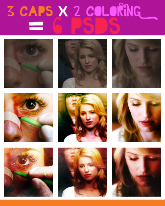
At first, I tried to work with the cap val_valerie provided me with, but for some reason I couldn't get the coloring right. I had never worked with Glee caps, so I had a browse through the gallery of the same Glee episode and I noticed that almost all the caps had similar features:
1. they lack contrast and are quite dark: you have to build contrast working on highlights and shadows;
2. they have a quite natural color scheme, so you can bring out pretty much any coloring you want;
3. they're a bit grainy, so you have to smooth things down a little with the Blur Tool or with some Gaussian Blur.
I don't know if that applies to all Glee episodes, though.
However, since I wasn't going anywhere with this cap, I picked up a couple of caps that catched my attention (one - two) and worked on them instead. I thought that they had similar feautures and issues, so I could build a coloring on them and then tweak the coloring a little to make it fit the cap val_valerie chose.
A twisted process, maybe, but it worked!
Here are the results:
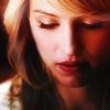
COLORING #1 - CAP #1
>
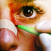
COLORING #2 - CAP #2
>
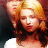
Then I copy-pasted val_valerie's cap under the coloring layers of both psds. I had to work on them a little further - I added/deleted layers, changed the opacity/blending mode of some layers and so on. I ended up with these outcomes:
COLORING #1 - CAP #3
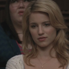
>
COLORING #2 - CAP #3

>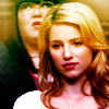
You can see the difference between those two icons:
1. Color scheme: in the first one warm hues such as red, yellow, orange and brown are predominant, while the other coloring is richer and you can see some green and magenta shades here and there.
2. Contrast: in the first one the contrast is softer and you can notice a subtle transition from the brighter area in the upper side of the icon to the darker area in the lower side; in the other one, the contrast is bolder and each area of the icon has its own "chiaroscuro" (hope it makes sense to you, it's difficult to explain it in English :D).
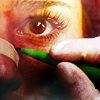
At this point I decided to use coloring #1 on cap #2 and coloring #2 on cap #1. Again, I had to work on the coloring to make it fit the cap in both cases.
COLORING #1 - CAP #2

>
COLORING #2 - CAP #1

>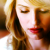
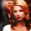
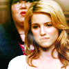
To summarize, I created two different coloring and then I applied them on three different caps. The point is, you can't use the same coloring on two different caps and call it a day. The caps may look similar, but it just won't work.
Here's what you'd get if you just slapped your base under the coloring layers:
COLORING #1 - CAP #3

>
Vs.
COLORING #2 - CAP #3

>
Vs.
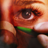
COLORING #1 - CAP #2

>
Vs.
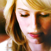
COLORING #2 - CAP #1

>
Vs.
(funny thing about coloring #1, cap #2: I forgot to delete a copy of the other pic set to Screen and it had a weird and yet nice effect, so I decided to keep that layer and I only masked it a little)
You'll be bored to death by now, so here's the thing - the experiment I was talking about in the cut, yeah! - I'm not writing a tut this time. I'm sharing with you six psds and you'll have to figure out which layer does what and why by yourself. There are several differences between the psds, and it's up to you to find them.
I'm a big fan of psds and I think there's a lot to learn from a psd if you know what to look for. Downloading psds and slapping your base under someone else's layers won't do you any good, and you'll waste a good chance to learn some new technique/trick. Not to mention the fact that nine times out of ten you'll end up with a crappy result.
Questions are more than welcome, of course. Feel free to ask and I'll do my best to answer as clearly as possible! :)
PSDs
COLORING #1
1.
- DOWNLOAD @BOX.NET - PS CS4+
- DOWNLOAD @BOX.NET - other versions of PS
2.
- DOWNLOAD @BOX.NET - PS CS4+
- DOWNLOAD @BOX.NET - other versions of PS
3.
- DOWNLOAD @BOX.NET - PS CS4+
- DOWNLOAD @BOX.NET - other versions of PS
COLORING #2
1.
- DOWNLOAD @BOX.NET - PS CS4+
- DOWNLOAD @BOX.NET - other versions of PS
2.
- DOWNLOAD @BOX.NET - PS CS4+
- DOWNLOAD @BOX.NET - other versions of PS
3.
- DOWNLOAD @BOX.NET - PS CS4+
- DOWNLOAD @BOX.NET - other versions of PS
@val_valerie: I know this isn't exactly what you asked for and perhaps you were expecting some kind of regular tut. I hope you don't mind and enjoy the challenge :)
I'll write a regular tut for the other coloring you requested, promise! Btw, I'd love to add credits, do you happen to know whose work is that graphics, by chance?
ETA If you're looking for good Glee tuts, I suggest you to have a look at this one by absolutelybatty and this one by raiindust. They're both very helpful and interesting to read!

At first, I tried to work with the cap val_valerie provided me with, but for some reason I couldn't get the coloring right. I had never worked with Glee caps, so I had a browse through the gallery of the same Glee episode and I noticed that almost all the caps had similar features:
1. they lack contrast and are quite dark: you have to build contrast working on highlights and shadows;
2. they have a quite natural color scheme, so you can bring out pretty much any coloring you want;
3. they're a bit grainy, so you have to smooth things down a little with the Blur Tool or with some Gaussian Blur.
I don't know if that applies to all Glee episodes, though.
However, since I wasn't going anywhere with this cap, I picked up a couple of caps that catched my attention (one - two) and worked on them instead. I thought that they had similar feautures and issues, so I could build a coloring on them and then tweak the coloring a little to make it fit the cap val_valerie chose.
A twisted process, maybe, but it worked!
Here are the results:
COLORING #1 - CAP #1

>

COLORING #2 - CAP #2

>

Then I copy-pasted val_valerie's cap under the coloring layers of both psds. I had to work on them a little further - I added/deleted layers, changed the opacity/blending mode of some layers and so on. I ended up with these outcomes:
COLORING #1 - CAP #3

>

COLORING #2 - CAP #3

>

You can see the difference between those two icons:
1. Color scheme: in the first one warm hues such as red, yellow, orange and brown are predominant, while the other coloring is richer and you can see some green and magenta shades here and there.
2. Contrast: in the first one the contrast is softer and you can notice a subtle transition from the brighter area in the upper side of the icon to the darker area in the lower side; in the other one, the contrast is bolder and each area of the icon has its own "chiaroscuro" (hope it makes sense to you, it's difficult to explain it in English :D).
At this point I decided to use coloring #1 on cap #2 and coloring #2 on cap #1. Again, I had to work on the coloring to make it fit the cap in both cases.
COLORING #1 - CAP #2

>

COLORING #2 - CAP #1

>

To summarize, I created two different coloring and then I applied them on three different caps. The point is, you can't use the same coloring on two different caps and call it a day. The caps may look similar, but it just won't work.
Here's what you'd get if you just slapped your base under the coloring layers:
COLORING #1 - CAP #3

>

Vs.

COLORING #2 - CAP #3

>

Vs.

COLORING #1 - CAP #2

>

Vs.

COLORING #2 - CAP #1

>

Vs.

(funny thing about coloring #1, cap #2: I forgot to delete a copy of the other pic set to Screen and it had a weird and yet nice effect, so I decided to keep that layer and I only masked it a little)
You'll be bored to death by now, so here's the thing - the experiment I was talking about in the cut, yeah! - I'm not writing a tut this time. I'm sharing with you six psds and you'll have to figure out which layer does what and why by yourself. There are several differences between the psds, and it's up to you to find them.
I'm a big fan of psds and I think there's a lot to learn from a psd if you know what to look for. Downloading psds and slapping your base under someone else's layers won't do you any good, and you'll waste a good chance to learn some new technique/trick. Not to mention the fact that nine times out of ten you'll end up with a crappy result.
Questions are more than welcome, of course. Feel free to ask and I'll do my best to answer as clearly as possible! :)
PSDs
COLORING #1
1.

- DOWNLOAD @BOX.NET - PS CS4+
- DOWNLOAD @BOX.NET - other versions of PS
2.

- DOWNLOAD @BOX.NET - PS CS4+
- DOWNLOAD @BOX.NET - other versions of PS
3.

- DOWNLOAD @BOX.NET - PS CS4+
- DOWNLOAD @BOX.NET - other versions of PS
COLORING #2
1.

- DOWNLOAD @BOX.NET - PS CS4+
- DOWNLOAD @BOX.NET - other versions of PS
2.

- DOWNLOAD @BOX.NET - PS CS4+
- DOWNLOAD @BOX.NET - other versions of PS
3.

- DOWNLOAD @BOX.NET - PS CS4+
- DOWNLOAD @BOX.NET - other versions of PS
@val_valerie: I know this isn't exactly what you asked for and perhaps you were expecting some kind of regular tut. I hope you don't mind and enjoy the challenge :)
I'll write a regular tut for the other coloring you requested, promise! Btw, I'd love to add credits, do you happen to know whose work is that graphics, by chance?
ETA If you're looking for good Glee tuts, I suggest you to have a look at this one by absolutelybatty and this one by raiindust. They're both very helpful and interesting to read!