Round 1 - Challenge 4 - Results
Results time! We need more participation! So make sure you all vote/enter the challenges!!!
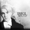
Banner Maker = julie_weasley
Results:
Eliminated:


elite_blue
with -6 votes
bunniesandtraps
with -4 votes
Please stick around to vote for other challenges!
There may be a challenge to allow you back into the competition!
People's Choice:Mod's Choice:

ennelya
with +2 votes
chrislola
Comments:
1. (-1) + (+1) = 0
- the texture is over-powering the image
+ The background is very well done.
2. (-1) + (+1) = 0
+ the texture(s) in the background just work wonderfully, the text is well place, and draco just seems to pop out from the background.
- Malfoy's edges are raggy, the picture is blurry, and I can't see the link between his character and the textured bird on the background.
3. (-2) + (+1) = -1
- image is too blue
+ no comment
- Icon is a bit too blue-ish.
4. (0) + (+2) = +2
+ I like the simplicity of it
+ Great use of texture.
5. (-1) + (+1) = 0
- the icon is really busy
+ I love the color.
6. (-2) + (0) = -2
- the icon is bland: the coloring offers nothing exciting and the text, although well placed, seems almost to blend too much into the icon itself. also, the background really does nothing to accentuate the subjects in the front.
- The crop ruins the focus of the icon.
7. (-1) + (+1) = 0
+ great colouring, nice border and good use of animation
- I think this icon would have been much cooler if in between the Slytherin shot, it could have had images of different Slytherins.
8. (-3) + (+1) = -2
- the icon is too dark
- The icon seems oversaturated.
- I'm pretty sure this is just a screencap of a layout made into an icon. I don't like it because there wan't much done, and it just doesn't translate into a good icon.
+ i really like the coloring =]
9. (-6) + (0) = -6
- looks like the least effort has been made to make this icon, it's also oversharpened
- the crop is awkward: the top of the end is just barely cut off and it seems almost as if the head is just floating. also, the coloring washes out draco's face a bit.
- It's a very simple icon, that needed something more to have a finished look, like another coloring, a new background without Crabbe and Goyle's shoulders...
- The coloring ruins the skin and the overall icon seems oversaturated
- Maybe some text or a border would have improved this. I think it's too plain.
- it too plain and oversharpened
10. (-3) + (0) = -3
- Image is too sharp and could use a little more contrast.
- Icon is a bit too blurry.
- basically it looks like the texture was just added out of no where and the image is very pixelated.
11. (-4) + (0) = -4
- too pixillated/ sharpened. Colouring and text is unattractive
- although the crop and coloring are nice, the text seems to clash with the over all image and the line just helps to make that division seem that much more apparent. a little more contrast would have also been nice.
- It looks like a base than an icon.
- the image looks too sharp
Banners:
Also, here's the banners for those of you who got eliminated and won a place in Challenge 3. Banner made by chlarkkent.


Banner Maker = julie_weasley
Results:
Eliminated:
elite_blue
with -6 votes
bunniesandtraps
with -4 votes
Please stick around to vote for other challenges!
There may be a challenge to allow you back into the competition!
People's Choice:Mod's Choice:
ennelya
with +2 votes
chrislola
Comments:
1. (-1) + (+1) = 0
- the texture is over-powering the image
+ The background is very well done.
2. (-1) + (+1) = 0
+ the texture(s) in the background just work wonderfully, the text is well place, and draco just seems to pop out from the background.
- Malfoy's edges are raggy, the picture is blurry, and I can't see the link between his character and the textured bird on the background.
3. (-2) + (+1) = -1
- image is too blue
+ no comment
- Icon is a bit too blue-ish.
4. (0) + (+2) = +2
+ I like the simplicity of it
+ Great use of texture.
5. (-1) + (+1) = 0
- the icon is really busy
+ I love the color.
6. (-2) + (0) = -2
- the icon is bland: the coloring offers nothing exciting and the text, although well placed, seems almost to blend too much into the icon itself. also, the background really does nothing to accentuate the subjects in the front.
- The crop ruins the focus of the icon.
7. (-1) + (+1) = 0
+ great colouring, nice border and good use of animation
- I think this icon would have been much cooler if in between the Slytherin shot, it could have had images of different Slytherins.
8. (-3) + (+1) = -2
- the icon is too dark
- The icon seems oversaturated.
- I'm pretty sure this is just a screencap of a layout made into an icon. I don't like it because there wan't much done, and it just doesn't translate into a good icon.
+ i really like the coloring =]
9. (-6) + (0) = -6
- looks like the least effort has been made to make this icon, it's also oversharpened
- the crop is awkward: the top of the end is just barely cut off and it seems almost as if the head is just floating. also, the coloring washes out draco's face a bit.
- It's a very simple icon, that needed something more to have a finished look, like another coloring, a new background without Crabbe and Goyle's shoulders...
- The coloring ruins the skin and the overall icon seems oversaturated
- Maybe some text or a border would have improved this. I think it's too plain.
- it too plain and oversharpened
10. (-3) + (0) = -3
- Image is too sharp and could use a little more contrast.
- Icon is a bit too blurry.
- basically it looks like the texture was just added out of no where and the image is very pixelated.
11. (-4) + (0) = -4
- too pixillated/ sharpened. Colouring and text is unattractive
- although the crop and coloring are nice, the text seems to clash with the over all image and the line just helps to make that division seem that much more apparent. a little more contrast would have also been nice.
- It looks like a base than an icon.
- the image looks too sharp
Banners:
Also, here's the banners for those of you who got eliminated and won a place in Challenge 3. Banner made by chlarkkent.