Mess, Er, Process
So, as some of you may know, zombieboyband recently released her sequel to Winter Wolf, titled City Wolf! (GO BUY IT the first one is currently FREE if you have not read it yet) And I had the pleasure of working with her again to create the cover! Which, lemme tell you, she's awesome to work with :D
While making the cover (and discussing the state of e-publishing and indie publishing in general) I got thinking again about the fact that a lot of self-publishing authors have never commissioned a piece of art or graphic design work before. And I know that can make it really intimidating to do, and also (unfortunately) makes it easy for scammy, or at least not-quite-ethical cover designers to prey on authors. So I thought I would just throw together a quick bit on my own process (with screenshots!) and hopefully make it a little less of a mystery as to what goes on at this end of things. Plus I thought people might find it interesting?
So when she contacted me about this cover on the 29th, I already had a good idea what she wanted because we had discussed it awhile back (while working on some promotional stuff for Winter Wolf). I knew she wanted a man in a suit standing in front of a cityscape, basically. Since this was the second book in a series, I wanted it to look like part of a whole, so I was already thinking about how the covers would fit together.
I started out with throwing together a very quick thumbnail in Photoshop to show her what I was thinking. This thumbnail was only done in about an hour, to convey things about pose, color, and flow that aren't easily communicated in words, so that we could discuss the design more easily. Here's that thumbnail:

(Do you like my little M-shaped birds? ;D)
At this point my goal was not to get perfect proportions (I explained that the color bars/layout would line up exactly with the Winter Wolf cover, as well as explaining some of my other decisions like the birds as a subtle visual tie-in to the first cover, which also has birds on it) or anything like a polished product, it was just to get colors and shapes on the screen. I made the silhouette (i.e. the guy on the cover) by color-filling/'painting over' a stock photo, for example.
Feedback was very positive, and some discussion of what it might look like in a more purple color scheme as well. If she hadn't liked the layout/concept, I would have done up some more based on her feedback, until we had a good rough copy that she was happy with. As it was, I started working on the actual cover at this point.
The illustration on the cover is a vector drawing. This basically means that (in its original form) it can be scaled to any size without becoming pixelated or blurry; this is because the image is created by equations rather than colored pixels. Vector images are really useful for a lot of things - logos, for example, should pretty much always be vector images. It's far from necessary for an e-book cover to be a vector, and the actual cover itself is not a vector file; I created a vector illustration for this cover because the illustration I used for the first cover was a lovely stock vector, and I wanted to maintain that style for the cover of the sequel.
Here's a screenshot to illustrate how many vector files went into creating the illustration:
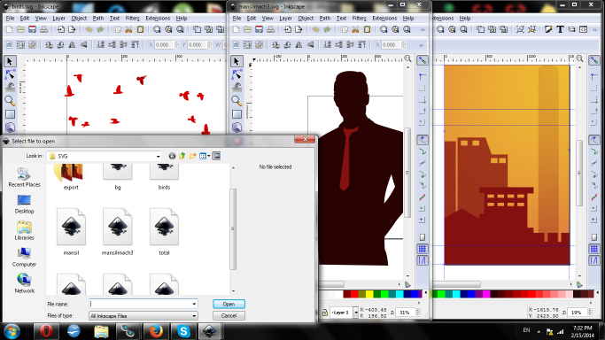
Basically, each element of the illustration (silhouette, birds, cityscape) were created separately, to make it easier to see what I was doing as I edited them. I didn't get any in-progress shots of actually drawing a vector image, but let me tell you, it involves a lot of weirdly bright, contrasting colors to make it easier for me to see what I'm doing as I draw one shape on top of another; the last thing I do is edit the colors to what they're actually supposed to be. You can see this a bit in how bright red the birds are.
Then I put it all together:
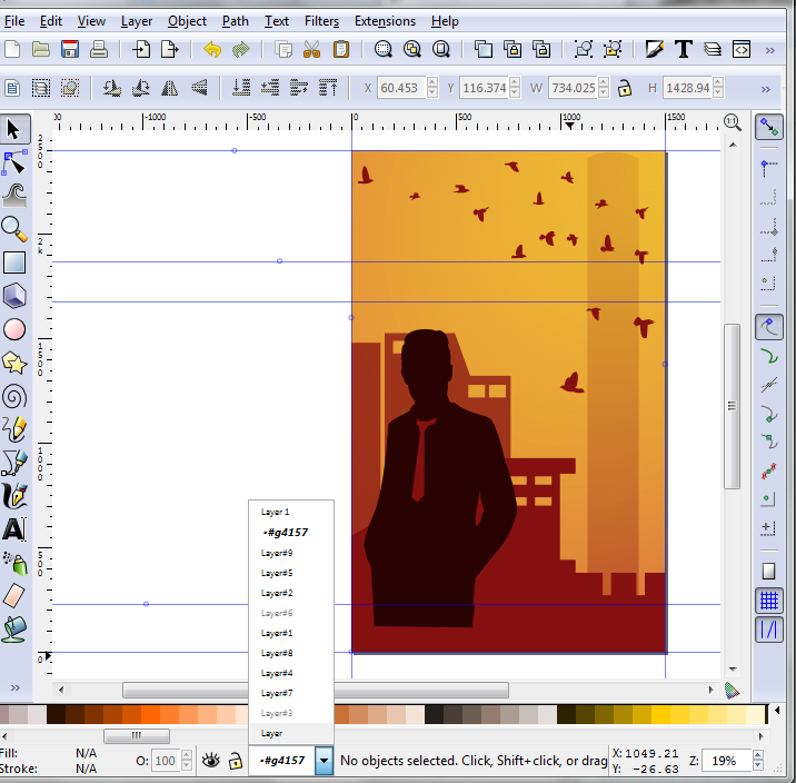
Now, many elements of the cover (the color bars, the text, any textures) are not done in Inkscape (the vector creation program). These were going to be added after I exported it to Photoshop as a raster (pixel) image of the correct size. But it was necessary to keep track of where important elements of the layout were going to be as I created the illustration, to be sure it would flow appropriately; so I used guides - those blue lines - to mark the top and bottom of the title bar, and where the author name bar would come up to. This allowed me to work with the final layout when creating the illustration.
Also, that dropdown list shows all the layers in the illustration, if you're curious.
At this point, I exported the image to Photoshop and completed the rest of the layout. I did not show zombieboyband the illustration by itself - she had already okayed the thumbnail, which I was using in building the illustration. So I built the complete 'rough draft' of the cover before showing it to her, so she could get the full effect. If, for some reason, we had not used the thumbnail, I probably would have showed her the illustration by itself or with rough color bars across it so that any major changes could be made before I started measuring out exact pixels for the layout.
The process for building the layout looked something like this:
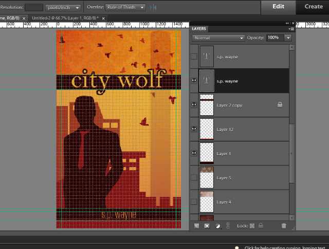
LINES EVERYWHERE.
The blue lines are guides again, like I used on the illustration. This time, I used them to mark exactly where these elements were on the Winter Wolf cover, so that I could line them up perfectly on the City Wolf cover. (Some of the guides are also marking margins for the text.) The grey lines are a grid that basically allow me to easily keep everything 'lined up'; it's usually a good idea to build any graphic design project on a grid, although not absolutely necessary! Also, keep in mind that the grid simplifies itself when I'm this zoomed out (and resizing confused the lines), so some things that look like they're off a grid line here are actually on grid lines.
So at this point I had a rough draft of the cover, and spammed zombieboyband with a bunch of iterations. These images are all sized down; the reason for this is to minimize the time/file space wasted sending them, and because e-book covers are mostly viewed at a smaller size (for example, have a look at the size on the Amazon page). So there's no point in sending a full-sized image when it just wastes space on both of our hard-drives and makes it more difficult to get an accurate idea of how the cover will be viewed 90% of the time.
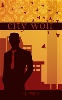
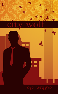
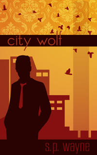
The basic idea is 'here are some things I think look cool, tell me what you like and what you don't like'. Since we had already gone over the thumbnail together, at this point, everything is pretty much just tweaks of varying degrees, and details. For example, picking a texture for the top:
And picking fonts:
My usual technique is to go through a bunch of ideas, pick out the ones that look good, and send them off for feedback. I also give a heads up if I'm going to be working on something in particular soon - ex. the font - in case the author already has some thoughts; in this case, zombieboyband wanted to see the font from the Winter Wolf cover, so I gave her that alongside some others to look at for comparison.
There were also tweaks made to the illustration - she wanted the silhouetted man broader/larger and with a less loose-looking tie, so we went through some iterations of that.
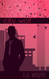
At this point we discovered that we were not quite understanding one another on the size of the silhouette, so I asked for photos of men around the size/shape she was thinking. She mostly sent me a bunch of photos of Gaspard Ulliel, then finally concluded that she mostly wanted the shoulders broader. We are so productive
I also tried a few purple versions for her:
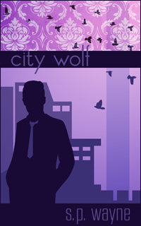
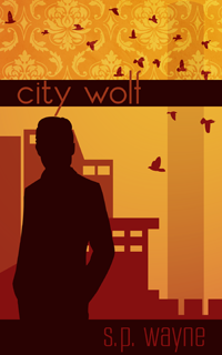
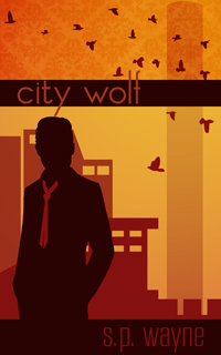
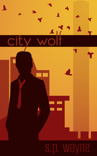
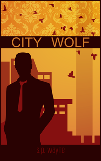
She ended up settling on the red and orange scheme. Other tweaks included the author name, adding some negative space to the bottom, adding a border, and making the birds a bit less intense. Here's the final round of tweaks before the final cover was created:
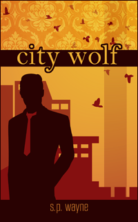
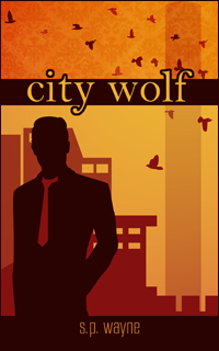
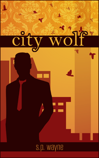
At this point, she declared it perfect, and I sent her the final full-sized images suitable for Amazon/Kindle upload, as well as a smaller image she could use for promotional purposes (specifically, on Tumblr).
And that's how it was done! Hopefully it was educational, or at least entertaining?
While making the cover (and discussing the state of e-publishing and indie publishing in general) I got thinking again about the fact that a lot of self-publishing authors have never commissioned a piece of art or graphic design work before. And I know that can make it really intimidating to do, and also (unfortunately) makes it easy for scammy, or at least not-quite-ethical cover designers to prey on authors. So I thought I would just throw together a quick bit on my own process (with screenshots!) and hopefully make it a little less of a mystery as to what goes on at this end of things. Plus I thought people might find it interesting?
So when she contacted me about this cover on the 29th, I already had a good idea what she wanted because we had discussed it awhile back (while working on some promotional stuff for Winter Wolf). I knew she wanted a man in a suit standing in front of a cityscape, basically. Since this was the second book in a series, I wanted it to look like part of a whole, so I was already thinking about how the covers would fit together.
I started out with throwing together a very quick thumbnail in Photoshop to show her what I was thinking. This thumbnail was only done in about an hour, to convey things about pose, color, and flow that aren't easily communicated in words, so that we could discuss the design more easily. Here's that thumbnail:
(Do you like my little M-shaped birds? ;D)
At this point my goal was not to get perfect proportions (I explained that the color bars/layout would line up exactly with the Winter Wolf cover, as well as explaining some of my other decisions like the birds as a subtle visual tie-in to the first cover, which also has birds on it) or anything like a polished product, it was just to get colors and shapes on the screen. I made the silhouette (i.e. the guy on the cover) by color-filling/'painting over' a stock photo, for example.
Feedback was very positive, and some discussion of what it might look like in a more purple color scheme as well. If she hadn't liked the layout/concept, I would have done up some more based on her feedback, until we had a good rough copy that she was happy with. As it was, I started working on the actual cover at this point.
The illustration on the cover is a vector drawing. This basically means that (in its original form) it can be scaled to any size without becoming pixelated or blurry; this is because the image is created by equations rather than colored pixels. Vector images are really useful for a lot of things - logos, for example, should pretty much always be vector images. It's far from necessary for an e-book cover to be a vector, and the actual cover itself is not a vector file; I created a vector illustration for this cover because the illustration I used for the first cover was a lovely stock vector, and I wanted to maintain that style for the cover of the sequel.
Here's a screenshot to illustrate how many vector files went into creating the illustration:
Basically, each element of the illustration (silhouette, birds, cityscape) were created separately, to make it easier to see what I was doing as I edited them. I didn't get any in-progress shots of actually drawing a vector image, but let me tell you, it involves a lot of weirdly bright, contrasting colors to make it easier for me to see what I'm doing as I draw one shape on top of another; the last thing I do is edit the colors to what they're actually supposed to be. You can see this a bit in how bright red the birds are.
Then I put it all together:
Now, many elements of the cover (the color bars, the text, any textures) are not done in Inkscape (the vector creation program). These were going to be added after I exported it to Photoshop as a raster (pixel) image of the correct size. But it was necessary to keep track of where important elements of the layout were going to be as I created the illustration, to be sure it would flow appropriately; so I used guides - those blue lines - to mark the top and bottom of the title bar, and where the author name bar would come up to. This allowed me to work with the final layout when creating the illustration.
Also, that dropdown list shows all the layers in the illustration, if you're curious.
At this point, I exported the image to Photoshop and completed the rest of the layout. I did not show zombieboyband the illustration by itself - she had already okayed the thumbnail, which I was using in building the illustration. So I built the complete 'rough draft' of the cover before showing it to her, so she could get the full effect. If, for some reason, we had not used the thumbnail, I probably would have showed her the illustration by itself or with rough color bars across it so that any major changes could be made before I started measuring out exact pixels for the layout.
The process for building the layout looked something like this:
LINES EVERYWHERE.
The blue lines are guides again, like I used on the illustration. This time, I used them to mark exactly where these elements were on the Winter Wolf cover, so that I could line them up perfectly on the City Wolf cover. (Some of the guides are also marking margins for the text.) The grey lines are a grid that basically allow me to easily keep everything 'lined up'; it's usually a good idea to build any graphic design project on a grid, although not absolutely necessary! Also, keep in mind that the grid simplifies itself when I'm this zoomed out (and resizing confused the lines), so some things that look like they're off a grid line here are actually on grid lines.
So at this point I had a rough draft of the cover, and spammed zombieboyband with a bunch of iterations. These images are all sized down; the reason for this is to minimize the time/file space wasted sending them, and because e-book covers are mostly viewed at a smaller size (for example, have a look at the size on the Amazon page). So there's no point in sending a full-sized image when it just wastes space on both of our hard-drives and makes it more difficult to get an accurate idea of how the cover will be viewed 90% of the time.
The basic idea is 'here are some things I think look cool, tell me what you like and what you don't like'. Since we had already gone over the thumbnail together, at this point, everything is pretty much just tweaks of varying degrees, and details. For example, picking a texture for the top:
And picking fonts:
My usual technique is to go through a bunch of ideas, pick out the ones that look good, and send them off for feedback. I also give a heads up if I'm going to be working on something in particular soon - ex. the font - in case the author already has some thoughts; in this case, zombieboyband wanted to see the font from the Winter Wolf cover, so I gave her that alongside some others to look at for comparison.
There were also tweaks made to the illustration - she wanted the silhouetted man broader/larger and with a less loose-looking tie, so we went through some iterations of that.
At this point we discovered that we were not quite understanding one another on the size of the silhouette, so I asked for photos of men around the size/shape she was thinking. She mostly sent me a bunch of photos of Gaspard Ulliel, then finally concluded that she mostly wanted the shoulders broader. We are so productive
I also tried a few purple versions for her:
She ended up settling on the red and orange scheme. Other tweaks included the author name, adding some negative space to the bottom, adding a border, and making the birds a bit less intense. Here's the final round of tweaks before the final cover was created:
At this point, she declared it perfect, and I sent her the final full-sized images suitable for Amazon/Kindle upload, as well as a smaller image she could use for promotional purposes (specifically, on Tumblr).
And that's how it was done! Hopefully it was educational, or at least entertaining?