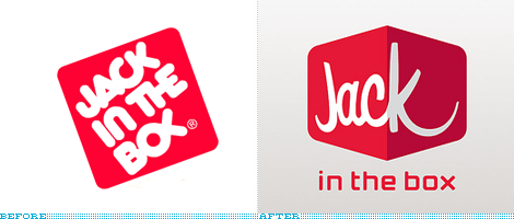
Jack in the Ba-Jesus

So, I was rolling over my usual list of design blogs that I somehow can never keep on top of and saw this. Jack in the Box is changing its logo. What. The. Hell.
Jack in the Box will always be that place you could rely on to royally mess you up at 2:30 in the morning after a solid bout of drinking downtown. Its menu consisted mostly of items that, I believe, were created on a dare with the intention to disguise fat in various digestible, delicious forms of "food." EVEN THEIR FUCKING TACO LETTUCE IS FRIED! It leaves no stone unturned.
In high school, our one Jewish friend made the joke that the "BOX" in the logo was actually just a B combined with a Jesus fish so it should be pronounced "Jack in the Ba-Jesus." To others, it was just Jack in the Crack. But now. Now, I don't know what the hell it is. I mean, with a logo like that it may as well just serve some carrot sticks and call it a day.
Read more about it here if you care to.