Icon Progress 2007-2011.
Following in the footsteps of firstillusion who posted her icon progress at illusoir_icons. Three icons from every batch I have posted in an attempt to show how my style has changed and hopefully improved over the years. Nostalgic self indulgence for me basically! I chose to pick three from each batch in order to force myself to select some icons which I don't like now but did at the time, and to try and get a good, encompassing mix.
Contains 120 icons, some of them quite embarrassing.
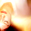
From my own journal, February 2007 to September 2007. Evidence of a lot of scratch textures, red light blobs and tiny text. Good grief, I was so proud of these haha. Some of them look to me like someone else made them just because they are such typical 2007 icons. The lighting and sharpness of the second to last icon in the first row for example. I think with a little tweaking, the last couple of rows aren't too far from what I am making now though. I think overall my cropping has stayed pretty consistent. I got a lot of praise about it from the very beginning so it encouraged me to keep doing what I was doing (and indeed, still do)! Although I remember being firmly against centre crops early on for some reason. That definitely doesn't apply anymore.
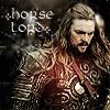
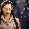
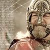
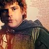

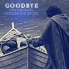
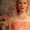

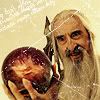

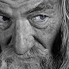
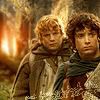
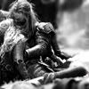


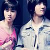


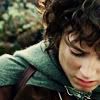
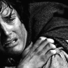
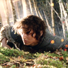



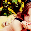

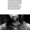
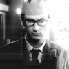
Posting at my first community, October 2007 to January 2008. I moved to my own comm because I felt I had 'matured' a bit from some of the trends I had been following (those awful red light blobs) and was getting enough lovely followers to want to separate things from my personal journal. I also had ps cs at this time so there is a little selective colouring/curves use over this period whereas everywhere else I am using ps elements. It isn't as evident in the examples that I selected but I wasn't very discriminating in what caps I chose to use and picked a lot that were blurry to begin with. Not good.
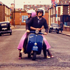


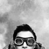
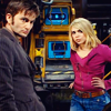
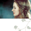
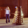

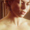

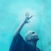
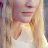

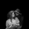
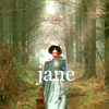

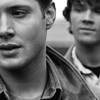
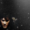
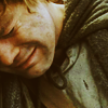
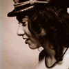
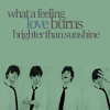

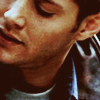
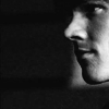
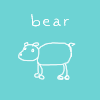
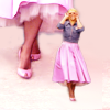
Posted at my current icon community home, polaroid_this, with the lovely dontcockblockme and the amazing xtine005, from January 2008 to December 2009. About five rows down you can see a bit of a change. I applied somewhere elite and was told that my icons were washed out and needed more contrast. Very accurate and I tired to implement their advice. Personally I think it helped a lot. As for the first half of this block, I really like some of the crops and lighting and kind of want to give them a tweak/makeover and reuse them! The lone 'bear' icon was from a mini hand (mouse) drawn set I made. I got a few requests for personalised ones in the end but I am not quite sure how they came about in the first place.
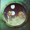
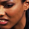
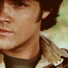

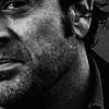
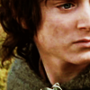

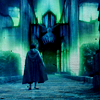
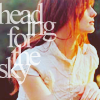
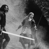



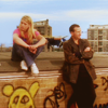

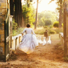

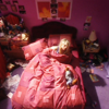
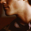
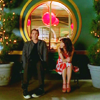
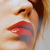
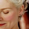
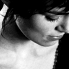
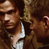
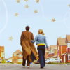
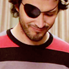

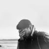

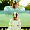
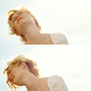

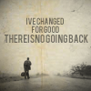

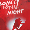
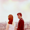
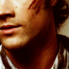

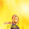
At this point I was accepted into magicmachine, May 2010 to October 2011. I don't think anything has helped me more than the con crit I received on my application and the activities there. I am still trying to work on getting my sharpness/blurriness right. I always seem to go too far one way or the other.
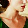
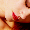
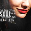
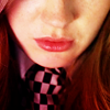




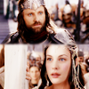
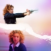



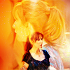
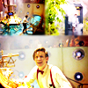

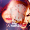
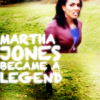


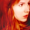
Well, there you have it! Thank you for anyone who had a browse, I hope you enjoyed laughing at my expense. ;D I encourage everyone to make one of these and let me know, I love looking at other people's icon evolution.
Contains 120 icons, some of them quite embarrassing.
From my own journal, February 2007 to September 2007. Evidence of a lot of scratch textures, red light blobs and tiny text. Good grief, I was so proud of these haha. Some of them look to me like someone else made them just because they are such typical 2007 icons. The lighting and sharpness of the second to last icon in the first row for example. I think with a little tweaking, the last couple of rows aren't too far from what I am making now though. I think overall my cropping has stayed pretty consistent. I got a lot of praise about it from the very beginning so it encouraged me to keep doing what I was doing (and indeed, still do)! Although I remember being firmly against centre crops early on for some reason. That definitely doesn't apply anymore.
Posting at my first community, October 2007 to January 2008. I moved to my own comm because I felt I had 'matured' a bit from some of the trends I had been following (those awful red light blobs) and was getting enough lovely followers to want to separate things from my personal journal. I also had ps cs at this time so there is a little selective colouring/curves use over this period whereas everywhere else I am using ps elements. It isn't as evident in the examples that I selected but I wasn't very discriminating in what caps I chose to use and picked a lot that were blurry to begin with. Not good.
Posted at my current icon community home, polaroid_this, with the lovely dontcockblockme and the amazing xtine005, from January 2008 to December 2009. About five rows down you can see a bit of a change. I applied somewhere elite and was told that my icons were washed out and needed more contrast. Very accurate and I tired to implement their advice. Personally I think it helped a lot. As for the first half of this block, I really like some of the crops and lighting and kind of want to give them a tweak/makeover and reuse them! The lone 'bear' icon was from a mini hand (mouse) drawn set I made. I got a few requests for personalised ones in the end but I am not quite sure how they came about in the first place.
At this point I was accepted into magicmachine, May 2010 to October 2011. I don't think anything has helped me more than the con crit I received on my application and the activities there. I am still trying to work on getting my sharpness/blurriness right. I always seem to go too far one way or the other.
Well, there you have it! Thank you for anyone who had a browse, I hope you enjoyed laughing at my expense. ;D I encourage everyone to make one of these and let me know, I love looking at other people's icon evolution.