A tutorial!
My new buddy dancing_crazy asked me to do a tutorial for one of my latest icons. It's my first tutorial so I'm excited. The tutorial is for PS8CS but, if you know what you're doing, I'm sure it can be translated into PSP.
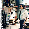
All right kids, today we're going to be learning how to make this icon:

1. You gotta get your picture first! I went here to get my picture of hot!Mulder.
2. Okay, so open the picture in Photoshop/PSP. First you're going to want to smooth out Mulder's skin a little bit so when you crop the picture it won't look as distorted. Mulder is WAY too pretty to be distorted. To do that, use the blur tool at about 13% strength and adjust the brush size to what you're comfortable using. I used about 5px.
3. Now you want to crop the picture. The best way I have found to do this is using the actual crop tool. When you click on the crop tool, at the top of the screen you set the width and height you want. Put 100 for both the width and the height. Make the resolution 72 and click the drop down box and select pixels/inch. Now crop the picture and at the top of the screen where you set the parameters, click the check mark. Now the picture should be 100x100.
4. Before you go on, you're going to want to sharpen the base. You can either use the normal Filter >> Sharpen >> Sharpen technique or the Unsharp Mask method. It depends on the amount of sharpening you want in the base. If you want to try unsharp mask, go to Filter >> Sharpen >> Unsharp Mask and set the "Amount" to 100%, the "Radius" to 0.5 pixels, and the "Threshold" to 3 levels.
5. Create a new layer. Fill it with color #003562. Set this layer to Exclusion.
6. Duplicate your base now and set it to Hard Light. Bring it to the top of all your layers (above the blue fill layer we just did.)
Now the icon should look kind of dull and a tad bit more blue but don't worry! We're going to brighten it up.
7. Create a new layer.
Use this light texture made by... (If this is yours, please tell me! I've credited you in my user info I'm sure but I'm not exactly sure who's it is.) Copy it and paste it onto the icon. (It should be its own layer.) Move it between Layer 2 (the blue fill layer) and the copy of our base (the one set on hard light.) Set it to screen. Now the icon should be much brighter.
8. I used a grungy border brush in white on the left side of the icon but you can use whatever you want from here brush and text wise of course.
9. When you're all done, go to Layer >> Flatten Image, which will merge all of the layers.
10. To finish, go to Filter >> Sharpen >> Sharpen. I would suggest experimenting with this step before any blatant brushes and text though since it might make those look weird.
Now you're done! Feel free to add and adjust anything you'd like. I hope this was easy to follow. If you have any questions, don't hesitate to ask and I'd love to see what you all do with this! Have fun! :]
All right kids, today we're going to be learning how to make this icon:
1. You gotta get your picture first! I went here to get my picture of hot!Mulder.
2. Okay, so open the picture in Photoshop/PSP. First you're going to want to smooth out Mulder's skin a little bit so when you crop the picture it won't look as distorted. Mulder is WAY too pretty to be distorted. To do that, use the blur tool at about 13% strength and adjust the brush size to what you're comfortable using. I used about 5px.
3. Now you want to crop the picture. The best way I have found to do this is using the actual crop tool. When you click on the crop tool, at the top of the screen you set the width and height you want. Put 100 for both the width and the height. Make the resolution 72 and click the drop down box and select pixels/inch. Now crop the picture and at the top of the screen where you set the parameters, click the check mark. Now the picture should be 100x100.
4. Before you go on, you're going to want to sharpen the base. You can either use the normal Filter >> Sharpen >> Sharpen technique or the Unsharp Mask method. It depends on the amount of sharpening you want in the base. If you want to try unsharp mask, go to Filter >> Sharpen >> Unsharp Mask and set the "Amount" to 100%, the "Radius" to 0.5 pixels, and the "Threshold" to 3 levels.
5. Create a new layer. Fill it with color #003562. Set this layer to Exclusion.
6. Duplicate your base now and set it to Hard Light. Bring it to the top of all your layers (above the blue fill layer we just did.)
Now the icon should look kind of dull and a tad bit more blue but don't worry! We're going to brighten it up.
7. Create a new layer.
Use this light texture made by... (If this is yours, please tell me! I've credited you in my user info I'm sure but I'm not exactly sure who's it is.) Copy it and paste it onto the icon. (It should be its own layer.) Move it between Layer 2 (the blue fill layer) and the copy of our base (the one set on hard light.) Set it to screen. Now the icon should be much brighter.
8. I used a grungy border brush in white on the left side of the icon but you can use whatever you want from here brush and text wise of course.
9. When you're all done, go to Layer >> Flatten Image, which will merge all of the layers.
10. To finish, go to Filter >> Sharpen >> Sharpen. I would suggest experimenting with this step before any blatant brushes and text though since it might make those look weird.
Now you're done! Feel free to add and adjust anything you'd like. I hope this was easy to follow. If you have any questions, don't hesitate to ask and I'd love to see what you all do with this! Have fun! :]