Winners: Challenge 9 - Where there are textures
Congrats to the winners of Challenge 9. Only one more to go :D
First
(4 pts)
Second
(3 pts)
Third
(2 pts)

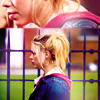
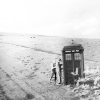
ccxvii
w/ 32 votes
darlingbones
w/ 31 votes
stillxmyxheart
w/ 14 votes
Best Rose
(1 pt)
Mod's Choice
(1 pt)

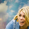
darlingbones
w/ 7 votes
star_girl42
TALLIES:
votes / special category
♥ = # of special category votes
~ = concrit

+++ - great use of space
+++ - no comment
+++ - I love the use of space in this. The grayscale works great in terms of contrast and light and the icon is just lovely, despite its simplicity.
+++ - Great use of negative space.
++ - great use of negative space
stillxmyxheart
14/00
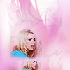
+++ - really stunning and creative icon
++ - Lovely coloring and use of repeated images.
+ - this would have been higher if rose hadn't been doubled. i hope there's a variation i can use ;) but gosh! the pink is beautiful and the textures look fantastic.
+ - interesting composition & use of colour
+ - no comment
+ - really great colour and concept
+ - love the use of the double image. Beautifully blended.
+ - colorful and eye-catching
♥♥♥
xeyra
11/03
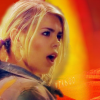
+ - I like how the warm colouring of the texture is reflected in Rose's skin and hair
~ Rose is a bit dark, I think the icon would look great if it was a bit brighter.
mattyroh07
01/00
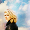
NO VOTES
♥
~ Nice coloring! The yellow and blue looks great together.
enviebeau
00/01
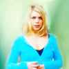
+++ - lacks sharpness but the colouring and background is stunning.
++ - Pretty coloring, Rose really pops.
+ - really nice colouring
♥♥
~ I love the coloring, but the icon is a bit too blurry.
wildalyss
06/02

+ - i like the text, and the coloring is nice, not to harsh of a red.
~ if this one wasn't so dark it would be vying for a top spot. the texture on the side looks lovely and the text looks terrific.
thistwilight
01/00
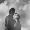
+++ - nice use of b&w, very simple but elegant
++ no comment
+ - I love the texture use and the cap choice, it looks kind of dream-like. The white blur works great, it makes the icon look shiny.
~ the contrast is a bit too high on this one, and the light texture kind of blurs the image, maybe a lower opacity would have worked.
~ I love this icon, but a bit more light on The Doctor and Rose would really make it.
magicallaw
06/00
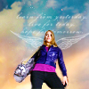
+++ - great cap/use of texture and i LOVE the wings! ♥
++ - no comment
♥♥♥♥
ivydoor
05/04
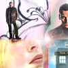
NO VOTES
~ This is fantastically creative! Really great texture use and choice of images. The only thing I don't like is that the crops make it look like The Doctor is standing on Rose's eye...
alizarin_skies
00/00

+ no comment
♥
star_girl42
01/01

+++ - great coloring!
+ - no comment
~ There is too much saturation here in Rose's face, try a soft light layer to soften the red in her cheek complexion.
lessrest
04/00
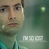
NO VOTES
~ The icon needs a little more contrast, and more brightness. The coloring is a bit too green.
maddythevampire
00/00
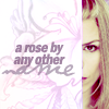
++ - great coloring and use of the text and texture
++ - The text really works well with the fierce look in the crop.
♥
jelly_head91
04/01
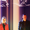
+++ - brilliant positioning, coloring and interesting use of texture
++ - the background works wonderfully with that cap choice. Gorgeous.
+ - the coloring is beautiful and it's a very crisp, clean looking icon
+ - The texture was used really well
zippogirl
07/00
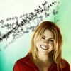
NO VOTES
~ The text doesn't really work with the image, it distracts the attention from Rose and doesn't feel like it's "a part" of the icon.
immortalje
00/00
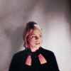
+++ - very subtle use of the texture and I love that, great coloring
+ - the muted color and use of the texture as shadows creates a subtle, melancholic atmosphere for the icon
~ watch out on the sharpness, other wise this is very nicely done.
stillcant
04/00
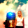
++ - the bright coloring and contrast really made the icon pop up
+ - Nice coloring and crop.
+ - beautiful coloring and blending
+ - crisp, nice coloring
~ I love the coloring, it looks very dramatic.
wild_sibyl
05/00

+++ - I love the composition and colouring of the icon
+++ - really fantastic colour and crop/play on crop.
+++ - beautiful vibrant coloring, and the rotation of the top image is very creative
+++ - Gorgeous clolouring and nice use of double images
+++ - no comment
++ - the colouring is what caught my eye, it's so natural, but vibrant and the two different caps look great together.
++ - no comment
++ - Great crop and coloring, I like the use of double images.
++ - love the double image use, really fantastic
++ - gorgeous coloring and cropping
++ - simple, good coloring
+ - Absolutely gorgeous coloring.
+ - gorgeous coloring, love the split crop
+ - Nice coloring, it fits the cap mood perfectly.
+ - no comment
♥♥♥♥♥♥♥
darlingbones
31/07

+++ - Great coloring and texture use. Love it.
+++ - love the use of texture and the crop - very interesting and unique!
+++ - really nice crop and creative use of the texture.
+++ - Fantastic coloring and texture use! Lovely crop.
+++ - Great use of texture, the Doctor fits perfectly!
+++ - no comment
++ - nice crop and coloring
++ - well cropped & great muted contrast
++ - very creative, the coloring is bright and I love the sort of soft look to it as well
++ - Love the coloring and texture use. Stunning icon!
++ - I love the layout of this icon
++ - The colouring and use of negative space is great
++ - Nice crop and texture use.
~ was almost my third choice, but it looks a little white-washed. perhaps even a soft-light layer would help.
ccxvii
32/00
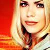
+++ - Great colouring and crop.
+ - Nice crop, the bright coloring is great too.
♥♥♥
blue_emotion
04/03
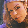
NO VOTES
~ The coloring is a bit too red. The icon needs a bit more contrast.
marcasite
00/00
Congratulations!
You can view the tally board here. Feel free to check it whenever you see fit.
First
(4 pts)
Second
(3 pts)
Third
(2 pts)
ccxvii
w/ 32 votes
darlingbones
w/ 31 votes
stillxmyxheart
w/ 14 votes
Best Rose
(1 pt)
Mod's Choice
(1 pt)
darlingbones
w/ 7 votes
star_girl42
TALLIES:
votes / special category
♥ = # of special category votes
~ = concrit
+++ - great use of space
+++ - no comment
+++ - I love the use of space in this. The grayscale works great in terms of contrast and light and the icon is just lovely, despite its simplicity.
+++ - Great use of negative space.
++ - great use of negative space
stillxmyxheart
14/00
+++ - really stunning and creative icon
++ - Lovely coloring and use of repeated images.
+ - this would have been higher if rose hadn't been doubled. i hope there's a variation i can use ;) but gosh! the pink is beautiful and the textures look fantastic.
+ - interesting composition & use of colour
+ - no comment
+ - really great colour and concept
+ - love the use of the double image. Beautifully blended.
+ - colorful and eye-catching
♥♥♥
xeyra
11/03
+ - I like how the warm colouring of the texture is reflected in Rose's skin and hair
~ Rose is a bit dark, I think the icon would look great if it was a bit brighter.
mattyroh07
01/00
NO VOTES
♥
~ Nice coloring! The yellow and blue looks great together.
enviebeau
00/01
+++ - lacks sharpness but the colouring and background is stunning.
++ - Pretty coloring, Rose really pops.
+ - really nice colouring
♥♥
~ I love the coloring, but the icon is a bit too blurry.
wildalyss
06/02

+ - i like the text, and the coloring is nice, not to harsh of a red.
~ if this one wasn't so dark it would be vying for a top spot. the texture on the side looks lovely and the text looks terrific.
thistwilight
01/00
+++ - nice use of b&w, very simple but elegant
++ no comment
+ - I love the texture use and the cap choice, it looks kind of dream-like. The white blur works great, it makes the icon look shiny.
~ the contrast is a bit too high on this one, and the light texture kind of blurs the image, maybe a lower opacity would have worked.
~ I love this icon, but a bit more light on The Doctor and Rose would really make it.
magicallaw
06/00
+++ - great cap/use of texture and i LOVE the wings! ♥
++ - no comment
♥♥♥♥
ivydoor
05/04
NO VOTES
~ This is fantastically creative! Really great texture use and choice of images. The only thing I don't like is that the crops make it look like The Doctor is standing on Rose's eye...
alizarin_skies
00/00
+ no comment
♥
star_girl42
01/01

+++ - great coloring!
+ - no comment
~ There is too much saturation here in Rose's face, try a soft light layer to soften the red in her cheek complexion.
lessrest
04/00
NO VOTES
~ The icon needs a little more contrast, and more brightness. The coloring is a bit too green.
maddythevampire
00/00
++ - great coloring and use of the text and texture
++ - The text really works well with the fierce look in the crop.
♥
jelly_head91
04/01
+++ - brilliant positioning, coloring and interesting use of texture
++ - the background works wonderfully with that cap choice. Gorgeous.
+ - the coloring is beautiful and it's a very crisp, clean looking icon
+ - The texture was used really well
zippogirl
07/00
NO VOTES
~ The text doesn't really work with the image, it distracts the attention from Rose and doesn't feel like it's "a part" of the icon.
immortalje
00/00
+++ - very subtle use of the texture and I love that, great coloring
+ - the muted color and use of the texture as shadows creates a subtle, melancholic atmosphere for the icon
~ watch out on the sharpness, other wise this is very nicely done.
stillcant
04/00
++ - the bright coloring and contrast really made the icon pop up
+ - Nice coloring and crop.
+ - beautiful coloring and blending
+ - crisp, nice coloring
~ I love the coloring, it looks very dramatic.
wild_sibyl
05/00
+++ - I love the composition and colouring of the icon
+++ - really fantastic colour and crop/play on crop.
+++ - beautiful vibrant coloring, and the rotation of the top image is very creative
+++ - Gorgeous clolouring and nice use of double images
+++ - no comment
++ - the colouring is what caught my eye, it's so natural, but vibrant and the two different caps look great together.
++ - no comment
++ - Great crop and coloring, I like the use of double images.
++ - love the double image use, really fantastic
++ - gorgeous coloring and cropping
++ - simple, good coloring
+ - Absolutely gorgeous coloring.
+ - gorgeous coloring, love the split crop
+ - Nice coloring, it fits the cap mood perfectly.
+ - no comment
♥♥♥♥♥♥♥
darlingbones
31/07
+++ - Great coloring and texture use. Love it.
+++ - love the use of texture and the crop - very interesting and unique!
+++ - really nice crop and creative use of the texture.
+++ - Fantastic coloring and texture use! Lovely crop.
+++ - Great use of texture, the Doctor fits perfectly!
+++ - no comment
++ - nice crop and coloring
++ - well cropped & great muted contrast
++ - very creative, the coloring is bright and I love the sort of soft look to it as well
++ - Love the coloring and texture use. Stunning icon!
++ - I love the layout of this icon
++ - The colouring and use of negative space is great
++ - Nice crop and texture use.
~ was almost my third choice, but it looks a little white-washed. perhaps even a soft-light layer would help.
ccxvii
32/00
+++ - Great colouring and crop.
+ - Nice crop, the bright coloring is great too.
♥♥♥
blue_emotion
04/03
NO VOTES
~ The coloring is a bit too red. The icon needs a bit more contrast.
marcasite
00/00
Congratulations!
You can view the tally board here. Feel free to check it whenever you see fit.