Winners: Challenge 6 - Where they're saying things
Uhm I'm late again, aren't I? >_> I'm so sorry, I'm having finals at school D:
To the winners of Challenge 6, all my congrats!
First
(4 pts)
Second
(3 pts)
Third
(2 pts)
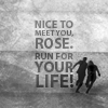


lessrest
w/ 32 votes
darlingbones
w/ 29 votes
ccxvii
w/ 15 votes
Best Emotional
(1 pt)
Mod's Choice
(1 pt)
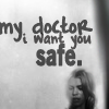

magicallaw
w/ 9 votes
marcasite
TALLIES:
votes / special category
♥ = # of special category votes
~ = concrit

+++ great use of colours and texture
++ The use of different fonts is done really well and the text placement is really good
+ I like how the text has been rotated
+ love the slanting of the text, and the font change for the last word. Lovely.
+ great texture use and mix of fonts
~ also a great job!
xeyra
08/00

+++ The overlay with a thin layer of the longer sentence gives an extra dimension to the clear cut rendering of the one word 'RUN' exclamation
+++ no comment
+++ love the color
+++ crisp and clear and great
++ I like the way they've actually filled the whole icon with the quote but not in a way that is overpowering
++ i like the transparent background text.
++ no comment
++ The color, the bulkier word at the front with the faded but readable text behind, really works on this!
++ Pretty colours. The text in the background is awesome, and the "RUN!" is very noticeable (which is great).
++ background text is great and make 'run'pop
++ Very clever use of text.
++ love the coloring
+ lovely coloring, positioning and use of font
darlingbones
29/00

+++ no comment
+ no comment
♥♥
~ the font used for "died" threw me off. The rest of the icon is very lovely, though, and fitting for the quote.
~ This would have looked quite lovely if the 'DIED' font choice had been different.
~ I think the lines of text need some more space between each other, vertically. It's a bit difficult to read as it is.
jelly_head91
04/02

+++ very lovely, style of text fits quote extremely well.
+++ clear and crisp, nice text coloring.
+++ love the placing of the text and great interpretation of using an image. Just brilliant.
+++ Great use of negative space and the texture used within the text is lovely
+++ PERFECT use of text only. Nice overlapping (if that's what it's called).
ccxvii
15/00

+++ lovely tardis blue, and great boxy text work. All text icons are very underrated. They are really difficult sometimes to do properly, and this icon does it beautifully.
+ Simple and to the point. I love it.
+ I like how bold and simple this icon is.
+ Great font choice!
~ I really like this quote and I like the simplicity of the icon, but I feel like maybe the slightest bit of gradation or some sort of texture in the background would have really made this icon pop and probably would have made it my first choice.
wildalyss
06/00

+++ I'm Bad Wolf... I love it ^_^
++ great coloring and typeface used
♥
~ a different font for the first three lines would make the emotion of the icon pop out even more. Love the italicized aspect, though.
~ The "BAD WOLF" bit is excellent, but the font used for "what two words..:" feels off to me. Maybe another font would work better?
maddythevampire
05/01
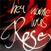
++ Lovely font, nice background.
++ I love color and quote
+ The font choice and background go together really well
♥♥
~ using a different (and more readable) font for "her name was" would make her name have more impact. Also, the image is not clearly a rose at first - the colouring on it makes it seem more evil at first glance than I believe you intended.
~ I love the text, but the background is too busy and distracting.
~ this is really gorgeous!
alizarin_skies
05/02

+++ The font choice, placement and arrangement really works on this icon. The textured background is also quite awesome.
+++ love the texture use and cap
+++ Great use of texture.
+++ great text placement and alignment plus I love the texture and silhouette
+++ great quote and the image just enhances it
+++ It's just so them!
++ while a smidge dark the textures in this icon are awesome + the placement perfect
++ nice positioning and sizing of text. Good use of background image
++ great composition
++ LOVE the boxiness of the text and the simple image use. Lovely job.
++ The image suits the quote perfectly
+ the texture adds to the text perfectly
+ really subtle use of the image. I love it.
+ great choice of desaturation and the text block builds nicely with the image.
+ i love the b/w and choice of cap which fits the quote perfectly
♥♥
lessrest
32/02
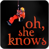
+++ very simple and the orange really stands out
+++ very sharp, easy to read, eye-catching, all around well-done.
++ absolutely lovely quote and the image of the doctor works so well with the text.
++ I love the way he's hanging over the words. It's like a play off of how the words are hanging over his head.
♥
~ I really like the colours and the font, and the picture of the Doctor is nice, but I think the text is a bit too big.
blue_emotion
10/01
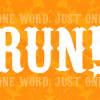
+++ Love the font and the layout of this icon
+ very creative with the small text on top and bottom of the word "RUN"
+ Great font choice and use of space
star_girl42
05/00
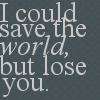
NO VOTES
♥♥♥♥♥
mellten
00/05
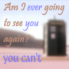
++ no comment
~ using a different font for the entire quote & choosing just "you can't" to be a different colour would make it have more impact that would go well with the image.
~ The font colors are too faded for the background. As a rule of thumb, solid or textured backgrounds work best for text and bolder colors on light backgrounds makes the colors pop better. You have two types of fonts here, and though that usually works, it depends on the fonts you choose. Usually a serif font on a smaller size works best against a word or two in cursive text. Also, the space between each line of text is excessive. It would look better if the text was concentrated on a particular point instead of all over the icon.
~ I think the icon would look better if the text lines were closer to each other vertically.
mattyroh07
02/00

++ i love the use of font
++ very emotional and nice work with the b/w
+ nice use of text & cropping
+ no comment
+ This is a bit less like a text only icon than an icon with text, but the font choices work very nicely so it lands as my third choice (the complete icon is quite gorgeous too).
♥♥♥♥♥♥♥♥♥
~ I really love the text and the b&w, but the placement of Rose feels a bit awkward to me. I think it would look better if she were more centered in the icon or if she wasn't in the icon at all - as it is now she distracts from the text a bit too much.
magicallaw
07/09
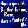
~ The very dark background clashes with the stark white of the text and it looks a bit too pixelated.
~ The icon feels very busy - try using a smaller font size, so the text doesn't cover the whole icon, to make the composition better. Lowering the opacity on the text layers a bit could also work.
immortalje
00/00

++ no comment
+ nice coloring, and great quote :D
marcasite
03/00
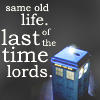
+++ Good composition and atmosphere! I love the different sized letters. The grey background works very well, and the TARDIS is nicely placed.
+ Good color and image
+ I really like those words with the lone Tardis. Very sad.
+ no comment
+ great quote but I think the text would have looked better if it were wrapped around the TARDIS more.
♥ this quote is so sad to me, so best emotional for that reason.
~ The inclusion of the Tardis left very little space for the quote you wanted to include, which ended up working against this icon, especially as it was supposed to be primarily a text icon.
ivydoor
07/01
Congratulations!
You can view the tally board here. Feel free to check it whenever you see fit.
To the winners of Challenge 6, all my congrats!
First
(4 pts)
Second
(3 pts)
Third
(2 pts)


lessrest
w/ 32 votes
darlingbones
w/ 29 votes
ccxvii
w/ 15 votes
Best Emotional
(1 pt)
Mod's Choice
(1 pt)
magicallaw
w/ 9 votes
marcasite
TALLIES:
votes / special category
♥ = # of special category votes
~ = concrit

+++ great use of colours and texture
++ The use of different fonts is done really well and the text placement is really good
+ I like how the text has been rotated
+ love the slanting of the text, and the font change for the last word. Lovely.
+ great texture use and mix of fonts
~ also a great job!
xeyra
08/00

+++ The overlay with a thin layer of the longer sentence gives an extra dimension to the clear cut rendering of the one word 'RUN' exclamation
+++ no comment
+++ love the color
+++ crisp and clear and great
++ I like the way they've actually filled the whole icon with the quote but not in a way that is overpowering
++ i like the transparent background text.
++ no comment
++ The color, the bulkier word at the front with the faded but readable text behind, really works on this!
++ Pretty colours. The text in the background is awesome, and the "RUN!" is very noticeable (which is great).
++ background text is great and make 'run'pop
++ Very clever use of text.
++ love the coloring
+ lovely coloring, positioning and use of font
darlingbones
29/00

+++ no comment
+ no comment
♥♥
~ the font used for "died" threw me off. The rest of the icon is very lovely, though, and fitting for the quote.
~ This would have looked quite lovely if the 'DIED' font choice had been different.
~ I think the lines of text need some more space between each other, vertically. It's a bit difficult to read as it is.
jelly_head91
04/02

+++ very lovely, style of text fits quote extremely well.
+++ clear and crisp, nice text coloring.
+++ love the placing of the text and great interpretation of using an image. Just brilliant.
+++ Great use of negative space and the texture used within the text is lovely
+++ PERFECT use of text only. Nice overlapping (if that's what it's called).
ccxvii
15/00

+++ lovely tardis blue, and great boxy text work. All text icons are very underrated. They are really difficult sometimes to do properly, and this icon does it beautifully.
+ Simple and to the point. I love it.
+ I like how bold and simple this icon is.
+ Great font choice!
~ I really like this quote and I like the simplicity of the icon, but I feel like maybe the slightest bit of gradation or some sort of texture in the background would have really made this icon pop and probably would have made it my first choice.
wildalyss
06/00

+++ I'm Bad Wolf... I love it ^_^
++ great coloring and typeface used
♥
~ a different font for the first three lines would make the emotion of the icon pop out even more. Love the italicized aspect, though.
~ The "BAD WOLF" bit is excellent, but the font used for "what two words..:" feels off to me. Maybe another font would work better?
maddythevampire
05/01
++ Lovely font, nice background.
++ I love color and quote
+ The font choice and background go together really well
♥♥
~ using a different (and more readable) font for "her name was" would make her name have more impact. Also, the image is not clearly a rose at first - the colouring on it makes it seem more evil at first glance than I believe you intended.
~ I love the text, but the background is too busy and distracting.
~ this is really gorgeous!
alizarin_skies
05/02
+++ The font choice, placement and arrangement really works on this icon. The textured background is also quite awesome.
+++ love the texture use and cap
+++ Great use of texture.
+++ great text placement and alignment plus I love the texture and silhouette
+++ great quote and the image just enhances it
+++ It's just so them!
++ while a smidge dark the textures in this icon are awesome + the placement perfect
++ nice positioning and sizing of text. Good use of background image
++ great composition
++ LOVE the boxiness of the text and the simple image use. Lovely job.
++ The image suits the quote perfectly
+ the texture adds to the text perfectly
+ really subtle use of the image. I love it.
+ great choice of desaturation and the text block builds nicely with the image.
+ i love the b/w and choice of cap which fits the quote perfectly
♥♥
lessrest
32/02
+++ very simple and the orange really stands out
+++ very sharp, easy to read, eye-catching, all around well-done.
++ absolutely lovely quote and the image of the doctor works so well with the text.
++ I love the way he's hanging over the words. It's like a play off of how the words are hanging over his head.
♥
~ I really like the colours and the font, and the picture of the Doctor is nice, but I think the text is a bit too big.
blue_emotion
10/01
+++ Love the font and the layout of this icon
+ very creative with the small text on top and bottom of the word "RUN"
+ Great font choice and use of space
star_girl42
05/00
NO VOTES
♥♥♥♥♥
mellten
00/05
++ no comment
~ using a different font for the entire quote & choosing just "you can't" to be a different colour would make it have more impact that would go well with the image.
~ The font colors are too faded for the background. As a rule of thumb, solid or textured backgrounds work best for text and bolder colors on light backgrounds makes the colors pop better. You have two types of fonts here, and though that usually works, it depends on the fonts you choose. Usually a serif font on a smaller size works best against a word or two in cursive text. Also, the space between each line of text is excessive. It would look better if the text was concentrated on a particular point instead of all over the icon.
~ I think the icon would look better if the text lines were closer to each other vertically.
mattyroh07
02/00
++ i love the use of font
++ very emotional and nice work with the b/w
+ nice use of text & cropping
+ no comment
+ This is a bit less like a text only icon than an icon with text, but the font choices work very nicely so it lands as my third choice (the complete icon is quite gorgeous too).
♥♥♥♥♥♥♥♥♥
~ I really love the text and the b&w, but the placement of Rose feels a bit awkward to me. I think it would look better if she were more centered in the icon or if she wasn't in the icon at all - as it is now she distracts from the text a bit too much.
magicallaw
07/09
~ The very dark background clashes with the stark white of the text and it looks a bit too pixelated.
~ The icon feels very busy - try using a smaller font size, so the text doesn't cover the whole icon, to make the composition better. Lowering the opacity on the text layers a bit could also work.
immortalje
00/00
++ no comment
+ nice coloring, and great quote :D
marcasite
03/00
+++ Good composition and atmosphere! I love the different sized letters. The grey background works very well, and the TARDIS is nicely placed.
+ Good color and image
+ I really like those words with the lone Tardis. Very sad.
+ no comment
+ great quote but I think the text would have looked better if it were wrapped around the TARDIS more.
♥ this quote is so sad to me, so best emotional for that reason.
~ The inclusion of the Tardis left very little space for the quote you wanted to include, which ended up working against this icon, especially as it was supposed to be primarily a text icon.
ivydoor
07/01
Congratulations!
You can view the tally board here. Feel free to check it whenever you see fit.