Winners: Challenge 4 - Were They're Not Together
Congrats to the winners of Challenge Four! Fantastic icons, really. I don't know how our voters choose. O_O
First
(4 pts)
Second
(3 pts)
Third
(2 pt)

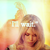
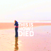
darlingbones
w/ 23 votes
blue_emotion
w/ 20 votes
stillxmyxheart
w/ 19 votes
Best Use of Text
(1 pt)
Mod's Choice
(1 pt)

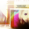
stillxmyxheart
w/ 7 votes
xphoenixrising
TALLIES:
votes / special category
♥ = # of special category votes
concrit
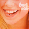
++ Nice text choice and placement.
+ simple soft coloring and crop
♥
♥ adore the text along with the sorta 'imp-ish' photo
~ Text is so difficult to do on icons. I hate doing it, personally, but this text doesn't stand out in a bad way. It blends with the icon and keeps the playful feeling of the picture.
enviebeau
03 / 02

+++ The texture and text placement fit the cap choice perfectly.
+++ interesting blending, use of a quote, and lovely colouring
+ lovely texture use
+ Nice texture and text use
+++ the entire compositon is beautiful; the colors are vibrant but subtle, the text is extremely well placed (and the use of the quote marks is great).
++ lovely use of texture, interesting positioning and choice of text and cap
+++ Nice colouring and use of text.
+++ Well blended, the background captures the eye and keeps attention on the icon.
+ nice coloring and text
♥
blue_emotion
20 / 01

+++ It was the first thing I noticed, like my eyes were just drawn to it. The look on Rose's face is almost haunting and the text just hits you right in the gut.
thistwilight
03

no votes
mattyroh07
00

+ It's so wonderfully simple and awesome.
+++ great crop and colouring
+ Nice colouring and crop.
dashafeather
05
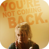
+ no comment
♥♥
♥ Wonderful use of text in the background.
~ I love everything about this icon, but Rose seems to blend into the background from the deep brownish shadow on her face. Maybe brightening Rose and coloring her jacket and hoodie brighter (individual layers, maybe on multiply) would bring her out of the background more :)
~ I would have put this icon in my top 3 but rose is too dark.
thewonderlife
01z
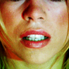
++ The cropping is very pretty and I love the coloring.
+++ the colouring and crop are amazing. everything just draws you in.
++ interesting & wellsharpened crop
++ Great colouring and cropping.
++ excellent crop
+ Absolutely stunning colors and crop.
+ Great colouring and an imaginitive crop.
+++ the crop and coloring are excellent
zippogirl
16

+++ great cropping, great cap, and amazing coloring!
+ nice close crop
++ Good crop and coloring, and awesome choice of screencap.
+ the crop's a little awkward, but I adore the colouring.
+ The smile on her face is great. It looks like a perfect candid moment.
jelly_head91
08
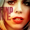
+ The sharpening is very well done and the coloring is gorgeous, love the text used.
+ Lovely coloring!
++ good use of text, pretty coloring, overall very clear and crisp.
+++ Absolutely stunning colouring and text!
++ the colors are amazing and vivid, and the text placement is great. the only concrit I have is that there's some sort of weird blur filter that doesn't really fit the rest of the icon. It needs to be sharpened a bit more.
++ center crops are hard and this one is done very well, lovely coloring
++ no comment
++ Nice crop and colouring.
♥
~ I just wanted to say that I adore the coloring. This was my fourth favorite icon!
wild_sibyl
15 / 01

+++ excellent cutout and use of negative space, the texture matches wonderfully
+++ Love the text, love the cap used, good cropping.
+++ great colouring/text - nice use of background
+++ The coloring is fantastic in every way. The background is beautiful, the colors on Rose and the Dalek are amazing and the text complements the icon perfectly.
+++ Awesome coloring and composition! I like the text, too.
+++ Great use of text with that image. Plus it looks gorgeous.
+++ brilliant color, clear cut editing and interesting choice of cap
++ love the bright orange and the interesting composition
♥♥♥♥♥
darlingbones
23 / 05

+++ love how the text always Rose to lean on it in a sense.
+++ The cropping reflects the emotion of the icon perfectly and the text is placed very nicely to make Rose the focal point.
++ the quote placement is really well done & the use of negative space is brilliant.
+ great use of space
++ Rose just stands out and the words just hit you like a punch in the gut.
+++ coloring is pretty, perfect use of text
+ the text is very effective, but the coloring looks a little washed out.
++ beautiful unusual coloring for this scene and good use of text
++ I love the heartbreaking image of Rose standing alone on the beach combined with the words she spoke at the beginning of Army of Ghosts.
♥♥♥♥♥♥♥
♥ Gorgeous use of text! Fits perfectly with the icon.
♥ it's very well placed, the quote chosen is great.
♥ heartbreaking :( but i love the position of the text and the font choice was excellent
stillxmyxheart
19 / 07

+ the blacks could be a little more black (just needs a tiny bit more contrast), but the way you've removed the surroundings from rose is terrific.
restlessme
01
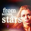
+++ love the cropping and text
+ great use of texture + text
+++ no comment
♥♥
~ It's an awesome icon, but I think the text is a bit too big. The same use of mixing smaller/bigger words and the same color & font, but all of it smaller so it didn't distract so much from Rose, and I would have voted for this icon in the "best text"-category.
magicallaw
07 / 02
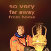
+ no comment
~ I love the crop and the coloring really works, but I think the font is wrong for this icon. Maybe you could try using a more serious font (something with a serif, maybe), since "so very far away from home" is a kind off serious sentence.
ivydoor
01
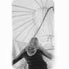
++ great use of the texture and the B&W is great
++ the crop is really gorgeous and love the simple coloring along with it.
+ very creative use of texture/b&w colour
++ this is just so interesting. it's a great original idea.
+ caught my eye, very simple and elegant, nice texture use
ccxvii
08

++ The soft coloring is lovely, and the crop is gorgeous. The text, even being blocky, and perhaps because of it, really works!
kirbyed
02
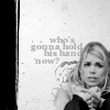
+ love the added background along with the text
+ Great use of negative space, text and textures. The icon has a great atmosphere.
++ no comment
++ very good composition!
++ Good use of texture and negative space.
♥♥♥♥
star_girl42
08 / 04

++ Very simplistic, yet beautifully done.
wildalyss
02
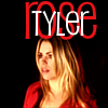
no votes
♥
mellten
00

+ the textures are amazing and beautiful. It is kind of hard to see the subject though.
+++ The colouring is really pretty and the texture and text placement really adds to the icon
++ the coloring is amazing, as well as the concept. so different from anything else
+++ brilliant composition and the coloring is stunning
~ It's kinda hard to tell what exactly is going on in the icon. It took me a while to see if it was the Doctor or Rose. The blurring or texture is a bit distracting even though it is colourful and eye grabbing.
~ I really really like the coloring on this but I couldn't choose it because it's so hard to understand what's actually going on in the icon.
xeyra
09

no votes
~ Good crop, but the purple coloring and the green text isn't a pretty combination. It would probably look better with b&w text.
maddythevampire
00
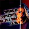
+ very unique, good choice of text, fascinating colouring/highlighting
♥
alizarin_skies
01

+ The composition of the icon works really well
xphoenixrising
01

++ good text, good use of image & shading/highlighting
+++ Just a very creative style. Don't see icons like this often.
+++ this icon is amazing. i love it more than life itself. oh. and it's because the caps are used brilliantly together, the contrast is perfect and the text is ace.
+++ Really nice overall composition.
+ love the composition and the position of the text
+++ Good use of b&w, text, and blending!
+ Text and placement of the image work well for the icon.
♥♥♥♥
lessrest
16 / 04
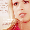
+ lovely coloring and cropping
++ beautiful coloring
stillcant
03

+++ great use of colour & space
++ really nice colouring and the blending to black looks great :)
++ It has really lovely colouring
piracy
07

+ very bright and lively, good use of text and brilliant coloring!
neonbliss
01
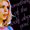
no votes
~ I think the vertical space between the words are too big. I think the text would look better if the words were closer to each other, and the text were written in a smaller size.
marcasite
00
~And lots of love to icons 6, 8, 13, 15, 17, 23, and 24: ”I just wanted to say that I loved so many of these icons and it was so hard to choose which ones I thought were the best. Not included in my voting that definitely deserve to be recognized...“
Congratulations!
You can view the tally board here. Feel free to check it whenever you see fit.
Don't forget to enter challenge five!
First
(4 pts)
Second
(3 pts)
Third
(2 pt)

darlingbones
w/ 23 votes
blue_emotion
w/ 20 votes
stillxmyxheart
w/ 19 votes
Best Use of Text
(1 pt)
Mod's Choice
(1 pt)
stillxmyxheart
w/ 7 votes
xphoenixrising
TALLIES:
votes / special category
♥ = # of special category votes
concrit
++ Nice text choice and placement.
+ simple soft coloring and crop
♥
♥ adore the text along with the sorta 'imp-ish' photo
~ Text is so difficult to do on icons. I hate doing it, personally, but this text doesn't stand out in a bad way. It blends with the icon and keeps the playful feeling of the picture.
enviebeau
03 / 02
+++ The texture and text placement fit the cap choice perfectly.
+++ interesting blending, use of a quote, and lovely colouring
+ lovely texture use
+ Nice texture and text use
+++ the entire compositon is beautiful; the colors are vibrant but subtle, the text is extremely well placed (and the use of the quote marks is great).
++ lovely use of texture, interesting positioning and choice of text and cap
+++ Nice colouring and use of text.
+++ Well blended, the background captures the eye and keeps attention on the icon.
+ nice coloring and text
♥
blue_emotion
20 / 01

+++ It was the first thing I noticed, like my eyes were just drawn to it. The look on Rose's face is almost haunting and the text just hits you right in the gut.
thistwilight
03
no votes
mattyroh07
00

+ It's so wonderfully simple and awesome.
+++ great crop and colouring
+ Nice colouring and crop.
dashafeather
05
+ no comment
♥♥
♥ Wonderful use of text in the background.
~ I love everything about this icon, but Rose seems to blend into the background from the deep brownish shadow on her face. Maybe brightening Rose and coloring her jacket and hoodie brighter (individual layers, maybe on multiply) would bring her out of the background more :)
~ I would have put this icon in my top 3 but rose is too dark.
thewonderlife
01z
++ The cropping is very pretty and I love the coloring.
+++ the colouring and crop are amazing. everything just draws you in.
++ interesting & wellsharpened crop
++ Great colouring and cropping.
++ excellent crop
+ Absolutely stunning colors and crop.
+ Great colouring and an imaginitive crop.
+++ the crop and coloring are excellent
zippogirl
16

+++ great cropping, great cap, and amazing coloring!
+ nice close crop
++ Good crop and coloring, and awesome choice of screencap.
+ the crop's a little awkward, but I adore the colouring.
+ The smile on her face is great. It looks like a perfect candid moment.
jelly_head91
08
+ The sharpening is very well done and the coloring is gorgeous, love the text used.
+ Lovely coloring!
++ good use of text, pretty coloring, overall very clear and crisp.
+++ Absolutely stunning colouring and text!
++ the colors are amazing and vivid, and the text placement is great. the only concrit I have is that there's some sort of weird blur filter that doesn't really fit the rest of the icon. It needs to be sharpened a bit more.
++ center crops are hard and this one is done very well, lovely coloring
++ no comment
++ Nice crop and colouring.
♥
~ I just wanted to say that I adore the coloring. This was my fourth favorite icon!
wild_sibyl
15 / 01

+++ excellent cutout and use of negative space, the texture matches wonderfully
+++ Love the text, love the cap used, good cropping.
+++ great colouring/text - nice use of background
+++ The coloring is fantastic in every way. The background is beautiful, the colors on Rose and the Dalek are amazing and the text complements the icon perfectly.
+++ Awesome coloring and composition! I like the text, too.
+++ Great use of text with that image. Plus it looks gorgeous.
+++ brilliant color, clear cut editing and interesting choice of cap
++ love the bright orange and the interesting composition
♥♥♥♥♥
darlingbones
23 / 05
+++ love how the text always Rose to lean on it in a sense.
+++ The cropping reflects the emotion of the icon perfectly and the text is placed very nicely to make Rose the focal point.
++ the quote placement is really well done & the use of negative space is brilliant.
+ great use of space
++ Rose just stands out and the words just hit you like a punch in the gut.
+++ coloring is pretty, perfect use of text
+ the text is very effective, but the coloring looks a little washed out.
++ beautiful unusual coloring for this scene and good use of text
++ I love the heartbreaking image of Rose standing alone on the beach combined with the words she spoke at the beginning of Army of Ghosts.
♥♥♥♥♥♥♥
♥ Gorgeous use of text! Fits perfectly with the icon.
♥ it's very well placed, the quote chosen is great.
♥ heartbreaking :( but i love the position of the text and the font choice was excellent
stillxmyxheart
19 / 07
+ the blacks could be a little more black (just needs a tiny bit more contrast), but the way you've removed the surroundings from rose is terrific.
restlessme
01
+++ love the cropping and text
+ great use of texture + text
+++ no comment
♥♥
~ It's an awesome icon, but I think the text is a bit too big. The same use of mixing smaller/bigger words and the same color & font, but all of it smaller so it didn't distract so much from Rose, and I would have voted for this icon in the "best text"-category.
magicallaw
07 / 02
+ no comment
~ I love the crop and the coloring really works, but I think the font is wrong for this icon. Maybe you could try using a more serious font (something with a serif, maybe), since "so very far away from home" is a kind off serious sentence.
ivydoor
01
++ great use of the texture and the B&W is great
++ the crop is really gorgeous and love the simple coloring along with it.
+ very creative use of texture/b&w colour
++ this is just so interesting. it's a great original idea.
+ caught my eye, very simple and elegant, nice texture use
ccxvii
08

++ The soft coloring is lovely, and the crop is gorgeous. The text, even being blocky, and perhaps because of it, really works!
kirbyed
02
+ love the added background along with the text
+ Great use of negative space, text and textures. The icon has a great atmosphere.
++ no comment
++ very good composition!
++ Good use of texture and negative space.
♥♥♥♥
star_girl42
08 / 04

++ Very simplistic, yet beautifully done.
wildalyss
02
no votes
♥
mellten
00

+ the textures are amazing and beautiful. It is kind of hard to see the subject though.
+++ The colouring is really pretty and the texture and text placement really adds to the icon
++ the coloring is amazing, as well as the concept. so different from anything else
+++ brilliant composition and the coloring is stunning
~ It's kinda hard to tell what exactly is going on in the icon. It took me a while to see if it was the Doctor or Rose. The blurring or texture is a bit distracting even though it is colourful and eye grabbing.
~ I really really like the coloring on this but I couldn't choose it because it's so hard to understand what's actually going on in the icon.
xeyra
09

no votes
~ Good crop, but the purple coloring and the green text isn't a pretty combination. It would probably look better with b&w text.
maddythevampire
00
+ very unique, good choice of text, fascinating colouring/highlighting
♥
alizarin_skies
01
+ The composition of the icon works really well
xphoenixrising
01

++ good text, good use of image & shading/highlighting
+++ Just a very creative style. Don't see icons like this often.
+++ this icon is amazing. i love it more than life itself. oh. and it's because the caps are used brilliantly together, the contrast is perfect and the text is ace.
+++ Really nice overall composition.
+ love the composition and the position of the text
+++ Good use of b&w, text, and blending!
+ Text and placement of the image work well for the icon.
♥♥♥♥
lessrest
16 / 04
+ lovely coloring and cropping
++ beautiful coloring
stillcant
03

+++ great use of colour & space
++ really nice colouring and the blending to black looks great :)
++ It has really lovely colouring
piracy
07

+ very bright and lively, good use of text and brilliant coloring!
neonbliss
01
no votes
~ I think the vertical space between the words are too big. I think the text would look better if the words were closer to each other, and the text were written in a smaller size.
marcasite
00
~And lots of love to icons 6, 8, 13, 15, 17, 23, and 24: ”I just wanted to say that I loved so many of these icons and it was so hard to choose which ones I thought were the best. Not included in my voting that definitely deserve to be recognized...“
Congratulations!
You can view the tally board here. Feel free to check it whenever you see fit.
Don't forget to enter challenge five!