(no subject)
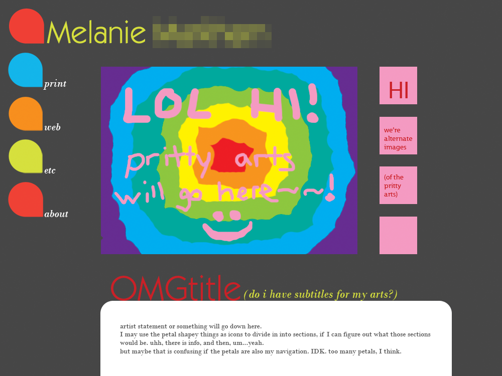
Well, I have progressed past logo design to site design for my portfolio...
So here's a general mock-up of what I'm looking at:
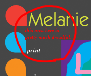
The main thing I'm still trying to figure out is the nav bar and where the main image should go in relation to it, because...
Haha. So here's a couple other ideas for the navbar:
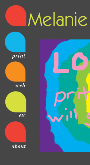
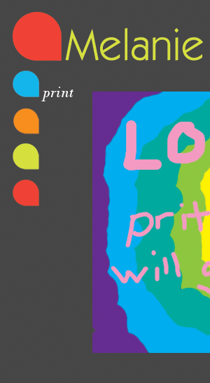
In that second one with the smaller petals, it would probably look better if I lined them up with the right side of the one in the logo instead of the left. Hmm.
I'm also thinking I might do rollovers for the nav bar - like only have the text appear when you mouseover the corresponding petal. Or I could do more with the rollovers - like have little petals and the rollover would be bigger. IDK.
SO DO YOU LIKE IT?!
I feel like it might be a little disorganized, like maybe it has some alignment issues....does it seem that way to anyone else, or am I just being too fussy with it? I can't quite figure out how to handle the fact that the images of various pieces will be different shapes and sizes. I don't want to force myself to make them sizes other than what they are, but having them all different makes it really hard to line things up. And there will be different numbers of alternate view icons too, which makes it even harder.
ANYWAY.
PLEASE tell me what you think of it! And if you have any thoughts about the nav bar or the alignment or any of the other stuff I'm bitching about, shaaare! And feel free to suggest things that I didn't actually mention or try yet or whatever. WOO.
(Can you tell I'm pretty damn proud of myself for getting this done today?)
So here's a general mock-up of what I'm looking at:

The main thing I'm still trying to figure out is the nav bar and where the main image should go in relation to it, because...

Haha. So here's a couple other ideas for the navbar:


In that second one with the smaller petals, it would probably look better if I lined them up with the right side of the one in the logo instead of the left. Hmm.
I'm also thinking I might do rollovers for the nav bar - like only have the text appear when you mouseover the corresponding petal. Or I could do more with the rollovers - like have little petals and the rollover would be bigger. IDK.
SO DO YOU LIKE IT?!
I feel like it might be a little disorganized, like maybe it has some alignment issues....does it seem that way to anyone else, or am I just being too fussy with it? I can't quite figure out how to handle the fact that the images of various pieces will be different shapes and sizes. I don't want to force myself to make them sizes other than what they are, but having them all different makes it really hard to line things up. And there will be different numbers of alternate view icons too, which makes it even harder.
ANYWAY.
PLEASE tell me what you think of it! And if you have any thoughts about the nav bar or the alignment or any of the other stuff I'm bitching about, shaaare! And feel free to suggest things that I didn't actually mention or try yet or whatever. WOO.
(Can you tell I'm pretty damn proud of myself for getting this done today?)