(no subject)
If anyone has a moment, I could really use some opinions on a logo design I'm working on.
Edit: I forgot to mention that Whiteface is a ski resort. One of their big things they're trying to sell is that they're a big mountain that's closer to home for people in the area - sort of like getting the experience of the Colorado mountains without the distance.
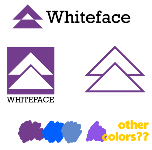
Which of those three logos do you prefer (and why, if you can explain)?
Do you like the text large and to the right (like the top example) or smaller and underneath (like the bottom left example)?
What color would you like to see this in? (I added some swatches for ideas but feel free to suggest something slightly or completely different)
THANKS SO MUCH to anyone who has time to give me advice!
Edited again to add:
Okay, I think I have this finalized. I'm using the bottom left logo in a color very close to the third swatch on the bottom there. The text is large and to the right like the top logo, and the baseline of the text is aligned with the bottom of the lower triangle, which I think looks nice. I'm pretty happy with it! Many thanks to those that gave me input!

Edit: I forgot to mention that Whiteface is a ski resort. One of their big things they're trying to sell is that they're a big mountain that's closer to home for people in the area - sort of like getting the experience of the Colorado mountains without the distance.
Which of those three logos do you prefer (and why, if you can explain)?
Do you like the text large and to the right (like the top example) or smaller and underneath (like the bottom left example)?
What color would you like to see this in? (I added some swatches for ideas but feel free to suggest something slightly or completely different)
THANKS SO MUCH to anyone who has time to give me advice!
Edited again to add:
Okay, I think I have this finalized. I'm using the bottom left logo in a color very close to the third swatch on the bottom there. The text is large and to the right like the top logo, and the baseline of the text is aligned with the bottom of the lower triangle, which I think looks nice. I'm pretty happy with it! Many thanks to those that gave me input!