Tutorial 06: Yuuko
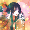
Going from 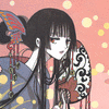
to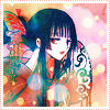
Made with: Photoshop CS2 [but probably translatable to other versions of PS, at least]
Level: Intermediate [not for your first icon]
Required Knowledge: Adjustment Layers, Layer Masks [preferably], Basic Photoshop Know-how
[Step 1] Instead of starting off with the image, as we usually do, we will start of with a solid base of #707070, a medium grey color. Already this is starting to intrigue you, ne? ^_^
[Step 2] Now, we take the base picture, in my case, of the lovely Yuuko, and set it on top at Hard Light 100%. Okay, so it's not much of a difference, but it slightly brightens up the whole image. And if it doesn't, then just let me believe it does. ^_^
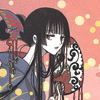
[Step 3] Now, you want to duplicate the previous layer, and apply the following adjustments, all of which can be found under [Image > Adjustments]: Auto Levels, Auto Contrast, Auto Color. I don't know if the order matters, but it's probably insignificant if does. I set that to Soft Light Fill 26% You can adjust opacity to your liking, but I didn't want it to make too much of a difference.

[Step 4]Now, take this pretty texture by... [?] and set it to Overlay 84%, adjusting opacity as needed. I know, I know. It looks really bad now. It'll be fixed, I promise.
>>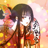
[Step 5] Now, I duplicated my base image of Yuuko, put it on top, and desaturated it. I set it to Pin Light 100%. This just darkens some of the black again. No biggie.
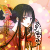
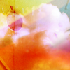
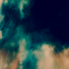
[Step 6] Now this is the step where it starts to get a little prettier [hopefully]. Set this texture by unmasked_icons to Screen 100% and marvel at how the icky dark-orange has suddenly gone away. Yay!! Go Blue!
>>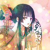
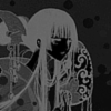
[Step 7] Well, our image is... dare I say still really weak and pale-looking? This next step will make it all so much better! Take your desaturated Yuuko image from step 5 and duplicate it. Drag it to the top, and invert the colours [Image > Adjustments > Invert]. Then adjust the brightness and contrast of this image [Image > Adjustments > Brightness/Contrast], reducing the contrast as you see fit, but leaving enough so that the lines are clearly differentiated from the background. Mine looks like the one you see below. Set that to Soft Light 100%. Hopefully, your image looks a lot better after this.
>>
[Step 8] Now is where it sucks to be those with PSP, because we are using the magical Selective Color! Create a new Selective Colour adjustment layer and play around with it until you're happy with the results. I'd rather not give you my settings in a case like this, but I understand that results can vary a LOT with Selective Color, so I'll show you mine as an example if you really really really want this particular colour scheme. Please don't use it if it creates something ugly! It's always nice to see people being creative as well
REDS:
Cyan -100
Magenta +13
Yellow +14
Black +15
YELLOWS
Cyan +100
Magenta +46
Yellow -33
Black -17
CYANS
Cyan +77
Magenta +56
Yellow -48
Black -11
NEUTRALS
Cyan +20
Magenta -7
Yellow -15
Black +9
Those settings should make things pretty and blueish. Or, if you used your own, hoorah for uniqueness! *gives you cookie*. In any case, just play around until you have something nice. This is pretty much the MAJOR color adjustment in this tutorial, aside from the shiny overlay layer.
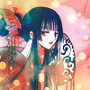
[Step 9] Another adjustment layer. Curves this time. I'm not going to show you my settings for this, since you can probably just guess or play around... Just remember, don't make any major crazy-bendy curves, or you're almost guaranteed something scary. Follow the natural line they give you and tweak it. I used mine to make it brighter and more contrasty.
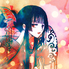
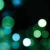
[Step 10] We're almost there! I then took this light texture by anais_dirge and set it on top at Lighten Fill 66% I thought it would go nicely with the spots my image originally had.
>>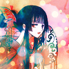
[Step 11] Now, I added a border, as usual. It's from a color I eyedropped from my icon. That's as far as I'll go into that, since borders are typically self-explanatory.
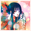
[Step 12] The final layer is a solid layer of #fff200, a really bright yellow. I set it to Saturation 11% to boost the brightness just a little. The original image is pretty bright to begin with, so I didn't use much. Just be careful about opacity, because saturation with such a strong color is dangerous. And that's the end of that. ^_^

If there are any questions, please comment with them... Also, feel free to friend me for any icon updates or tutorials that I post here. I'd love to see any and all results that were spawned from this tut. Alternately, if you have Photoshop, you can download my .psd file.

to

Made with: Photoshop CS2 [but probably translatable to other versions of PS, at least]
Level: Intermediate [not for your first icon]
Required Knowledge: Adjustment Layers, Layer Masks [preferably], Basic Photoshop Know-how
[Step 1] Instead of starting off with the image, as we usually do, we will start of with a solid base of #707070, a medium grey color. Already this is starting to intrigue you, ne? ^_^
[Step 2] Now, we take the base picture, in my case, of the lovely Yuuko, and set it on top at Hard Light 100%. Okay, so it's not much of a difference, but it slightly brightens up the whole image. And if it doesn't, then just let me believe it does. ^_^

[Step 3] Now, you want to duplicate the previous layer, and apply the following adjustments, all of which can be found under [Image > Adjustments]: Auto Levels, Auto Contrast, Auto Color. I don't know if the order matters, but it's probably insignificant if does. I set that to Soft Light Fill 26% You can adjust opacity to your liking, but I didn't want it to make too much of a difference.

[Step 4]Now, take this pretty texture by... [?] and set it to Overlay 84%, adjusting opacity as needed. I know, I know. It looks really bad now. It'll be fixed, I promise.

>>

[Step 5] Now, I duplicated my base image of Yuuko, put it on top, and desaturated it. I set it to Pin Light 100%. This just darkens some of the black again. No biggie.

[Step 6] Now this is the step where it starts to get a little prettier [hopefully]. Set this texture by unmasked_icons to Screen 100% and marvel at how the icky dark-orange has suddenly gone away. Yay!! Go Blue!

>>

[Step 7] Well, our image is... dare I say still really weak and pale-looking? This next step will make it all so much better! Take your desaturated Yuuko image from step 5 and duplicate it. Drag it to the top, and invert the colours [Image > Adjustments > Invert]. Then adjust the brightness and contrast of this image [Image > Adjustments > Brightness/Contrast], reducing the contrast as you see fit, but leaving enough so that the lines are clearly differentiated from the background. Mine looks like the one you see below. Set that to Soft Light 100%. Hopefully, your image looks a lot better after this.

>>

[Step 8] Now is where it sucks to be those with PSP, because we are using the magical Selective Color! Create a new Selective Colour adjustment layer and play around with it until you're happy with the results. I'd rather not give you my settings in a case like this, but I understand that results can vary a LOT with Selective Color, so I'll show you mine as an example if you really really really want this particular colour scheme. Please don't use it if it creates something ugly! It's always nice to see people being creative as well
REDS:
Cyan -100
Magenta +13
Yellow +14
Black +15
YELLOWS
Cyan +100
Magenta +46
Yellow -33
Black -17
CYANS
Cyan +77
Magenta +56
Yellow -48
Black -11
NEUTRALS
Cyan +20
Magenta -7
Yellow -15
Black +9
Those settings should make things pretty and blueish. Or, if you used your own, hoorah for uniqueness! *gives you cookie*. In any case, just play around until you have something nice. This is pretty much the MAJOR color adjustment in this tutorial, aside from the shiny overlay layer.

[Step 9] Another adjustment layer. Curves this time. I'm not going to show you my settings for this, since you can probably just guess or play around... Just remember, don't make any major crazy-bendy curves, or you're almost guaranteed something scary. Follow the natural line they give you and tweak it. I used mine to make it brighter and more contrasty.

[Step 10] We're almost there! I then took this light texture by anais_dirge and set it on top at Lighten Fill 66% I thought it would go nicely with the spots my image originally had.

>>

[Step 11] Now, I added a border, as usual. It's from a color I eyedropped from my icon. That's as far as I'll go into that, since borders are typically self-explanatory.

[Step 12] The final layer is a solid layer of #fff200, a really bright yellow. I set it to Saturation 11% to boost the brightness just a little. The original image is pretty bright to begin with, so I didn't use much. Just be careful about opacity, because saturation with such a strong color is dangerous. And that's the end of that. ^_^

If there are any questions, please comment with them... Also, feel free to friend me for any icon updates or tutorials that I post here. I'd love to see any and all results that were spawned from this tut. Alternately, if you have Photoshop, you can download my .psd file.