Tutorial 04 [violet]
Per request by... someone from clamp_visual, here's a tutorial to go from:
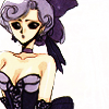
to
Difficulty: Moderate. May be difficult for beginners.
Requirements: Knowledge of layer masks and curves, as well as basic Photoshop skills.
Written for: Photoshop CS2
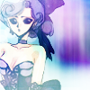
We start out with this base from clamp_visual: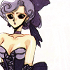
I suggest that your base be similar to mine in that it is cold-toned to begin with [green, blue, or violet] and that it has a lot of empty space on the right, or this tutorial will make your icon very ugly. Trust me.
[Step 1]Now we uglify it by duplicating the layer and setting it to Soft Light 74% or whatever your image requires to be nice and bold. We need it very bold for the next steps.

[Step 2] Next, take this texture
[by anais_dirge] and set it to Multiply 100%. Use a layer mask to cover up all the parts that overlap your image. If you're uncomfortable using layer masks, erasing is an option, but it is safer to use a layer mask. Layer masks are also easier to edit and do not destroy your image the way the eraser does, so be warned. Layer masks are very handy so read up on how to use them and they'll save you lots of pain later on [can you tell that I love them?].
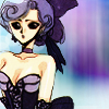
[Step 3] Now take the same texture as before, sans deletions and layer masks and set it to Hard Light 85%. Percentages will vary depending on each icon, so experiment.
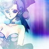
[Step 4] Duplicate the base and set it to Soft Light 56% or whatever percentage looks nice. This gives the image more definition over the very light texture we just used.
[Step 5] Now take this texture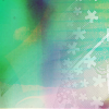
by the lovely gender and set it to Lighten 100%. I then used a layer mask and used a black to white gradient on it to cover up the left side smoothly. [This can be done if you make a brush from a gradient and use the eraser tool with that brush on the texture. But layer masks are simply easier. ^_^] This way, you don't make the image any lighter.
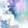
[Step 6] Now duplicate that texture [without erasures or layer masks] and set it to Color Burn 100%. I then applied a new layer mask [yes, I used them a lot] and used it to cover up most of my image as it would have been too bright and scary without it.
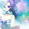
[Step 7] Duplicate that layer [mask and all] and keep it at Color Burn 100%.
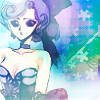
[Step 8] Still not bright enough for me, so I duplicate again with layer mask and set it to Color Burn 27%.
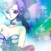
[Step 9] Flood fill a layer with #96d2f3 and set it to Color Burn 51% or wherever it looks nice.
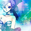
[Step 10] I then flood filled a new layer with #f598ab and set it to Soft Light 55%.
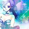
[Step 11] I duplicated that layer and set it to Color Burn 23%.
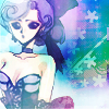
[Step 12] I then took this texture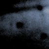
[by ?] and set it to Soft Light 100%. This would probably our first major color change. ^_^ I'm all for subtlety.
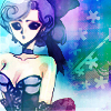
[Step 13] Next take this texture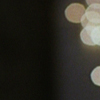
[by ?] and set it to Screen 69%
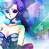
[Step 14] Now it's time to add text. I just used plain white.
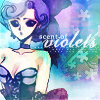
[Step 15] Now I created a curves layer and played around with curves until I liked it. I'm not going to show you my exact settings because curves are all about experimenting [I think], so just go wild. Tip: never distort the curves too badly from where they are or it will look terrible. Also, if you're really unsure, try clicking "Auto" first and go from there. Also here is an awesome curves tutorial. I got this:

[Step 16] I then added a 2 px white border all around and then a dotted border that I used in this tutorial of mine. These were not added on top but several layers down so that the border matches the icon's colors at those places.
Final Result:
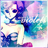
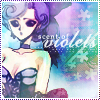
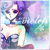
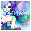
It is very easy to create variations just by making a curves layer over everything else. Here are some examples:
I would love to see your results. Questions are quite welcome if you are confused. Comments are loved. ^_^
Do not just copy this tutorial, but learn from it to develop your own techniques and style. Don't just steal mine because that is completely uncreative.
This will be my last tutorial for a while, for various reasons.

to

Difficulty: Moderate. May be difficult for beginners.
Requirements: Knowledge of layer masks and curves, as well as basic Photoshop skills.
Written for: Photoshop CS2
We start out with this base from clamp_visual:

I suggest that your base be similar to mine in that it is cold-toned to begin with [green, blue, or violet] and that it has a lot of empty space on the right, or this tutorial will make your icon very ugly. Trust me.
[Step 1]Now we uglify it by duplicating the layer and setting it to Soft Light 74% or whatever your image requires to be nice and bold. We need it very bold for the next steps.

[Step 2] Next, take this texture

[by anais_dirge] and set it to Multiply 100%. Use a layer mask to cover up all the parts that overlap your image. If you're uncomfortable using layer masks, erasing is an option, but it is safer to use a layer mask. Layer masks are also easier to edit and do not destroy your image the way the eraser does, so be warned. Layer masks are very handy so read up on how to use them and they'll save you lots of pain later on [can you tell that I love them?].

[Step 3] Now take the same texture as before, sans deletions and layer masks and set it to Hard Light 85%. Percentages will vary depending on each icon, so experiment.

[Step 4] Duplicate the base and set it to Soft Light 56% or whatever percentage looks nice. This gives the image more definition over the very light texture we just used.

[Step 5] Now take this texture

by the lovely gender and set it to Lighten 100%. I then used a layer mask and used a black to white gradient on it to cover up the left side smoothly. [This can be done if you make a brush from a gradient and use the eraser tool with that brush on the texture. But layer masks are simply easier. ^_^] This way, you don't make the image any lighter.

[Step 6] Now duplicate that texture [without erasures or layer masks] and set it to Color Burn 100%. I then applied a new layer mask [yes, I used them a lot] and used it to cover up most of my image as it would have been too bright and scary without it.

[Step 7] Duplicate that layer [mask and all] and keep it at Color Burn 100%.

[Step 8] Still not bright enough for me, so I duplicate again with layer mask and set it to Color Burn 27%.

[Step 9] Flood fill a layer with #96d2f3 and set it to Color Burn 51% or wherever it looks nice.

[Step 10] I then flood filled a new layer with #f598ab and set it to Soft Light 55%.

[Step 11] I duplicated that layer and set it to Color Burn 23%.

[Step 12] I then took this texture

[by ?] and set it to Soft Light 100%. This would probably our first major color change. ^_^ I'm all for subtlety.

[Step 13] Next take this texture

[by ?] and set it to Screen 69%

[Step 14] Now it's time to add text. I just used plain white.

[Step 15] Now I created a curves layer and played around with curves until I liked it. I'm not going to show you my exact settings because curves are all about experimenting [I think], so just go wild. Tip: never distort the curves too badly from where they are or it will look terrible. Also, if you're really unsure, try clicking "Auto" first and go from there. Also here is an awesome curves tutorial. I got this:

[Step 16] I then added a 2 px white border all around and then a dotted border that I used in this tutorial of mine. These were not added on top but several layers down so that the border matches the icon's colors at those places.
Final Result:

It is very easy to create variations just by making a curves layer over everything else. Here are some examples:


I would love to see your results. Questions are quite welcome if you are confused. Comments are loved. ^_^
Do not just copy this tutorial, but learn from it to develop your own techniques and style. Don't just steal mine because that is completely uncreative.
This will be my last tutorial for a while, for various reasons.