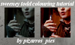
Icon tutorial - Sweeney Todd colouring
As requested by a few people at sweeney_stills .
This was done in PSP9 but I'm presuming it'd be easily translatable.
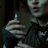
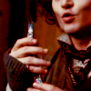
Start off with your base cropped to how you want it.
Duplicate it and set to screen
Duplicate the base again, bring it to the top and set to soft light.
Add a new layer between the screen and soft light layers and fill with #ffbbfe (pink). Set this to soft light.
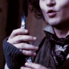
Add another new layer above the pink one, and fill with #ecb48a (orangey colour). Again, set it to soft light.
And a new saturation layer to the top of everything (Layers > New adjustment layer > hue/saturation/lightness). Leave the lightness/hue markers as they are but set the saturation one to about 60.
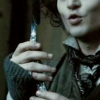
After that, it's just a matter of messing around with opacity levels. I usually lower the pink layer a little and sometimes duplicate the orange one and set the opacity around 15. The opacity of the saturation layer depends on your base image. If it's pretty dark like this then usually the opacity's best around 50-70 but if the original image is quite brigh then 40 should do it. It's basically personal preference though as to how bright you want the image. You might even want to duplicate the base again (leave it just above the base) and set it to multiply on a low opacity, just to give the image a bit more depth. That's what I did with this =)
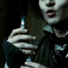
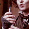
Then I merged all the layers, duplicated the base and set to burn (opacity 12)
Added this spiffing texture from lookslikeicons, set to multiply at a low opacity, just so it was a little less bright
et voila! A more colourful Sweeney Todd =)

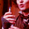
A few people on my flist have been asking me to do a tutorial for months about my colouring. Basically I use how I did this with everything. It's just different images call for different opacity levels with the pink/orange layers, sometimes even reducing the opacity on the dupliacated base I set to soft light works. The biggest difference is that I nearly always put either a blue (e.g. #6accfe) or a green (e.g. #6afeb3) soft light layer above the orange one. Again, fiddle with the opacity and see what looks good.
If there's any questions just gimme a shout =) Hope it helps somebody!
This was done in PSP9 but I'm presuming it'd be easily translatable.
Start off with your base cropped to how you want it.
Duplicate it and set to screen
Duplicate the base again, bring it to the top and set to soft light.
Add a new layer between the screen and soft light layers and fill with #ffbbfe (pink). Set this to soft light.
Add another new layer above the pink one, and fill with #ecb48a (orangey colour). Again, set it to soft light.
And a new saturation layer to the top of everything (Layers > New adjustment layer > hue/saturation/lightness). Leave the lightness/hue markers as they are but set the saturation one to about 60.
After that, it's just a matter of messing around with opacity levels. I usually lower the pink layer a little and sometimes duplicate the orange one and set the opacity around 15. The opacity of the saturation layer depends on your base image. If it's pretty dark like this then usually the opacity's best around 50-70 but if the original image is quite brigh then 40 should do it. It's basically personal preference though as to how bright you want the image. You might even want to duplicate the base again (leave it just above the base) and set it to multiply on a low opacity, just to give the image a bit more depth. That's what I did with this =)
Then I merged all the layers, duplicated the base and set to burn (opacity 12)
Added this spiffing texture from lookslikeicons, set to multiply at a low opacity, just so it was a little less bright
et voila! A more colourful Sweeney Todd =)
A few people on my flist have been asking me to do a tutorial for months about my colouring. Basically I use how I did this with everything. It's just different images call for different opacity levels with the pink/orange layers, sometimes even reducing the opacity on the dupliacated base I set to soft light works. The biggest difference is that I nearly always put either a blue (e.g. #6accfe) or a green (e.g. #6afeb3) soft light layer above the orange one. Again, fiddle with the opacity and see what looks good.
If there's any questions just gimme a shout =) Hope it helps somebody!