Icon tutorial - Blue coloring
We'll be turning 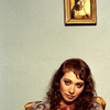
into
Done in PS CS3
1. Take your base. I love how this works on images with grey backgrounds. Like, you know..this one. :P

2. I duplicated the base and set it on screen, because that's what one should do. But that was just too bright. So I used a layer mask to hide the layer on screen everywhere except Regina's face. Or you can just erase everything except the parts you want with a round soft brush.
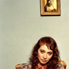
3. I needed this to be lighter still. Please note that from here on I have used a billion curves layers to get what I wanted, but that's because I was experimenting as I went. I am sure you can get the same effect in lesser moves. :P
So, Curves layer with these settings -
I-34, O-38 on RGB.
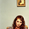
4. I duplicated this Curves layer, set it on Screen and reduced the opacity to 15%.
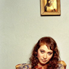
5. Contrast needed! Another Curves layer with these settings -
I-39, O-76 on RGB set on Colorburn 22%
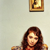
6. Now I wanted more detail of some kind in all that grey. I took this texture by sanami276, desaturated it, rotated it 90C and set it on softlight. I also erased some part.

7. I took a light texture(basically just brushed some red-ish ornage) and set it on Screen.

8. I wanted more yellow in the icon. So I created a new layer, flood filled it with #f2f1c7 and set it on ColorBurn 55%.
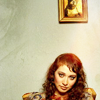
9. Too yellow? Another flood fill layer #caffff on Colorburn 55%.

10. The mega selective color layer now.
Reds: -100, +9, +100, +16
Yellows: -31, 0, -22, +2
Neutrals: +100, -16, -56, +14
Blacks: 0,0,0,+29
I reduced the opacity of this layer to 80%.

11. Added some text and done.

More examples of the same-ish coloring-
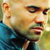
...
...
- Experiment. Don't put in the same values as me. They won't work on every picture.
- Comment if this was helpful
- Friend us for more tuts
- Any question, ask.
into
Done in PS CS3
1. Take your base. I love how this works on images with grey backgrounds. Like, you know..this one. :P
2. I duplicated the base and set it on screen, because that's what one should do. But that was just too bright. So I used a layer mask to hide the layer on screen everywhere except Regina's face. Or you can just erase everything except the parts you want with a round soft brush.
3. I needed this to be lighter still. Please note that from here on I have used a billion curves layers to get what I wanted, but that's because I was experimenting as I went. I am sure you can get the same effect in lesser moves. :P
So, Curves layer with these settings -
I-34, O-38 on RGB.
4. I duplicated this Curves layer, set it on Screen and reduced the opacity to 15%.
5. Contrast needed! Another Curves layer with these settings -
I-39, O-76 on RGB set on Colorburn 22%
6. Now I wanted more detail of some kind in all that grey. I took this texture by sanami276, desaturated it, rotated it 90C and set it on softlight. I also erased some part.
7. I took a light texture(basically just brushed some red-ish ornage) and set it on Screen.
8. I wanted more yellow in the icon. So I created a new layer, flood filled it with #f2f1c7 and set it on ColorBurn 55%.
9. Too yellow? Another flood fill layer #caffff on Colorburn 55%.
10. The mega selective color layer now.
Reds: -100, +9, +100, +16
Yellows: -31, 0, -22, +2
Neutrals: +100, -16, -56, +14
Blacks: 0,0,0,+29
I reduced the opacity of this layer to 80%.
11. Added some text and done.
More examples of the same-ish coloring-
...
...
- Experiment. Don't put in the same values as me. They won't work on every picture.
- Comment if this was helpful
- Friend us for more tuts
- Any question, ask.