on the pavement

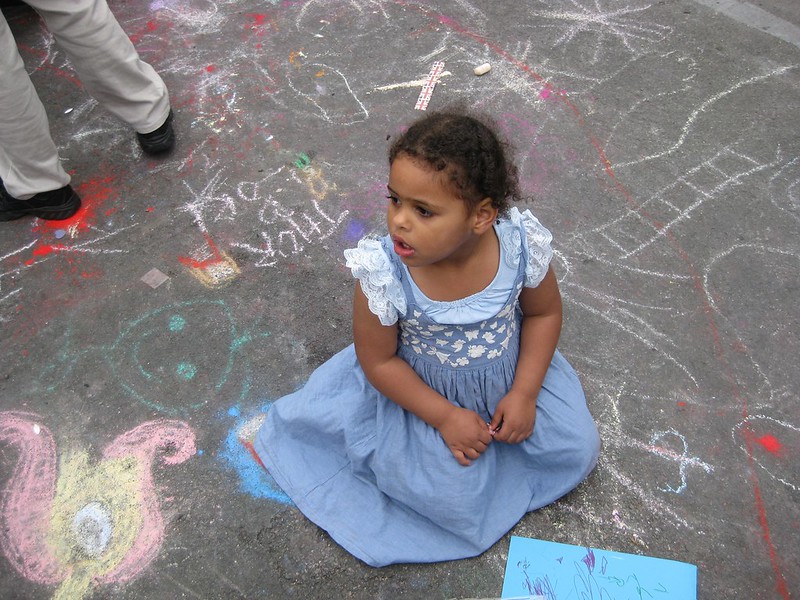
This isn't a recent image and it predates our acquisition of 2 Nikon DSLRs and a huge number of lenses, but it's one of my favourite pictures of my niece, Sophia.
This was last summer at the Jubilee street party in my parents' road. The road was blocked off and filled with tables and chairs, music and people dancing. There were chalks and lots of kids (and grown-ups too) making pictures on the road. Sophia was about 2 and a half. About old enough to enjoy the bouncy castle and tentatively join in with the games of the other little girls. They made a den under under one of the tables and sat it in doing drawing with felt tips.
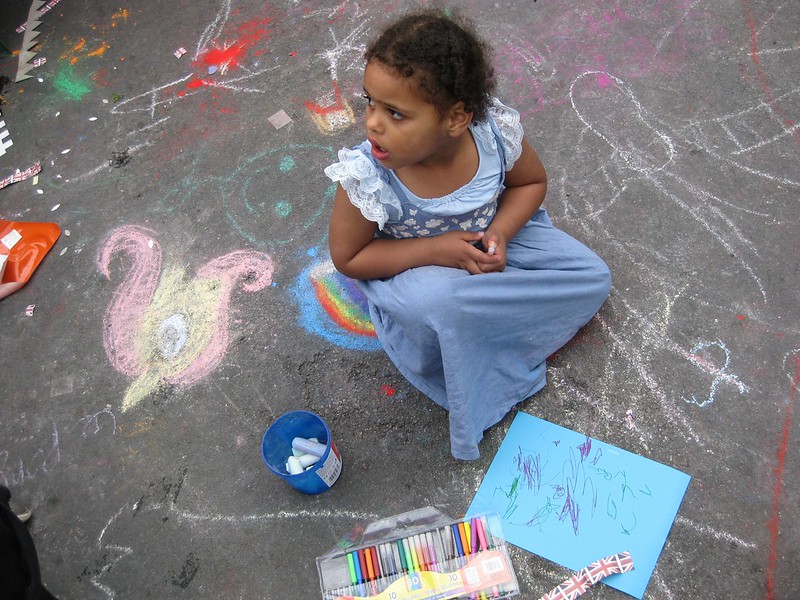
Here Sophia is carefully watching what the other girls and doing and getting up the courage to go and join in.
I like the chalk drawing background and the way the adult in the picture is just a pair of legs. I also like the blues - the paper, her dress, the chalk and the way they contrast with her skin. The three-quarters profile means you can see her gorgeous long eyelashes and her watchful expression.
I think there's a little too much space to the right hand side. It would be good to be a little lower so the picture is in Sophia's space rather than from above. Would also be good to have a sense in the photo of what it is she's looking at.

I think the angle in this one is a little more dynamic, though again it's from above and there's no sense of what she's looking at. It's more colourful (the rainbow she's sitting on, echoed in the felt tips). I'm not sure which I prefer.
Neither image is perfect, but I think for what are basically snaps on a compact camera, they're OK. What do you think?