Blending Tutorial 2 - Header on a black background
A blending tutorial featuring Mick St. John. I'm kind of in love with every detail of Alex O'Loughlin's face, from his round forehead to his cleft chin and everything in between. ;)
We're going to be making this header from that lovely face: click the thumbnail
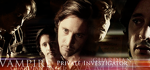
This tutorial was made using Photoshop CS2. We're going to blend again, using the "add layer mask" tool. I'm also going to show you how to use a "gradient map" to change the color of a screencap. This blending tutorial is a little easier than my last one.
Choose your screencaps
Like I said, I decided to go with some screencaps of 1980's Mick St. John from the Moonlight episode "Out of the Past". These have already been reduced to the size I think I want to use and cropped. Screencaps from CrystalFires.com
Click to see the caps I'm starting with
Screencaps I started out with - screencap
I was going to do this in black and and white, but I noticed that three of the caps have a kind of sepia tone to them with lots of contrast between the darks and lights. I decided to keep those colors, so I changed the two blue tinted caps to match.
TIP: This tutorial will not work well on screencaps that have a light colored or white background.
~~~~~~~~~~~~~~~~~~~~~
How to change the color of the blue tinted caps
You can skip this part if you want.
I made a three color gradient based on the browns and peaches in one of the sepia toned caps. Use your "Eyedropper Tool" to pick three colors - in a light, medium and dark shade. Make your gradient starting with the dark colors.
(If you don't know how to make a gradient in Photoshop, go to Help>Photoshop Help. When the "Adobe Help Center" dialog pops up go to the Index. Click on "G". Then Gradients>Creating. If your help center works the same as mine you should be at "To create a smooth gradient". Follow the directions there.)
This was my gradient.
Unfortunately I did something and lost it before I could save it as a .grd file, so I don't have that to share with you. But it's probably best that you make your own gradient anyway. Or just use one of the gradients you already have to experiment with.
When you have your gradient ready open one of your blue toned caps. In the "Layers Palette" click on the "Create new fill or adjustment layer" tool. Then click on "Gradient Map". In the Gradient Map dialog box that pops up find the gradient you made and select it. Then click "OK". Set the Blend Mode to "Color".
Now these are going to look a little flat. There won't be as many colors as in the three sepia toned caps, which have a lot of greens and grays in them. The grayish brown would be OK, but you want to avoid that green because we are trying to get the skin tones as close to those other three caps as possible.
click to see the result
The two blue tinted caps colored to match the other pictures
There are many other way to change the color of your caps. If you have your own way of doing it and it works, by all means go with it.
If all else fails, you could even just desaturate those blue tinted caps and use them in black and white if you want.
~~~~~~~~~~~~~~~~~~~~~
Do whatever it is that you do to prepare your screencaps/pictures. I am going to wait till I have mine blended the way I want them before I do anything else to them.
Arrange your caps onto your canvas
Open a blank canvas and give it a black background. Drag your caps onto the canvas, above the black layer, and arrange them in a pleasing fashion. This is always the hardest thing for me and I don't think I get it right most of the time. So, if you are good at this sort of thing be proud. :)
Tip
OK, here's the really cool thing about working on a black background. You can set all your caps to "screen" and still see them! Personally, when I'm working on a black background it's the first thing I do because they are transparent and it's much easier to arrange them.
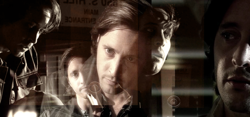
So here is how I arranged them.
Blending Your Pictures
Now it's time to start blending. I have a tutorial that already explains how to do this and if you want more detailed instructions you can go take a look at it BLENDING YOUR PICTURES, otherwise follow these simple instructions.
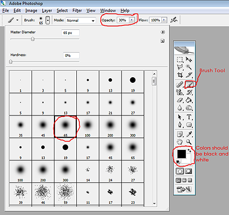
In your color pallette your foreground color should be black and your background color white. Click on your brush tool. For this size graphic I started out with a "soft 30px round brush" and set the "opacity to 100%". Actually you're going to have to play around with the opacity and size of your brush. You'll see when you start blending. But this is a good place to start. Ignore the brush size and opacity I have circled in the graphic below. This just shows you where they are.
Now go to your "Layers palette" and click on "Add layer mask" and you'll see a white rectangle appear in the layer you have selected.
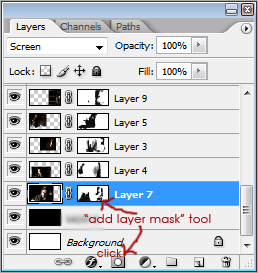
Start masking out parts of the caps you don't want in your final product. For instance the parts covering Mick's face and the hard lines at the edges of the caps would be a good place to start. Go slow and take your time.
If you make a mistake use the "eraser tool" to fix it.
What I do is I work on all my images at once. So I will add a mask to each layer and go back and forth between each one and blend till I get my caps blended the way I want.
This is what I ended up with.
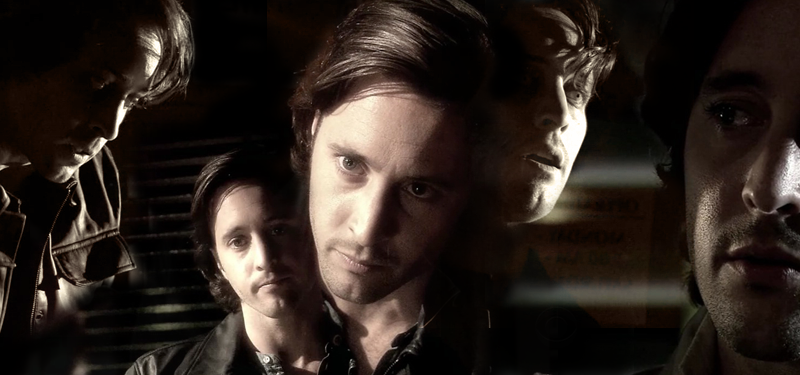
Sometimes it's good to leave a little of the background from some of the caps because it helps to connect them. You can also do this with textures.
That's the basics. You can add some textures or brushes and text. Whatever you want. This is my final product. A "1980's Mick St. John" header for the top of your LJ layout.

I hope this was helpful. If there is anything you don't understand or you see any mistakes please let me know in a comment.
The header is, of course, up for grabs. If you want to use it and need the text changed please let me know. Please do not try to add text to it yourself. It will look weird.
Please credit phlourish_icons or endlessdeep if you use the header.
I love comments, so please leave one.
Thanks everyone. :)
We're going to be making this header from that lovely face: click the thumbnail

This tutorial was made using Photoshop CS2. We're going to blend again, using the "add layer mask" tool. I'm also going to show you how to use a "gradient map" to change the color of a screencap. This blending tutorial is a little easier than my last one.
Choose your screencaps
Like I said, I decided to go with some screencaps of 1980's Mick St. John from the Moonlight episode "Out of the Past". These have already been reduced to the size I think I want to use and cropped. Screencaps from CrystalFires.com
Click to see the caps I'm starting with
Screencaps I started out with - screencap
I was going to do this in black and and white, but I noticed that three of the caps have a kind of sepia tone to them with lots of contrast between the darks and lights. I decided to keep those colors, so I changed the two blue tinted caps to match.
TIP: This tutorial will not work well on screencaps that have a light colored or white background.
~~~~~~~~~~~~~~~~~~~~~
How to change the color of the blue tinted caps
You can skip this part if you want.
I made a three color gradient based on the browns and peaches in one of the sepia toned caps. Use your "Eyedropper Tool" to pick three colors - in a light, medium and dark shade. Make your gradient starting with the dark colors.
(If you don't know how to make a gradient in Photoshop, go to Help>Photoshop Help. When the "Adobe Help Center" dialog pops up go to the Index. Click on "G". Then Gradients>Creating. If your help center works the same as mine you should be at "To create a smooth gradient". Follow the directions there.)
This was my gradient.

Unfortunately I did something and lost it before I could save it as a .grd file, so I don't have that to share with you. But it's probably best that you make your own gradient anyway. Or just use one of the gradients you already have to experiment with.
When you have your gradient ready open one of your blue toned caps. In the "Layers Palette" click on the "Create new fill or adjustment layer" tool. Then click on "Gradient Map". In the Gradient Map dialog box that pops up find the gradient you made and select it. Then click "OK". Set the Blend Mode to "Color".
Now these are going to look a little flat. There won't be as many colors as in the three sepia toned caps, which have a lot of greens and grays in them. The grayish brown would be OK, but you want to avoid that green because we are trying to get the skin tones as close to those other three caps as possible.
click to see the result
The two blue tinted caps colored to match the other pictures
There are many other way to change the color of your caps. If you have your own way of doing it and it works, by all means go with it.
If all else fails, you could even just desaturate those blue tinted caps and use them in black and white if you want.
~~~~~~~~~~~~~~~~~~~~~
Do whatever it is that you do to prepare your screencaps/pictures. I am going to wait till I have mine blended the way I want them before I do anything else to them.
Arrange your caps onto your canvas
Open a blank canvas and give it a black background. Drag your caps onto the canvas, above the black layer, and arrange them in a pleasing fashion. This is always the hardest thing for me and I don't think I get it right most of the time. So, if you are good at this sort of thing be proud. :)
Tip
OK, here's the really cool thing about working on a black background. You can set all your caps to "screen" and still see them! Personally, when I'm working on a black background it's the first thing I do because they are transparent and it's much easier to arrange them.
So here is how I arranged them.

Blending Your Pictures
Now it's time to start blending. I have a tutorial that already explains how to do this and if you want more detailed instructions you can go take a look at it BLENDING YOUR PICTURES, otherwise follow these simple instructions.
In your color pallette your foreground color should be black and your background color white. Click on your brush tool. For this size graphic I started out with a "soft 30px round brush" and set the "opacity to 100%". Actually you're going to have to play around with the opacity and size of your brush. You'll see when you start blending. But this is a good place to start. Ignore the brush size and opacity I have circled in the graphic below. This just shows you where they are.

Now go to your "Layers palette" and click on "Add layer mask" and you'll see a white rectangle appear in the layer you have selected.

Start masking out parts of the caps you don't want in your final product. For instance the parts covering Mick's face and the hard lines at the edges of the caps would be a good place to start. Go slow and take your time.
If you make a mistake use the "eraser tool" to fix it.
What I do is I work on all my images at once. So I will add a mask to each layer and go back and forth between each one and blend till I get my caps blended the way I want.
This is what I ended up with.

Sometimes it's good to leave a little of the background from some of the caps because it helps to connect them. You can also do this with textures.
That's the basics. You can add some textures or brushes and text. Whatever you want. This is my final product. A "1980's Mick St. John" header for the top of your LJ layout.

I hope this was helpful. If there is anything you don't understand or you see any mistakes please let me know in a comment.
The header is, of course, up for grabs. If you want to use it and need the text changed please let me know. Please do not try to add text to it yourself. It will look weird.
Please credit phlourish_icons or endlessdeep if you use the header.
I love comments, so please leave one.
Thanks everyone. :)