Celtic knotwork
One script that I have always loved is called Insular Majuscule. It's the main script used in the Book of Kells and the Lindisfarne Gospels, as well as a large variety of manuscripts written in England and Ireland in the seventh, eighth, and ninth centuries I haven't ever really mastered it, but I think in part that is due in (very small) part to my tools. See, the pen angle for Insular Majuscule is extremely shallow. This means that the thin lines are at the top and bottom of a curve, as in the O on the left in the picture below, rather than occurring at the top left and bottom right portions, as in the O on the right.
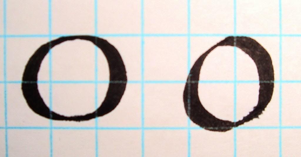
Now, a broad-edged pen, as used to create the letters above, can have its nib cut in two ways. One of them is so that it is perpendicular to the line of the pen, as in the nib on the left below. Imagine holding such a pen and writing naturally. If you're right-handed, your arm will be positioned in such a way that the nib will naturally have a steeper angle, creating curves like the O on the right above.
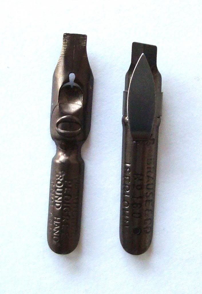
For a long time, I've been using only nibs like the one on the left, and as a result it's been very difficult to keep my pen angle constantly shallow for scripts such as Insular Majuscule, which leads to unsatisfactory lettering. By contrast, the nib on the right is cut obliquely, rather than perpendicularly, so that it counteracts this angle of the arm. This makes it much easier to write letters with a shallow pen angle.
The point of this little preamble is that I have now received from an excellent, excellent calligraphy supplier a large number of oblique-cut nibs, which means I've been diving into Insular Majuscule, and, by extension, other varieties of Insular manuscript decoration. To start with, I've been learning Celtic knotwork. The remainder of this entry will illustrate my adventures in this area.
I got a book out of the library and have been working through it for the last two days. It is surprising how principled the knots are. I guess it should be obvious that the decorators didn't just start drawing and hope that the design would weave itself shut all tidily when they were done. Something like this carpet page from the Lindisfarne Gospels (zoom in! The resolution is excellent!) makes the necessity of planning very clear. So I've been learning how to do that.
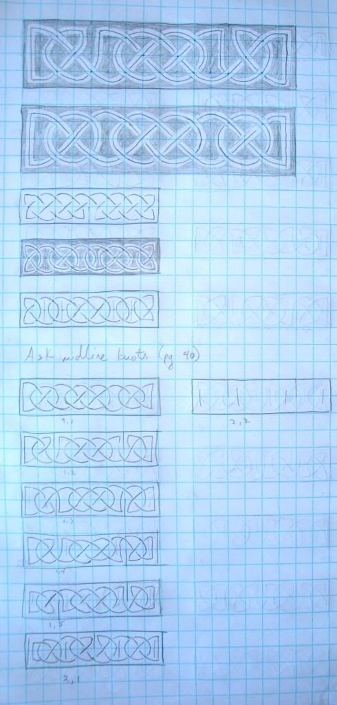
Here is my first attempt, starting with the first lesson in the book. After the first few blocks, I've figured out how to make them look all smooth and nice, but I only have one pattern to play with.
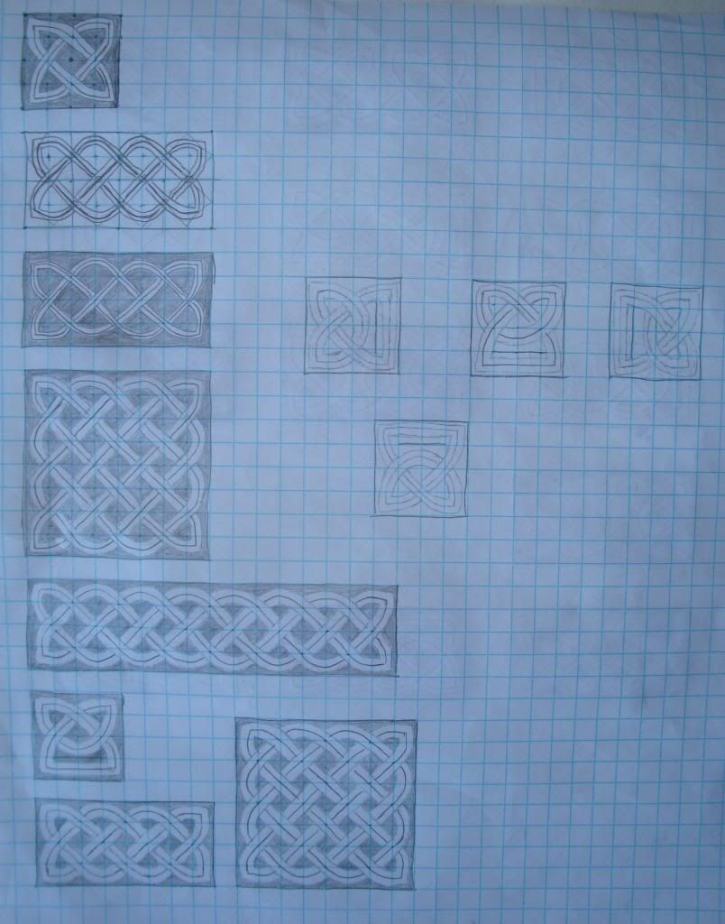
This next page is where I start learning variants in the basic four-by-two pattern that you can see I'd mastered in the bottom left panel of the picture above. Below, are a variety of different patterns based on that initial design. (The checkmarks are next to the variants that I particularly like.)
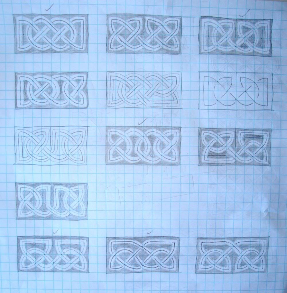
Next, you can see that I've started putting two four-by-two panels together in various combinations. I've also stopped coloring in the background, because I'm focusing on the design elements.
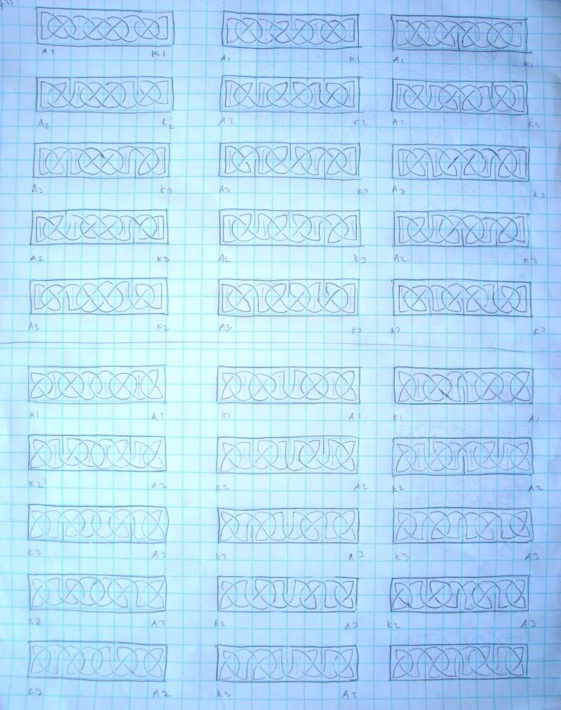
Below are thirty variants of one basic eight-by-two design. You can see I've annotated exactly how those variants work. The left column has no central dividing break; the middle column has a central dividing break at the top, and the right column has a central dividing break at the bottom. The top half combines pattern "A" on the left with pattern "K" on the right, while the bottom half combines pattern "K" on the left and pattern "A" on the right. The five rows in each half represent the five different variants of patterns "A" and "K" that are defined based on internal breaks in the pattern. It's really quite systematic!
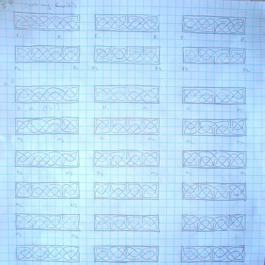
After I had drawn those thirty variants, I felt comfortable that I basically understand the mechanics of an eight-by-two panel. My book suggests that I memorize a few of them, but I'm happy looking back at a reference sheet and selecting the pattern that I like. They're easy enough to construct once you've laid out the grid properly. At any rate, the next page shows me playing around with a few different combinations. The top two rows represent panels made from patterns "F" and "P", but as my marginal comment explains, I don't really like how they look, so the lower rows are variants on patterns "H" and "N." I like those better.
I will finish with a presentation of a combination panel, consisting of four of the panels shown above all strung together. (In order, the patterns are N, H, F, P P, F, N, H. Note that this is not a palindrome because pattern H is the mirror of pattern N, so in order for the right end to mirror the left end, initial N must match final H, and second H must match penultimate N. F and P did not pose this problem.)

I'm quite pleased with how quickly I can produce very nice knots! I think before I go any further in the book I'll start playing with color and ink and so on, and maybe create borders on a few pieces of paper. I'm also tempted to try to copy a few designs from a manuscript, but every time I zoom in on some examples I'm reminded that I've really only been playing with this for two days. I've got a long way to go before I can create something like this.
This entry was originally posted at my dreamwidth site, which I will be using as my primary journal rather than livejournal. Crossposting will continue until morale improves.

Now, a broad-edged pen, as used to create the letters above, can have its nib cut in two ways. One of them is so that it is perpendicular to the line of the pen, as in the nib on the left below. Imagine holding such a pen and writing naturally. If you're right-handed, your arm will be positioned in such a way that the nib will naturally have a steeper angle, creating curves like the O on the right above.

For a long time, I've been using only nibs like the one on the left, and as a result it's been very difficult to keep my pen angle constantly shallow for scripts such as Insular Majuscule, which leads to unsatisfactory lettering. By contrast, the nib on the right is cut obliquely, rather than perpendicularly, so that it counteracts this angle of the arm. This makes it much easier to write letters with a shallow pen angle.
The point of this little preamble is that I have now received from an excellent, excellent calligraphy supplier a large number of oblique-cut nibs, which means I've been diving into Insular Majuscule, and, by extension, other varieties of Insular manuscript decoration. To start with, I've been learning Celtic knotwork. The remainder of this entry will illustrate my adventures in this area.
I got a book out of the library and have been working through it for the last two days. It is surprising how principled the knots are. I guess it should be obvious that the decorators didn't just start drawing and hope that the design would weave itself shut all tidily when they were done. Something like this carpet page from the Lindisfarne Gospels (zoom in! The resolution is excellent!) makes the necessity of planning very clear. So I've been learning how to do that.
Here is my first attempt, starting with the first lesson in the book. After the first few blocks, I've figured out how to make them look all smooth and nice, but I only have one pattern to play with.

This next page is where I start learning variants in the basic four-by-two pattern that you can see I'd mastered in the bottom left panel of the picture above. Below, are a variety of different patterns based on that initial design. (The checkmarks are next to the variants that I particularly like.)

Next, you can see that I've started putting two four-by-two panels together in various combinations. I've also stopped coloring in the background, because I'm focusing on the design elements.

Below are thirty variants of one basic eight-by-two design. You can see I've annotated exactly how those variants work. The left column has no central dividing break; the middle column has a central dividing break at the top, and the right column has a central dividing break at the bottom. The top half combines pattern "A" on the left with pattern "K" on the right, while the bottom half combines pattern "K" on the left and pattern "A" on the right. The five rows in each half represent the five different variants of patterns "A" and "K" that are defined based on internal breaks in the pattern. It's really quite systematic!

After I had drawn those thirty variants, I felt comfortable that I basically understand the mechanics of an eight-by-two panel. My book suggests that I memorize a few of them, but I'm happy looking back at a reference sheet and selecting the pattern that I like. They're easy enough to construct once you've laid out the grid properly. At any rate, the next page shows me playing around with a few different combinations. The top two rows represent panels made from patterns "F" and "P", but as my marginal comment explains, I don't really like how they look, so the lower rows are variants on patterns "H" and "N." I like those better.

I will finish with a presentation of a combination panel, consisting of four of the panels shown above all strung together. (In order, the patterns are N, H, F, P P, F, N, H. Note that this is not a palindrome because pattern H is the mirror of pattern N, so in order for the right end to mirror the left end, initial N must match final H, and second H must match penultimate N. F and P did not pose this problem.)

I'm quite pleased with how quickly I can produce very nice knots! I think before I go any further in the book I'll start playing with color and ink and so on, and maybe create borders on a few pieces of paper. I'm also tempted to try to copy a few designs from a manuscript, but every time I zoom in on some examples I'm reminded that I've really only been playing with this for two days. I've got a long way to go before I can create something like this.
This entry was originally posted at my dreamwidth site, which I will be using as my primary journal rather than livejournal. Crossposting will continue until morale improves.