Prologue: The sailor
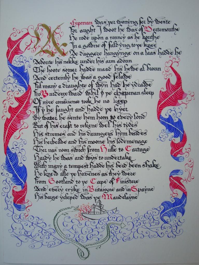
Since I have last posted, I've bought about ahem $150 of calligraphy supplies. This includes a large number of nibs, some fairly pricey paper, and some gouache (pronounced "gwash"; I asked), which is apparently the authentic material to use for coloring and so on. I also worked through the demo on acanthus leaves that I linked to yesterday, and I have now put everything together into a little manuscript, which I present below. Rather than the first 30 lines of the Canterbury Tales, I copied out instead a portion of the prologue in which the sailor is introduced. I chose it for three reasons:
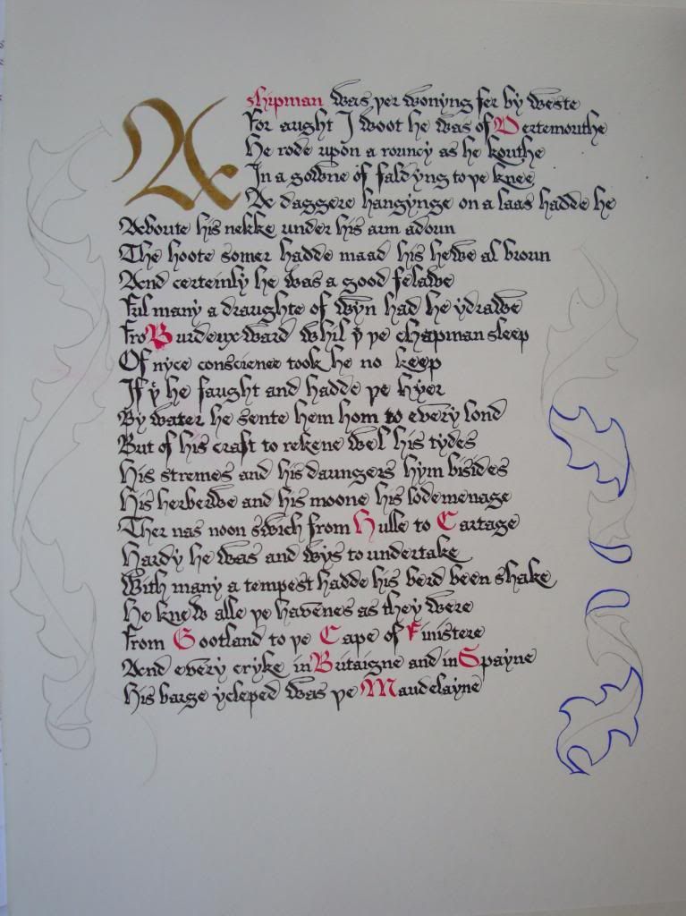
Here you can see I've copied out the text and penciled in the acanthus leaves. I've also started outlining them. I've found I'm pretty bad with a brush, but not bad with a steel nib, so I've repurposed a pointed copperplate nib for all my outlining needs. The text is not my best work. It's a bit smudgy and the paper got damaged, so the ink got absorbed unevenly toward the middle of the page. Until I'm more confident of my decorative skills, however, I'm not going to sweat the lettering. I do like how the gold capital looks! The ink is tricky to use, because unless it's very thick, it doesn't dry sparkly, but if it's thick enough to look right it doesn't really flow properly from the pen. Evidently I got the right balance here.
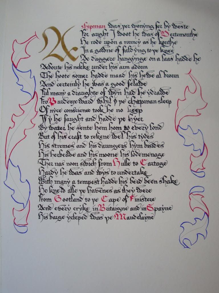
Here the outlining in contrastive colors is complete:
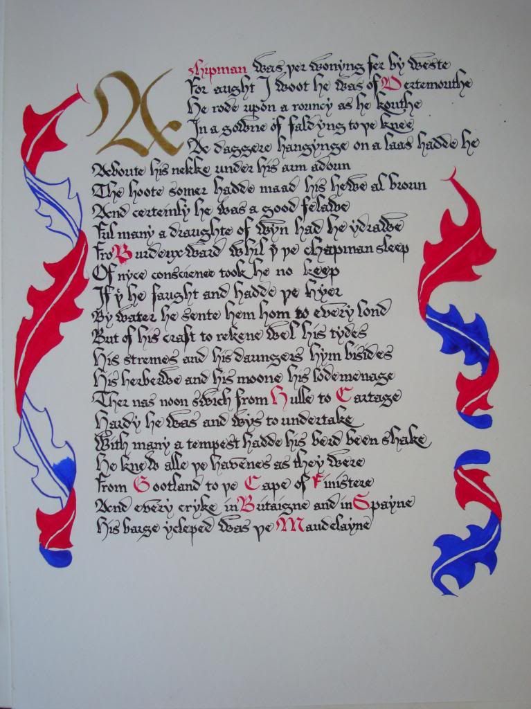
Now I start filling in the leaves. At this point I've switched to a brush, because the borders are safely marked out for me. It's basically paint by numbers at this point.
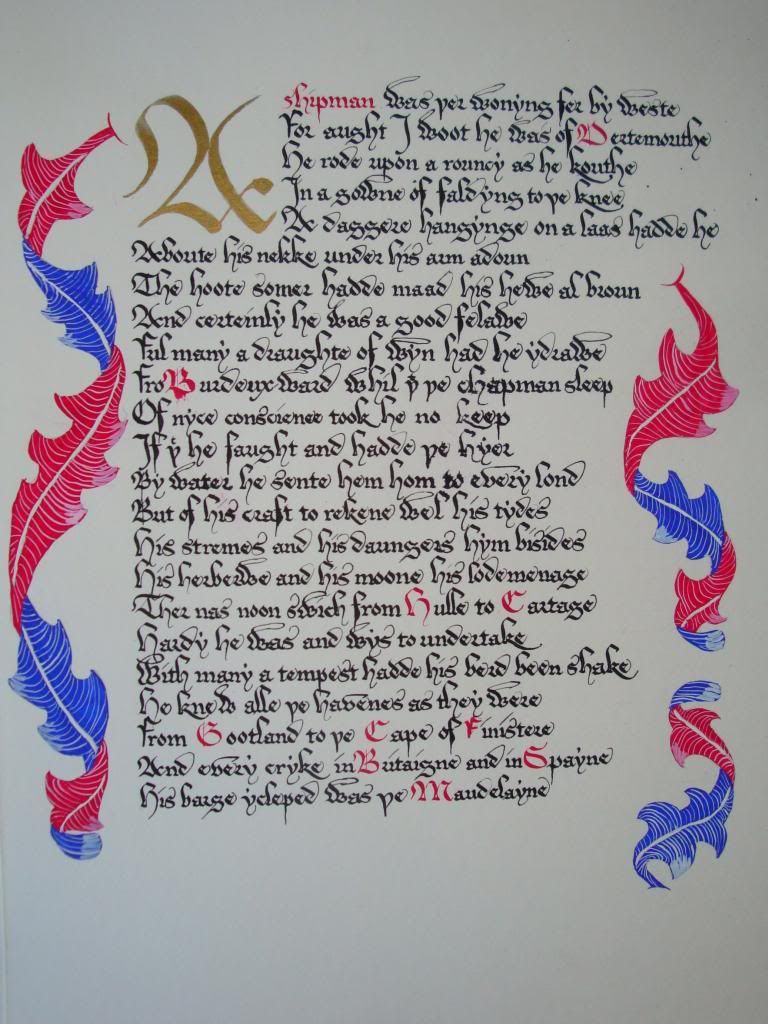
Here I've added some veins and highlights to lighten up the leaves. The veins are another case where the tutorial said to use a brush, but I just pulled out my copperplate pen again. Those thin lines are too hard to get with something as flimsy as a brush. (That is, if you are me.) I'm still not quite comfortable making them. I don't quite understand how the curve is supposed to work, and I can't decide whether it's better to have more of them, thinly spaced (as in the bottom right blue leaf) or fewer (as in everywhere else.)
Finally, I added the embellishments. This is where I had fun with the idea that the fellow is a sailor. I'm quite pleased with how it turned out!
This entry was originally posted at my dreamwidth site, which I will be using as my primary journal rather than livejournal. Crossposting will continue until morale improves.
- It was exactly the right length to fit on the paper I wanted to use.
- It did not begin with any text indicating that something came before it (e.g., "There was also . . . " or "With him was . . ." In other words, it is a stand-alone characterization.)
- A piece about a sailor is fun to decorate, as you shall see.
Here you can see I've copied out the text and penciled in the acanthus leaves. I've also started outlining them. I've found I'm pretty bad with a brush, but not bad with a steel nib, so I've repurposed a pointed copperplate nib for all my outlining needs. The text is not my best work. It's a bit smudgy and the paper got damaged, so the ink got absorbed unevenly toward the middle of the page. Until I'm more confident of my decorative skills, however, I'm not going to sweat the lettering. I do like how the gold capital looks! The ink is tricky to use, because unless it's very thick, it doesn't dry sparkly, but if it's thick enough to look right it doesn't really flow properly from the pen. Evidently I got the right balance here.

Here the outlining in contrastive colors is complete:

Now I start filling in the leaves. At this point I've switched to a brush, because the borders are safely marked out for me. It's basically paint by numbers at this point.

Here I've added some veins and highlights to lighten up the leaves. The veins are another case where the tutorial said to use a brush, but I just pulled out my copperplate pen again. Those thin lines are too hard to get with something as flimsy as a brush. (That is, if you are me.) I'm still not quite comfortable making them. I don't quite understand how the curve is supposed to work, and I can't decide whether it's better to have more of them, thinly spaced (as in the bottom right blue leaf) or fewer (as in everywhere else.)

Finally, I added the embellishments. This is where I had fun with the idea that the fellow is a sailor. I'm quite pleased with how it turned out!

This entry was originally posted at my dreamwidth site, which I will be using as my primary journal rather than livejournal. Crossposting will continue until morale improves.